New features: Difference between revisions
David Mudrak (talk | contribs) m (New card-deck based layout) |
|||
| (627 intermediate revisions by 8 users not shown) | |||
| Line 1: | Line 1: | ||
{{About Moodle}} | |||
Read on for an overview of the key features and improvements in Moodle 3.11, or watch our [https://www.youtube.com/playlist?list=PLxcO_MFWQBDdG1jK_Eu_D4GC-AOGBEXh6 YouTube playlist of 3.11 New features]. | |||
For role-specific information, see [[New for teachers]], [[New for students]] and [[New for administrators]]. | |||
=== | The list of major features and improvements can be found in the [[:dev:Moodle 3.11 release notes|Moodle 3.11 release notes]]. | ||
__NOTOC__ | |||
===Student activity completion (MUA)=== | |||
<div class="card-deck mt-3"> | |||
<div class="card"> | |||
<div class="card-body"> | |||
[[File:ActivityCompletion311.png|class=img-fluid]] | |||
<h4 class="card-title"> | |||
Improved learner experience | |||
</h4> | |||
<p class="card-text"> | |||
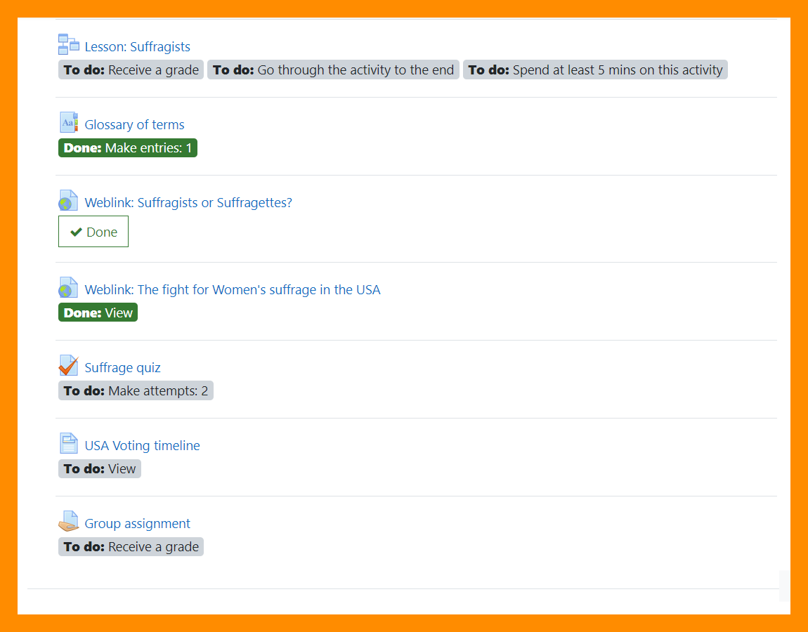
Activity dates and [[Activity completion]] conditions may be shown on the course page. | |||
</p> | |||
</div> | |||
</div> | |||
<div class="card"> | |||
<div class="card-body"> | |||
[[File:311CompletionWithinActivity.png|class=img-fluid]] | |||
<h4 class="card-title"> | |||
Dates and completion conditions within activities | |||
</h4> | |||
<p class="card-text"> | |||
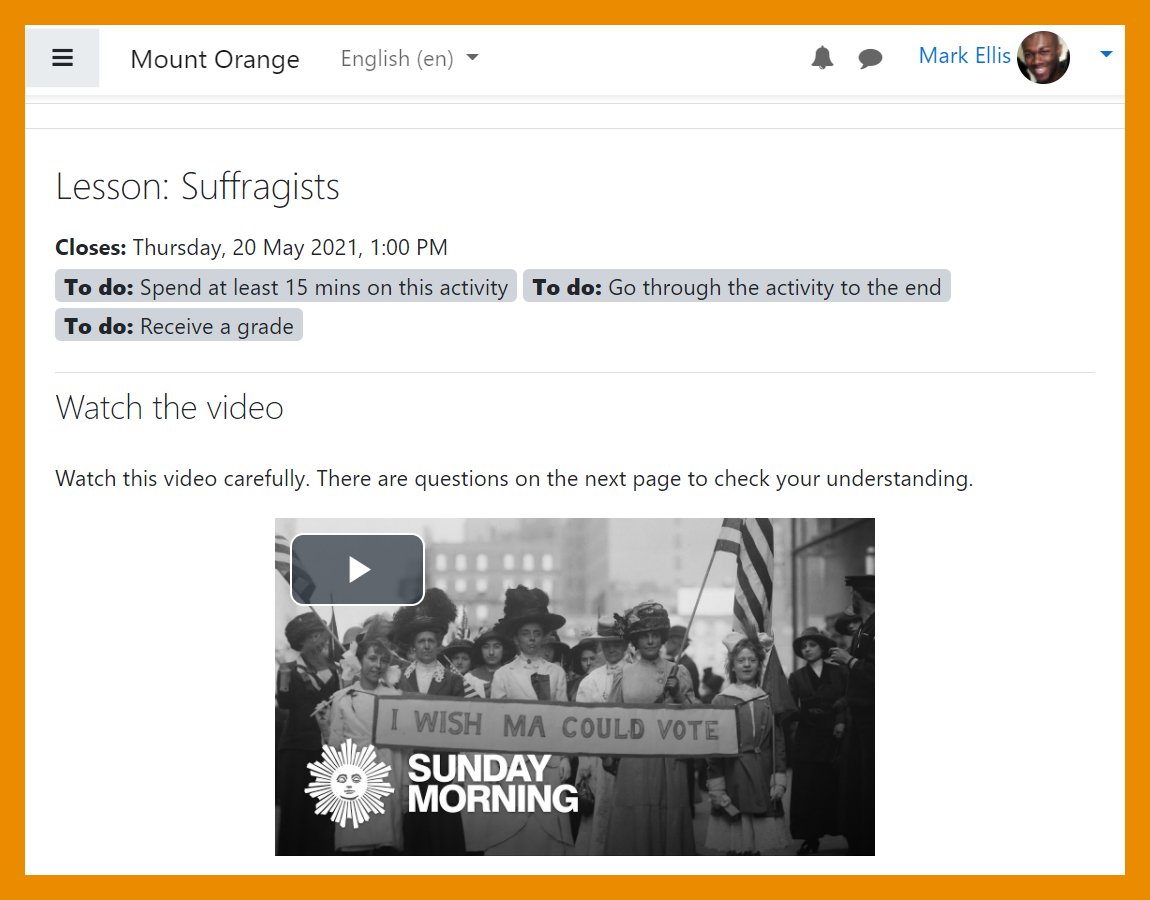
Activity dates and [[Activity completion]] conditions are shown at the top of the activity page. | |||
</p> | |||
</div> | |||
</div> | |||
</div> | |||
<div class="card-deck mt-3"> | |||
<div class="card"> | |||
<div class="card-body"> | |||
[[File:StudentManualCompletion.png|class=img-fluid]] | |||
<h4 class="card-title"> | |||
Manual completion | |||
</h4> | |||
<p class="card-text"> | |||
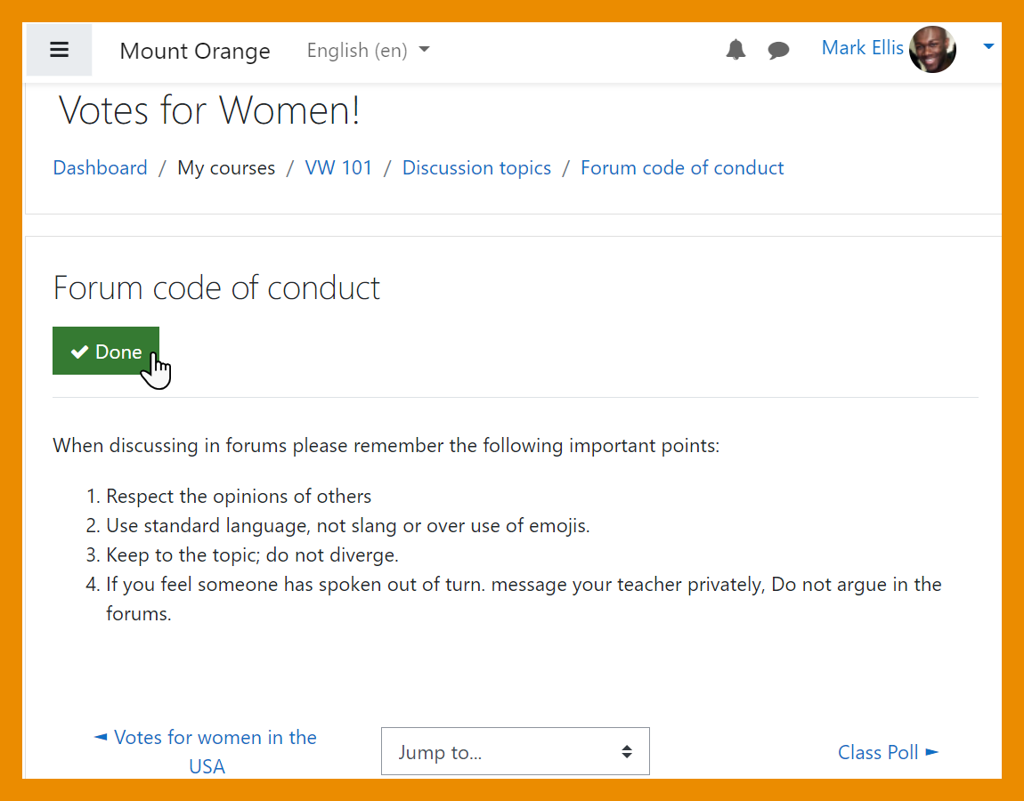
Students can mark an activity as complete from within the activity itself. | |||
</p> | |||
</div> | |||
</div> | |||
=== | <div class="card"> | ||
<div class="card-body"> | |||
[[File:TeacherCompletionSettings.png|class=img-fluid]] | |||
<h4 class="card-title"> | |||
New display settings | |||
</h4> | |||
<p class="card-text"> | |||
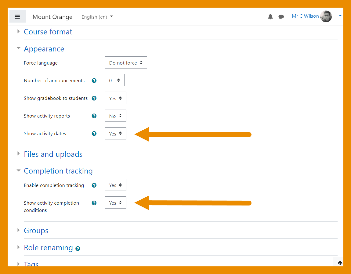
New settings allow teachers to hide or show activity dates and completion conditions on the course page. | |||
</p> | |||
</div> | |||
</div> | |||
</div> | |||
| [[File: | ===Accessibility toolkit=== | ||
| [[File: | |||
| [[File: | <div class="card-deck mt-3"> | ||
| | |||
<div class="card"> | |||
<div class="card-body"> | |||
[[File:BrickfieldAdmin1.png|class=img-fluid]] | |||
<h4 class="card-title"> | |||
Free starter toolkit | |||
</h4> | |||
<p class="card-text"> | |||
An [[Accessibility toolkit]] (from Brickfield Education Labs) identifies course accessibility issues. | |||
</p> | |||
</div> | |||
</div> | |||
<div class="card"> | |||
<div class="card-body"> | |||
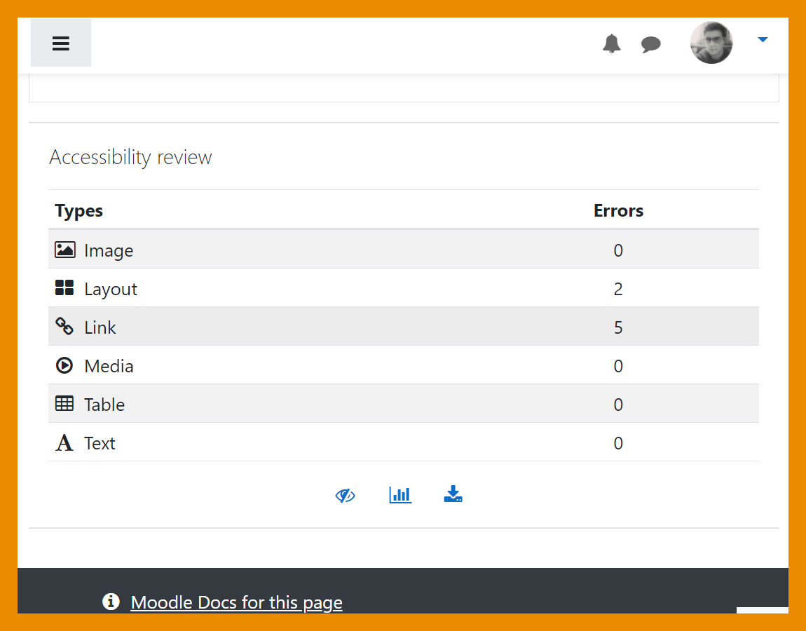
[[File:AccessiblityBlock.png|class=img-fluid]] | |||
<h4 class="card-title"> | |||
Course accessibility review | |||
</h4> | |||
<p class="card-text"> | |||
Course content is analysed so teachers can identify and fix accessibility errors. | |||
</p> | |||
</div> | |||
</div> | |||
</div> | |||
<div class="card-deck mt-3"> | |||
<div class="card"> | |||
<div class="card-body"> | |||
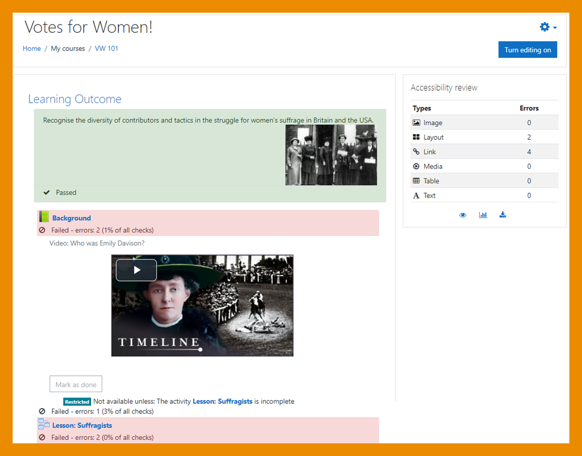
[[File:BrickfieldTeacher.png|class=img-fluid]] | |||
<h4 class="card-title"> | |||
Heatmap of errors | |||
</h4> | |||
<p class="card-text"> | |||
A heatmap offers a coloured and contextual view of the areas of concern. | |||
</p> | |||
</div> | |||
</div> | |||
<div class="card"> | |||
<div class="card-body"> | |||
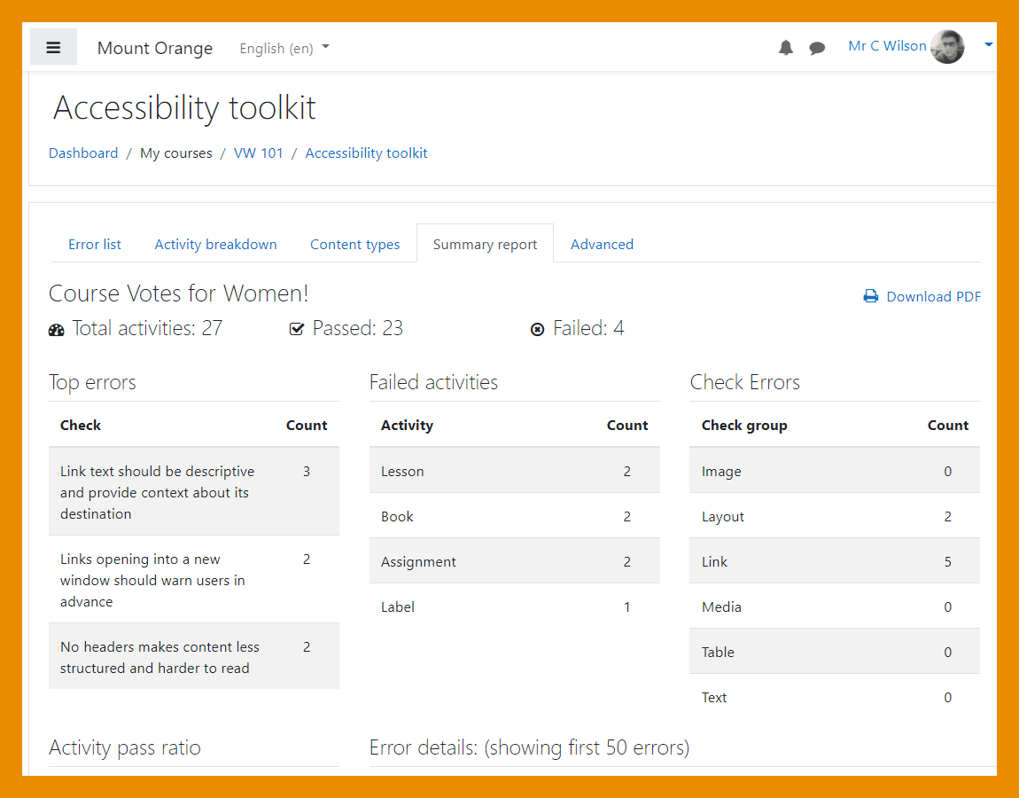
[[File:SummaryReport.png|class=img-fluid]] | |||
<h4 class="card-title"> | |||
Range of reports and graphs | |||
</h4> | |||
<p class="card-text"> | |||
Errors can be viewed in graphic form, or as a list with a downloadable report. | |||
</p> | |||
</div> | |||
</div> | |||
</div> | |||
===H5P and content bank=== | |||
<div class="card-deck mt-3"> | |||
<div class="card"> | |||
<div class="card-body"> | |||
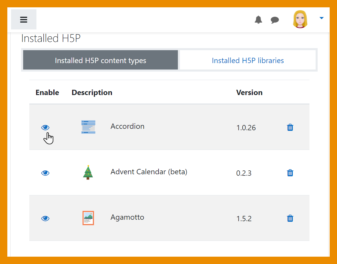
[[File:DisableH5Pcontent.png|class=img-fluid]] | |||
<h4 class="card-title"> | |||
Disable selected H5P content types | |||
</h4> | |||
<p class="card-text"> | |||
Admins can disable selected [[H5P|H5P content types]] from the admin settings. | |||
</p> | |||
</div> | |||
</div> | |||
<div class="card"> | |||
<div class="card-body"> | |||
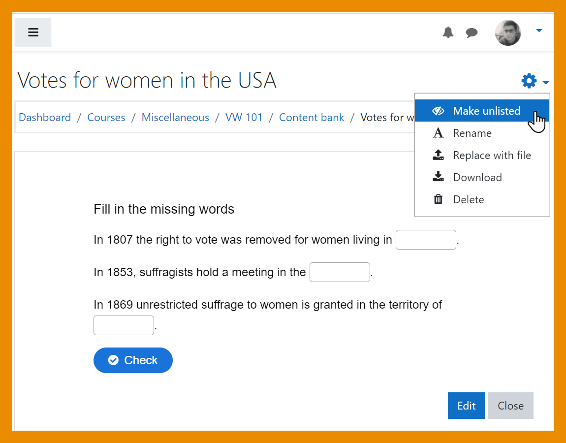
[[File:MakeUnlisted.png|class=img-fluid]] | |||
<h4 class="card-title"> | |||
Mark content as unlisted | |||
</h4> | |||
<p class="card-text"> | |||
Teachers can hide content in the [[Content bank|content bank]] by marking it as unlisted. | |||
</p> | |||
</div> | |||
</div> | |||
</div> | |||
<div class="card-deck mt-3"> | |||
<div class="card"> | |||
<div class="card-body"> | |||
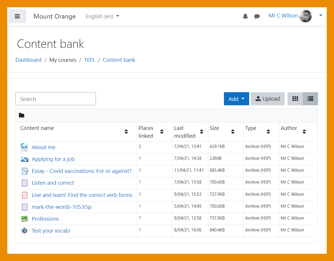
[[File:LinkedContent.png|class=img-fluid]] | |||
<h4 class="card-title"> | |||
See which content is linked | |||
</h4> | |||
<p class="card-text"> | |||
A new column in the [[Content bank|content bank]] displays the number of times an item is linked. | |||
</p> | |||
</div> | |||
</div> | |||
<div class="card"> | |||
<div class="card-body"> | |||
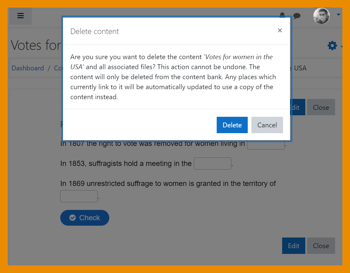
[[File:DeleteAlert.png|class=img-fluid]] | |||
<h4 class="card-title"> | |||
Alert when deleting linked content | |||
</h4> | |||
<p class="card-text"> | |||
An alert is displayed when linked content is about to be deleted, explaining what will happen | |||
</p> | |||
</div> | |||
</div> | |||
</div> | |||
===Quiz and question types=== | |||
<div class="card-deck mt-3"> | |||
<div class="card"> | |||
<div class="card-body"> | |||
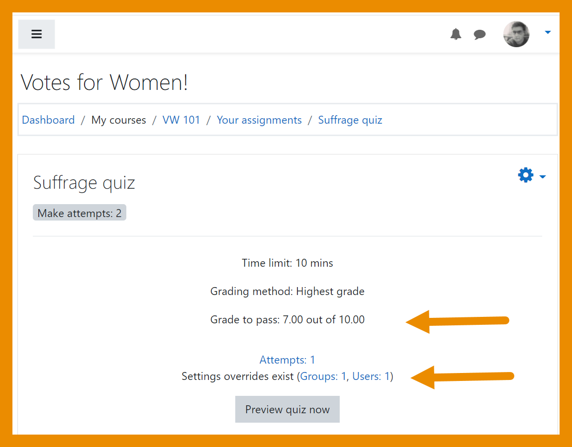
[[File:QuizOverridePassGrade.png|class=img-fluid]] | |||
<h4 class="card-title"> | |||
View overrides and pass grades | |||
</h4> | |||
<p class="card-text"> | |||
Teachers can view overrides and students can view pass grades directly on the Quiz page. | |||
</p> | |||
</div> | |||
</div> | |||
<div class="card"> | |||
<div class="card-body"> | |||
[[File:RetainedQuestionSettings.png|class=img-fluid]] | |||
<h4 class="card-title"> | |||
Preferred question settings retained | |||
</h4> | |||
<p class="card-text"> | |||
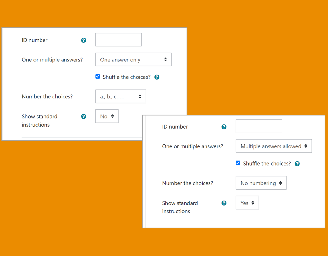
Changes from the default settings of a question type are retained for the next time a teacher creates a question. | |||
</p> | |||
</div> | |||
</div> | |||
</div> | |||
<div class="card-deck mt-3"> | |||
<div class="card"> | |||
<div class="card-body"> | |||
[[File:QuizMinMaxStudent.png|class=img-fluid]] | |||
<h4 class="card-title"> | |||
Essay question word limits | |||
</h4> | |||
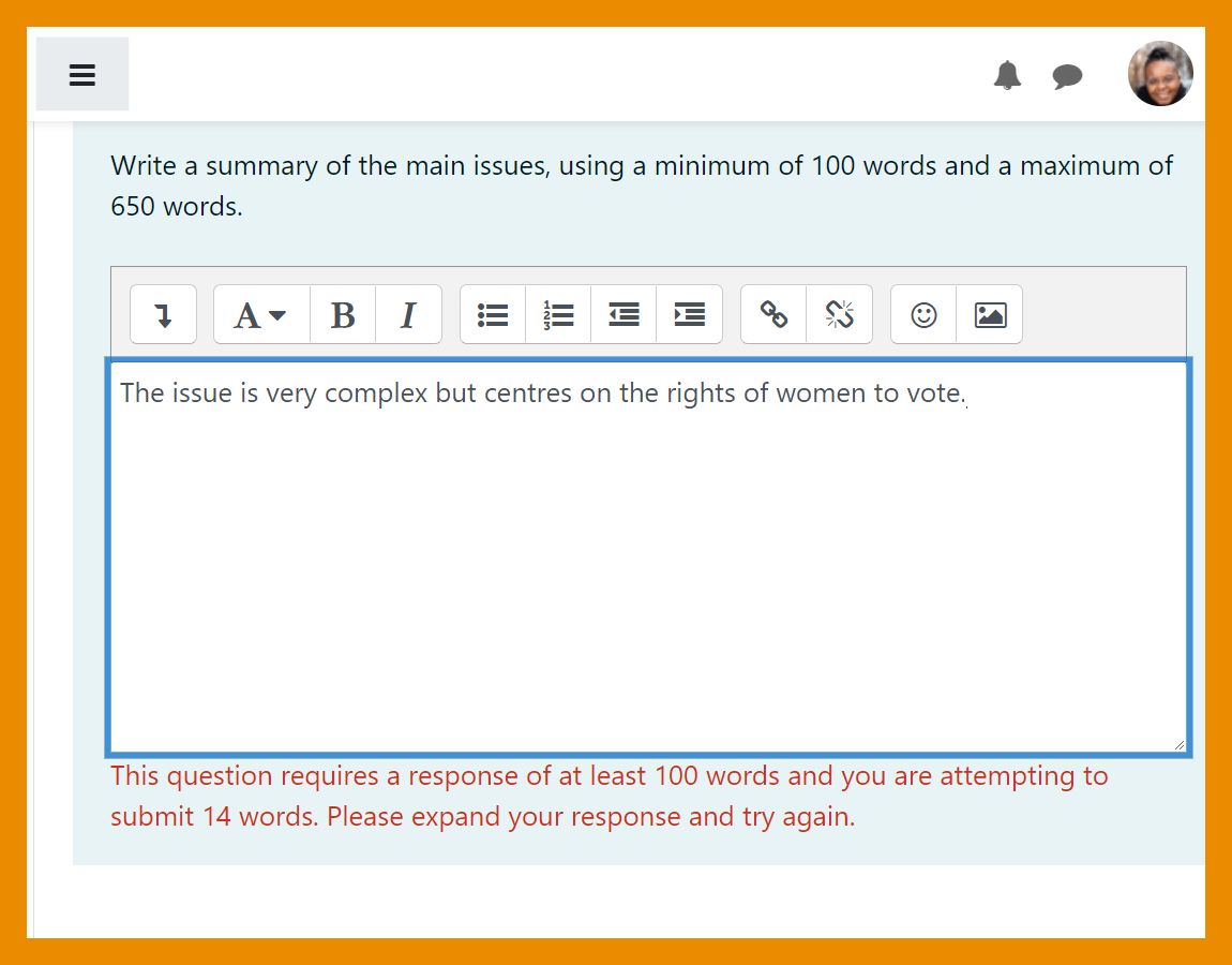
<p class="card-text"> | |||
A minimum and maximum word limit can be specified for [[Essay question type|Essay questions]]. | |||
</p> | |||
</div> | |||
</div> | |||
<div class="card"> | |||
<div class="card-body"> | |||
[[File:PlagiarismSupport.png|class=img-fluid]] | |||
<h4 class="card-title"> | |||
Essay plagiarism support | |||
</h4> | |||
<p class="card-text"> | |||
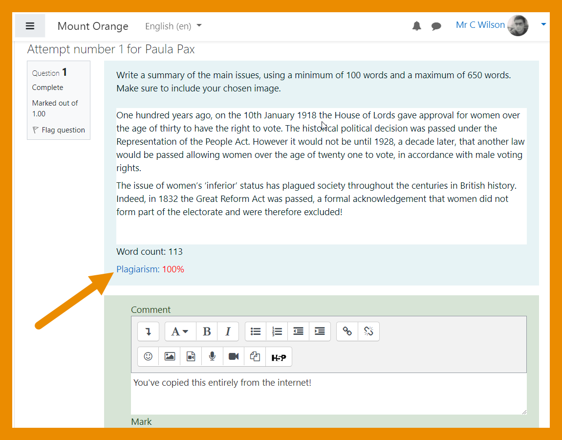
If a plagiarism checker is installed, it now supports the [[Essay question type]]. | |||
</p> | |||
</div> | |||
</div> | |||
</div> | |||
===Badges=== | ===Badges=== | ||
<div class="card-deck mt-3"> | |||
<div class="card"> | |||
<div class="card-body"> | |||
[[File:ManageBackPacks.png|class=img-fluid]] | |||
<h4 class="card-title"> | |||
Better backpack management | |||
</h4> | |||
<p class="card-text"> | |||
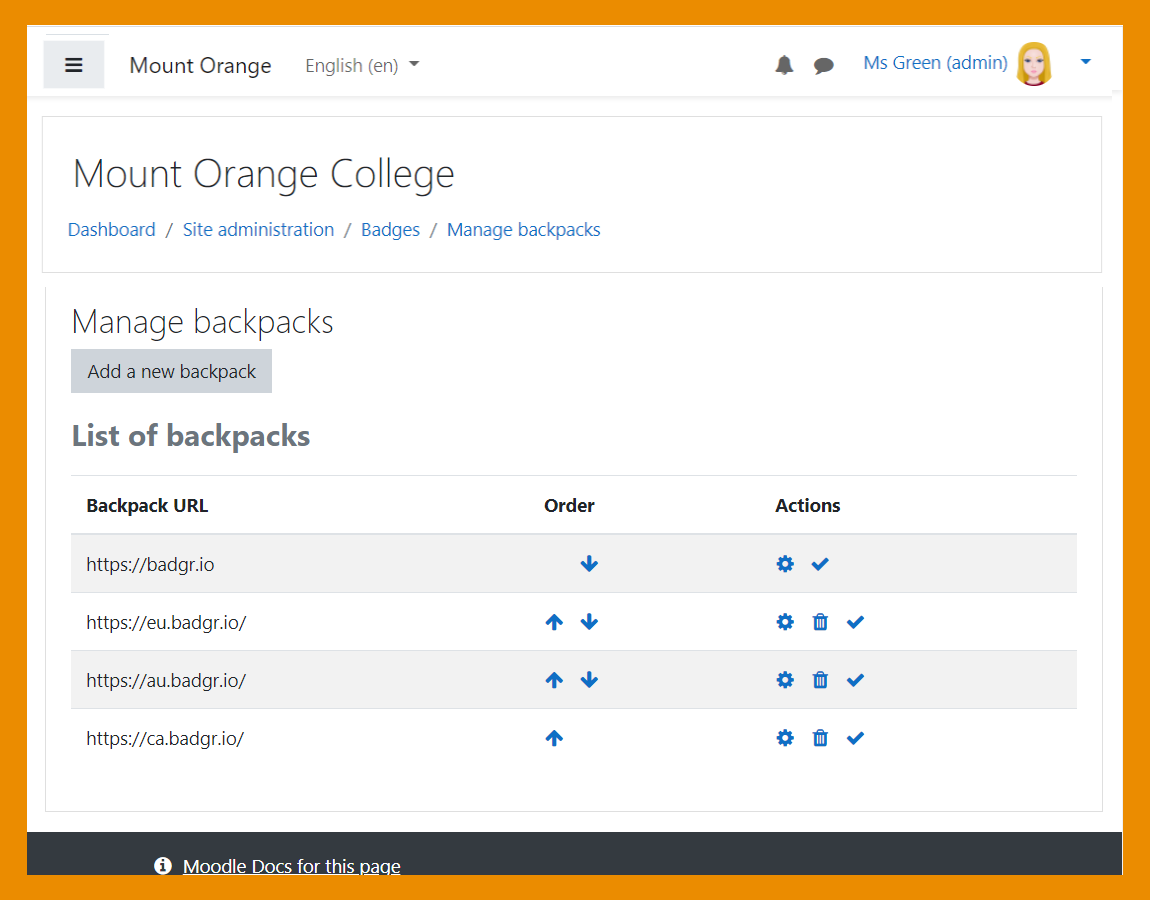
Admins can set the order in which [[Backpacks|backpacks]] are listed for users. | |||
</p> | |||
</div> | |||
</div> | |||
<div class="card"> | |||
<div class="card-body"> | |||
[[File:BadgesAPI.png|class=img-fluid]] | |||
<h4 class="card-title"> | |||
Open Badges v 2.1 compliant | |||
</h4> | |||
<p class="card-text"> | |||
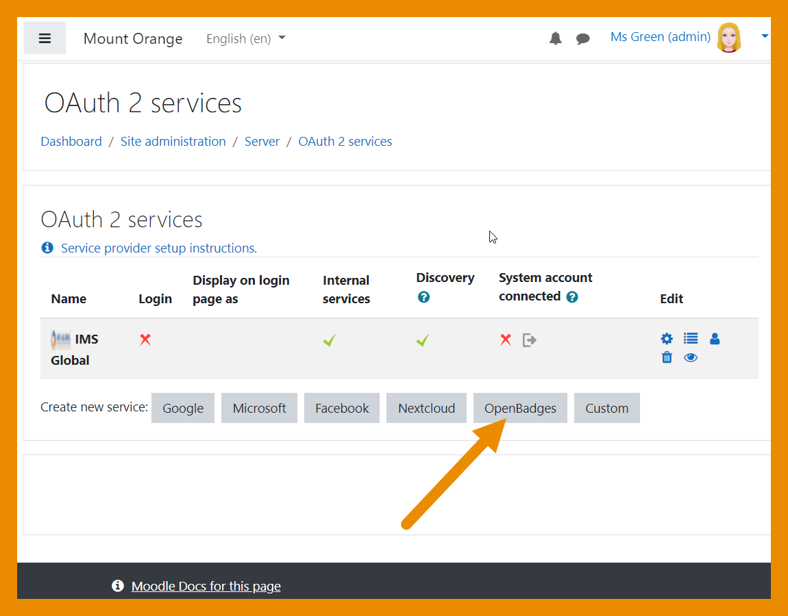
Moodle 3.11 is Open Badges v 2.1 compliant and a new [[OAuth 2 Open Badges service]] enables users to connect to their OB v 2.1 compliant backpack without having to enter their credentials into Moodle. | |||
</p> | |||
</div> | |||
</div> | |||
</div> | |||
===User profile fields=== | |||
<div class="card-deck mt-3"> | |||
<div class="card"> | |||
<div class="card-body"> | |||
[[File:SocialField.png|class=img-fluid]] | |||
<h4 class="card-title"> | |||
New Social profile field | |||
</h4> | |||
<p class="card-text"> | |||
A new [[User profile fields#Overview| Social profile field]] replaces the hard-coded fields in the user profile. | |||
</p> | |||
</div> | |||
</div> | |||
=== | <div class="card"> | ||
<div class="card-body"> | |||
[[File:UserProfileUserIdentity.png|class=img-fluid]] | |||
<h4 class="card-title"> | |||
Custom profile fields selectable in Show user identity | |||
</h4> | |||
<p class="card-text"> | |||
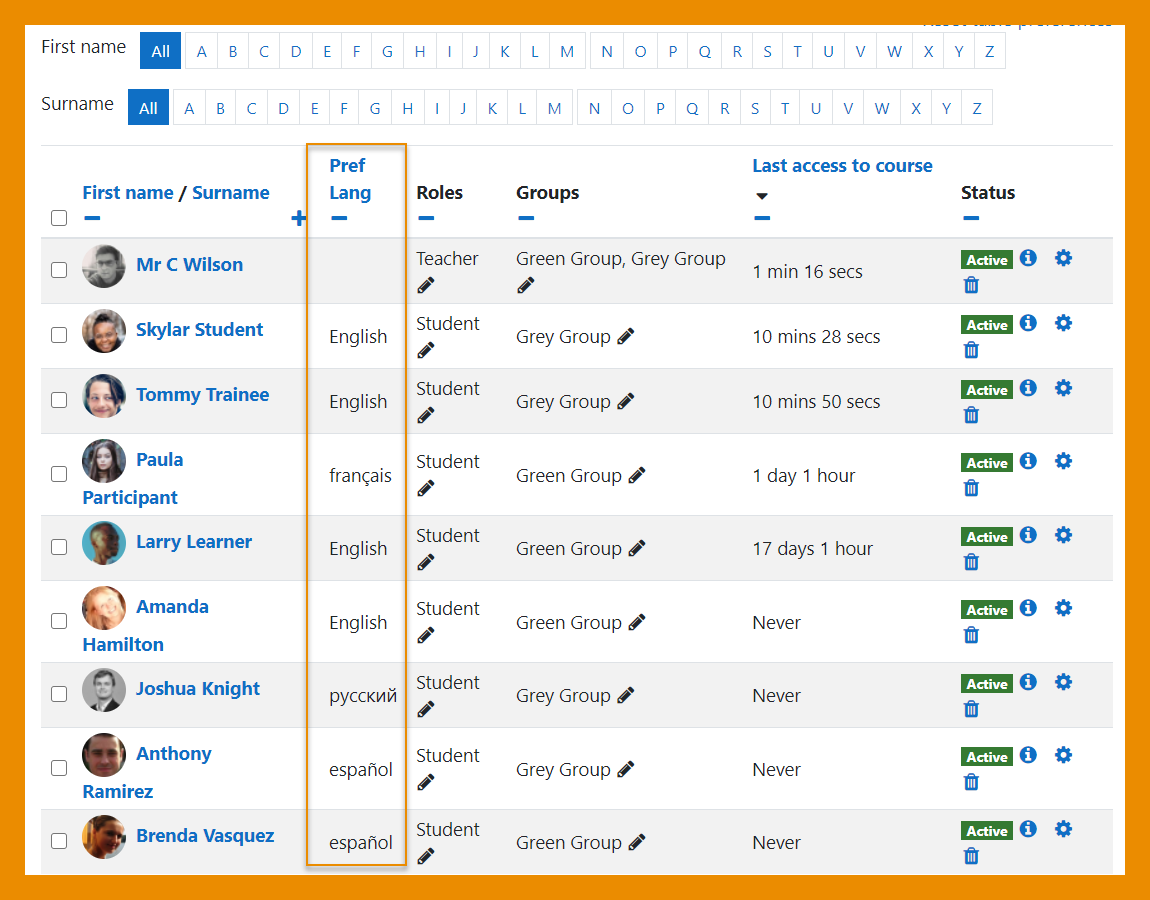
Custom profile fields may be selected in User polices > Show user identity so they display in participant lists. | |||
</p> | |||
</div> | |||
</div> | |||
</div> | |||
===Other features and improvements=== | |||
= | <div class="card-deck mt-3"> | ||
<div class="card"> | |||
<div class="card-body"> | |||
[[File:PlayRate.png|class=img-fluid]] | |||
<h4 class="card-title"> | |||
Control audio / video playback rates | |||
</h4> | |||
<p class="card-text"> | |||
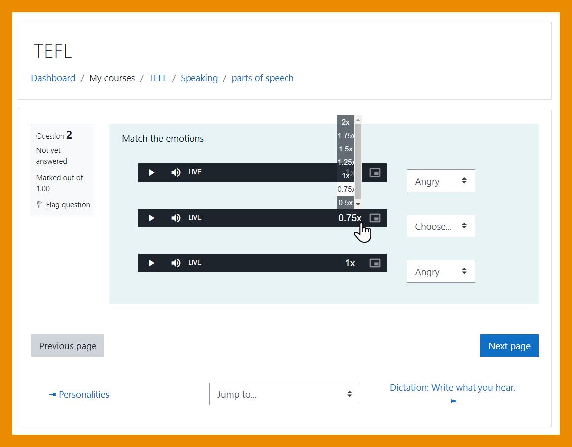
Students can control the speed at which [[Audio]] and [[Video]] files will play. | |||
</p> | |||
</div> | |||
</div> | |||
=== | <div class="card"> | ||
<div class="card-body"> | |||
[[File:ActivityCompletionreport.png|class=img-fluid]] | |||
<h4 class="card-title"> | |||
Improved activity completion report | |||
</h4> | |||
<p class="card-text"> | |||
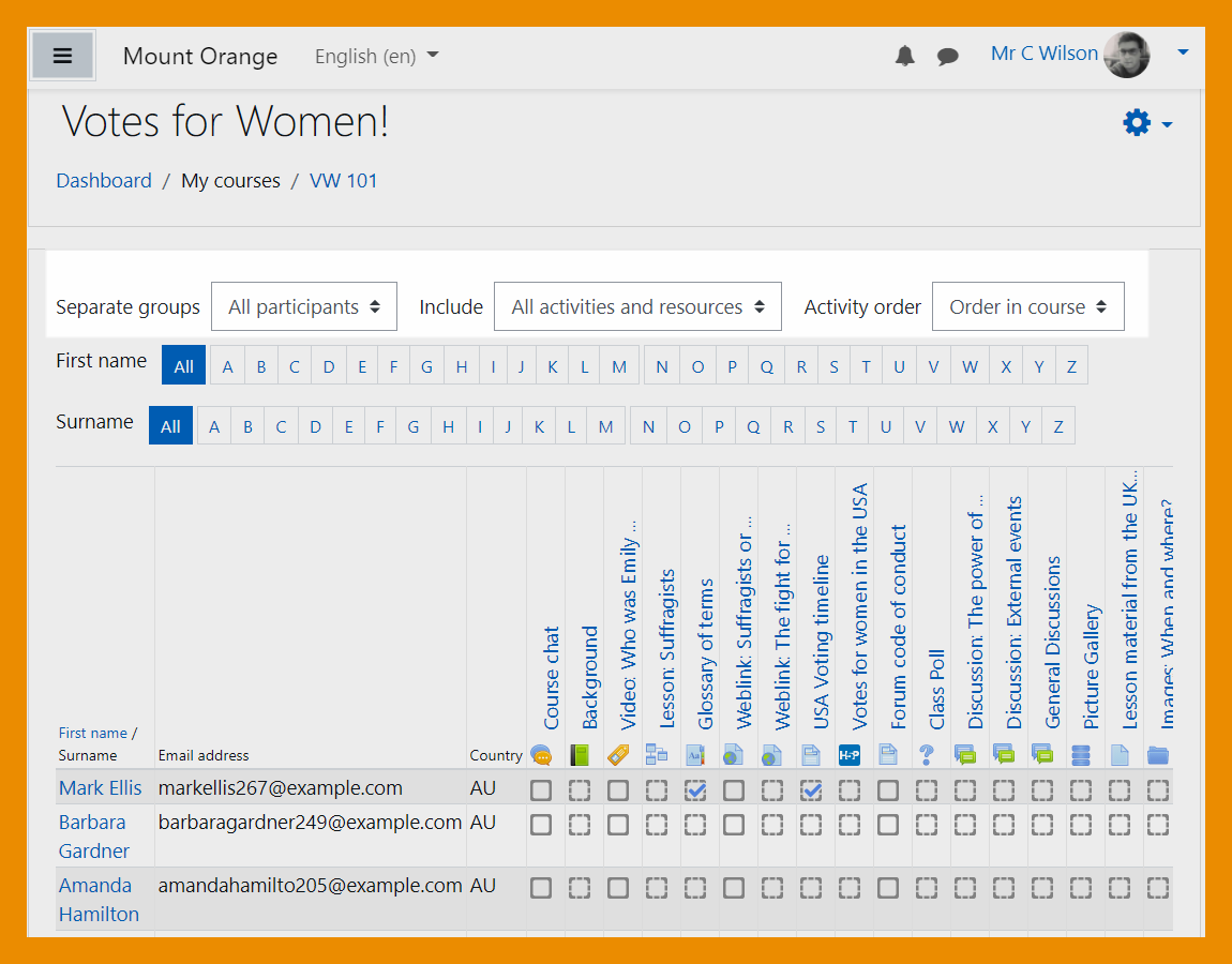
The activity completion report may be filtered by activity and activity order. | |||
</p> | |||
</div> | |||
</div> | |||
</div> | |||
<div class="card-deck mt-3"> | |||
== | <div class="card"> | ||
<div class="card-body"> | |||
[[File:SearchLangPacks.png|class=img-fluid]] | |||
<h4 class="card-title"> | |||
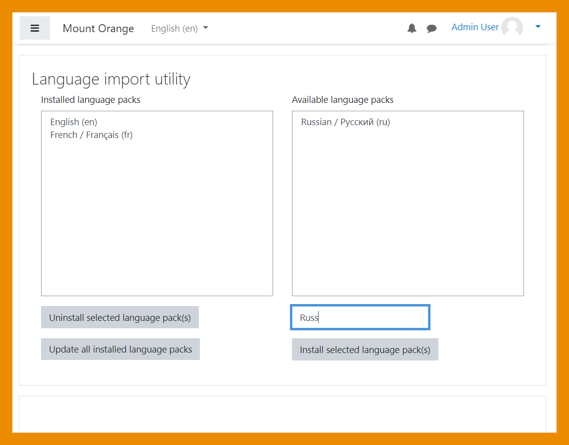
Search language packs | |||
</h4> | |||
<p class="card-text"> | |||
The list of languages may be searched when installing new [[Language packs]]. | |||
</p> | |||
</div> | |||
</div> | |||
===New | <div class="card"> | ||
<div class="card-body"> | |||
[[File:Poppler.png|class=img-fluid]] | |||
<h4 class="card-title"> | |||
New PDF to PNG converter | |||
</h4> | |||
<p class="card-text"> | |||
For assignment submission annotations, a new converter, Poppler is available instead of Ghostscript. | |||
</p> | |||
</div> | |||
</div> | |||
</div> | |||
<div class="card-deck mt-3"> | |||
<div class="card"> | |||
<div class="card-body"> | |||
[[File:SectionNameLinks.png|class=img-fluid]] | |||
<h4 class="card-title"> | |||
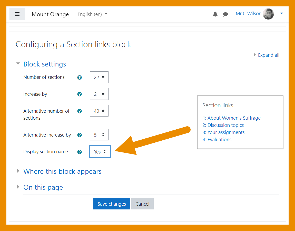
Section links block | |||
</h4> | |||
<p class="card-text"> | |||
Titles may now be displayed in the Section links block. | |||
</p> | |||
</div> | |||
</div> | |||
<div class="card"> | |||
<div class="card-body"> | |||
[[File:OverridePermissions.png|class=img-fluid]] | |||
<h4 class="card-title"> | |||
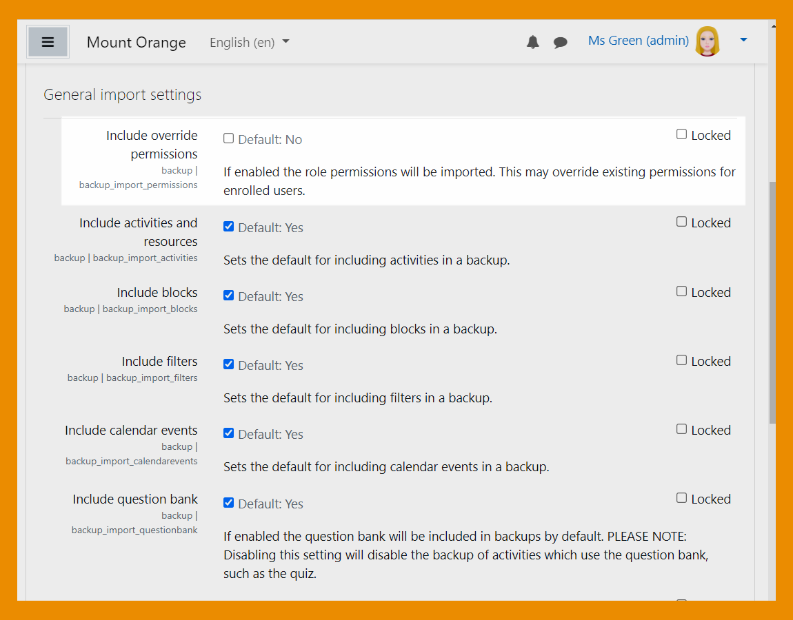
Restore/import role permissions | |||
</h4> | |||
<p class="card-text"> | |||
Enable or disable role permission overrides when restoring or importing a course. | |||
</p> | |||
</div> | |||
</div> | |||
</div> | |||
[[Category:New features]] | |||
[[de:Neue Funktionalitäten]] | |||
[[es:Nuevas características de Moodle 3.11]] | |||
[[fr:Nouveautés de Moodle 3.11]] | |||
Latest revision as of 14:44, 14 July 2021
Read on for an overview of the key features and improvements in Moodle 3.11, or watch our YouTube playlist of 3.11 New features.
For role-specific information, see New for teachers, New for students and New for administrators.
The list of major features and improvements can be found in the Moodle 3.11 release notes.
Student activity completion (MUA)
Improved learner experience
Activity dates and Activity completion conditions may be shown on the course page.
Dates and completion conditions within activities
Activity dates and Activity completion conditions are shown at the top of the activity page.
Accessibility toolkit
Free starter toolkit
An Accessibility toolkit (from Brickfield Education Labs) identifies course accessibility issues.
H5P and content bank
Disable selected H5P content types
Admins can disable selected H5P content types from the admin settings.
See which content is linked
A new column in the content bank displays the number of times an item is linked.
Quiz and question types
Essay plagiarism support
If a plagiarism checker is installed, it now supports the Essay question type.
Badges
Open Badges v 2.1 compliant
Moodle 3.11 is Open Badges v 2.1 compliant and a new OAuth 2 Open Badges service enables users to connect to their OB v 2.1 compliant backpack without having to enter their credentials into Moodle.
User profile fields
New Social profile field
A new Social profile field replaces the hard-coded fields in the user profile.
