Moodle Mobile 2 (Ionic 1) Themes
Note: This page is a work-in-progress. Feedback and suggested improvements are welcome. Please join the discussion on moodle.org or use the page comments.
The Mobile app can retrieve your custom styles from your Moodle site. Since is an HTML5 app, you can apply safely CSS3 styles.
In your Moodle installation go to Plugins / Web services / Mobile and enter in the mobilecssurl field a valid URL pointing to a CSS file containing your custom styles (theme).
The CSS should be placed inside your Moodle installation (in your custom theme or inside a local plugin)
Once the user is logged in the app, there is a periodical process that retrieves your remote CSS files for applying your custom styles into the app.
Notice that on the first time a user opens the app, he will see the default "orange" style. Your custom styles will be applied once the user has added a site in the app.
Notice also that styles comes from a site, there is no way for changing the Add site / Manage account styles.
Elements and properties that can be styled
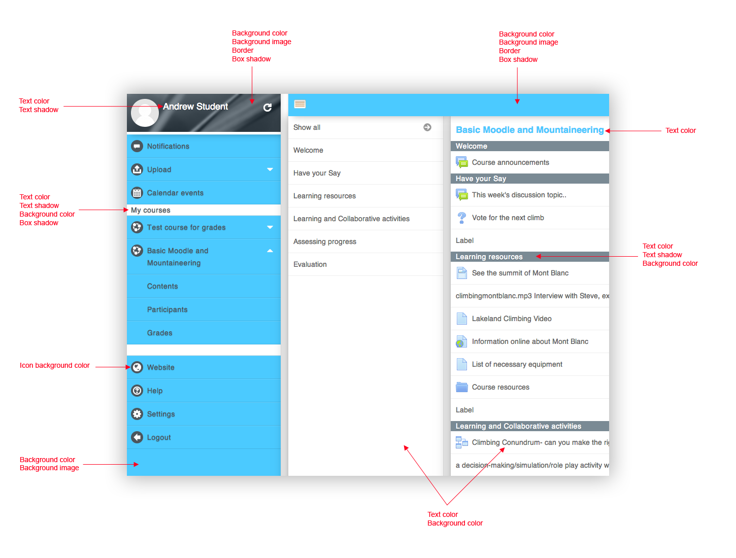
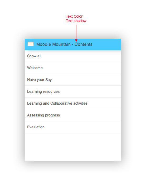
The images below show the elements and properties that can be styled.
The page title that is visible only on mobile at the moment.
How to modify the app icons
There are several ways for modifying the app icons
All the parent elements of img tags containing app icons has a "app-ico" class applied, so it's very easy to modify icons using styles
Use CSS filters
.app-ico img {
 -webkit-filter: invert(100%);
}
This will make all the icons black
More information about filters: http://www.html5rocks.com/en/tutorials/filters/understanding-css/
Replace images using CSS
img[src*="notifications/icon.png"] {
    content: url(dataURI);
}
Notice that for allowing the app works offline, images hosted in remotes servers should not be referenced. Instead, data URIs should be used. Note also that this makes the CSS file bigger.
More information about data URIs http://css-tricks.com/data-uris/
Testing
You can use the Moodle Mobile simulator for testing your CSS file, it includes an option for simulating the Mobile CSS URL Moodle feature
Example of a custom theme (CSS file)
Notice that the data URI for the image is shorten, you can view the complete example here: https://gist.githubusercontent.com/jleyva/0821122c3461925b45a7/raw/425821513072daf7ce5a16874f3ea21ffe92325e/moodlemobile-sample_theme.css
body {
 background: #4bcaff;
}
h1 {
 color: #4bcaff;
}
h2 {
 color: #ffffff;
 background-color: #7a8a94;
}
.header-main {
 color: #4b565d;
 background: #4bcaff;
}
#page-title {
 text-shadow: none;
}
.user-menu {
 background: #4bcaff;
}
.user-menu header {
 background: #4b565d url(data:image/png;base64,iVBORw0KGgoAAAANSUhEUgAAAU***);
 border-bottom: 5px solid #ffffff;
 box-shadow: 10px 0 20px rgba(0, 0, 0, 0.3);
}
.user-menu h2 {
 color: #4b565d;
 background: #ffffff;
 box-shadow: none;
}
.user-menu .nav-item > a {
 color: #4b565d;
}
.user-menu .nav-item .plugin-ico,
.user-menu .nav-item .course-ico {
 background-color: #4b565d;
}
.grades .section-name {
 color: #ffffff;
 background-color: #7a8a94;
}
See also
http://caniuse.com/ Support tables for CSS3 styles (including Mobile browsers)

