Read the whole story:
- Frank Ralf/Moodle HTML
- Frank Ralf/Semantic HTML2
- Frank Ralf/Semantic HTML3
- Course Categories - Clearing the Tables
- Frank Ralf/Semantic HTML5
Course Categories - Clearing the Tables
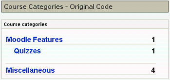
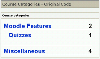
Now we want to get rid of the tables altogether. Just for comparison reason here's the screenshot of the original again:
Lists from scratch
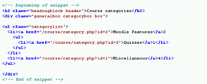
This time we go for the radical approach and create the list structure from scratch, thereby deleting most of the existing classes and ids.
The code:
Stripped down to the barest possible, only the relevant part shown.
<h2 class="headingblock header">Course categories</h2>
<div class="generalbox categorybox box">

<ul class="categorylist">
  <li><a href="/course/category.php?id=2">Moodle Features</a>2
    <ul>
      <li><a href="/course/category.php?id=3">Quizzes</a>1</li>
    </ul>
  </li>
  <li><a href="/course/category.php?id=1">Miscellaneous</a>4</li>
</ul>

</div>
Screenshot
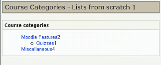
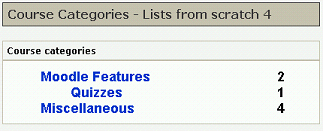
That's the way it looks (compare this with the original above):
Discussion
- The font sizes got lost because we deleted the class attributes.
- The nested list provides for the indentation.
- There's a superfluous bullet point.
- The underlining is lost.
- The margins differ from the original, especially the left one is too big.
- The numbers which aligned on the right side in the original now sit flush against the category links.
Getting back to normal
Let's try re-creating the look of the original.
Bigger font
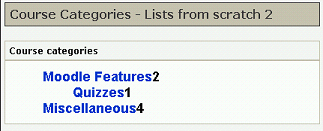
At first we get rid of the list marker, increase the font-size of the list items, and make the text bold with the following CSS:
li {
 font-size: medium;
 font-weight: bold;
 list-style: none;
}
That will look like this:
Putting it right
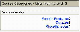
To amend the alignment we add the text-align property to the list items:
li {
 font-size: medium;
 font-weight: bold;
 list-style: none;
 text-align: right;
}
That will move all of the text over to the right side:
Something left
With just another rule we can float the links within the list items to the left again:
li {
 font-size: medium;
 font-weight: bold;
 list-style: none;
 text-align: right;
}

li a {
 float: left;
}
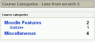
Now we're getting closer:
Final touches
With some more CSS and after some trial & error we get this result:
And this is the CSS.
- Note that we first reset all margins and padding from the browser and/or other stylesheets so those won't get in our way.
- Also note that we make the sub-categories a little smaller than the categories and move them a little away from the next categories.
/* resetting all margins and padding from the browser and other style sheets */
ul, li {
  margin: 0;
  padding: 0;
}

ul.categorylist {
  margin-left: 0.5em;
  margin-right: 1em;
  width: 100%;
}

li {
 font-size: medium;
 font-weight: bold;
 list-style: none;
 padding-bottom: 5px;
 text-align: right;
}

li a {
  float: left;
}

/* sub-categories */
ul ul li {
  font-size: x-small;
  padding-bottom: 0;
  padding-left: 1.5em;
}
The silver lining
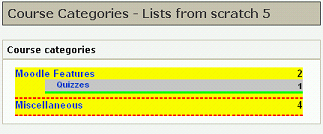
The only thing that's still missing are the lines between the category entries. Here's where our semantic markup makes things actually a little harder than usual. Because a nested list (the sub-categories) is completely enclosed by the preceding list item we cannot just underline the list items as the following screenshot demonstrates:
You see that the red underlining of the first category appears under its sub-category (green underlining) so it looks like it isn't underlined at all.
Here's one possible solution to this problem: Instead of giving the sub-categories a bottom border we give them a top border which will look like an underlining of their category. Here's only the additional CSS:
li {
 border-bottom: 1px solid #C6BDA8;
}

/* sub-categories */
ul ul li {
  border-bottom: 0;
  border-top: 1px solid #C6BDA8;
}
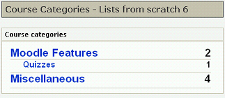
That's the way it looks:
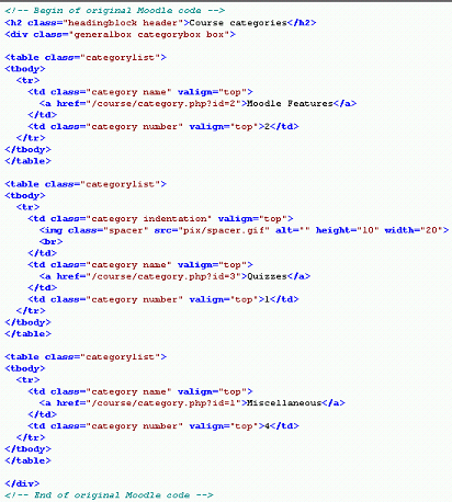
And for a final comparison, here's the original code again:
The result
More semantic and much leaner and therefore more maintainable code, especially for the sub-categories:
BEFORE:
AFTER:
Best demonstrated by the code for the subcategory:
BEFORE:
<table class="categorylist">
<tbody>
  <tr>
    <td class="category indentation" valign="top">
      <img class="spacer" src="pix/spacer.gif" alt="" height="10" width="20">
      <br>
    </td>
    <td class="category name" valign="top">
      <a href="/course/category.php?id=3">Quizzes</a>
    </td>
    <td class="category number" valign="top">1</td>
  </tr>
</tbody>
</table>
AFTER:
<ul>
  <li><a href="/course/category.php?id=3">Quizzes</a>1</li>
</ul>
Additional benefits
- We didn't have to change any of the original CSS but only to override some settings. Therefore the theme in general is left untouched.
- We got rid of most of the class attributes. We only applied the "categorylist" class to the outmost UL tag to provide context.
