Moodle 4.0 navigation improvements
Introduction
With the incoming release of Moodle 4.0, it is our desire to improve the user experience surrounding the navigation of courses, modules and other key areas by reducing the cognitive load upon users when navigating. These improvements will only be made to the existing primary Moodle theme: Boost. Whilst the primary focus is upon Boost it is our goal that the theme Classic will retain its current functionality. The overall aim of this project is to create a simplified navigation hierarchy where:
- Users no longer feel overwhelmed by numerous pathways to get to a single destination
- Navigation pathways follow common patterns all throughout Moodle
- Navigation options presented to the user are contextually relevant; so that users intuitively and quickly learn how to get to where they need to be
- Navigation has a consistent look and feel between desktop sized viewports & mobile sized viewports
The focus of this project is on the student and teacher navigation experience.
Prototype / mock-ups
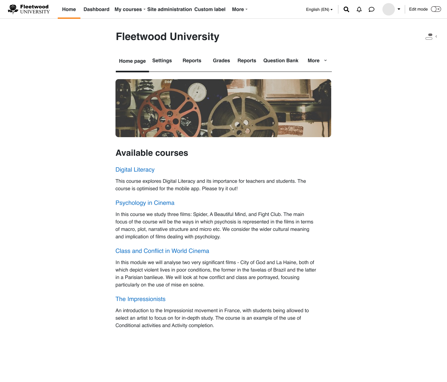
Across all of Moodle the header of the site will be changed for 4.0 with important navigation elements being rendered within the header of Moodle. With this change to navigation new active and hover states will be created to inform users of where they currently are and where they are navigating to at a glance.
When the amount of navigation items exceeds the width of the viewport width then a new dynamic menu item will appear that navigation elements overflow into.
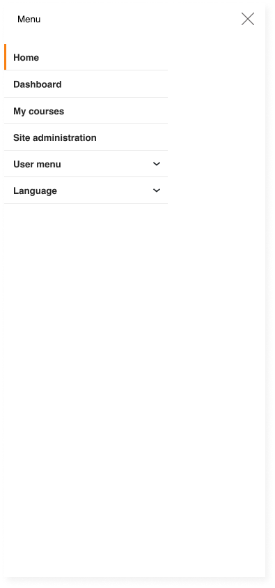
On mobile devices it is expected that within Moodle the primary navigation will be rendered as a navigation drawer in the same fashion as the current navigation drawer.
The image below shows a prototype for Moodle 4.0 with navigation within the header for the page, it also includes custom menu elements to demonstrate that existing functionality is being accounted for.
Primary navigation (mobile device inactive)

Primary navigation (mobile device active)
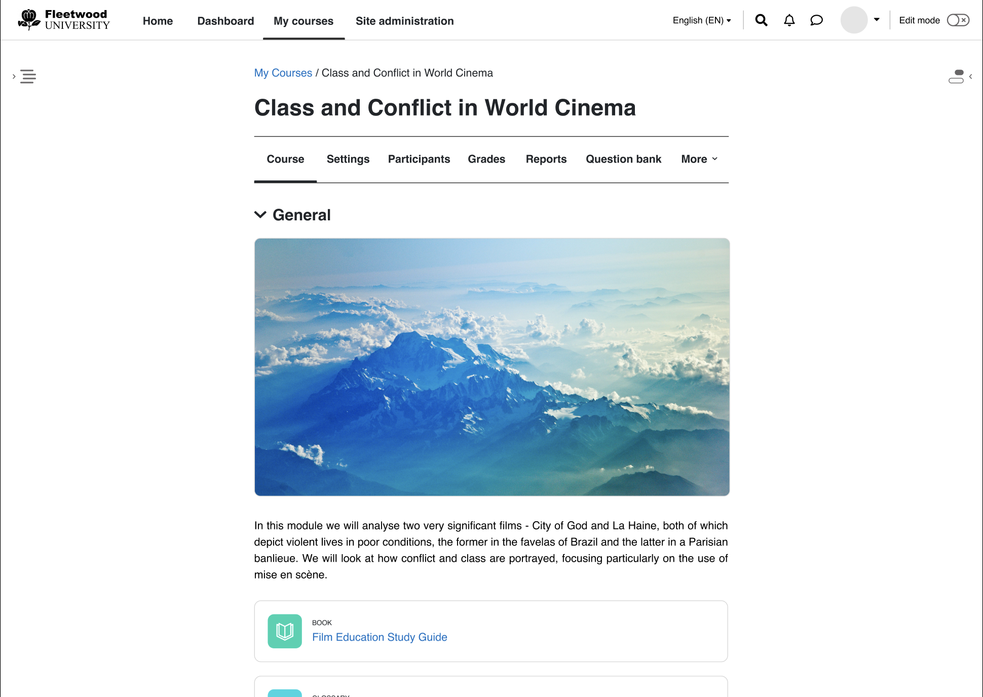
Navigation items will now appear as tabs within the context header (Course header, Site admin header, etc...) and similar to the primary navigation the active element will have an indicator below the active tab and have hover styling that indicates the potential tab item that’ll be navigated to.
Also similar to the primary navigation a dynamic “More” menu will be implemented to accommodate navigation elements when the viewport width reduces to a point where elements can not feasibly be shown within the menu area. At most 5 tabs will be shown excluding the 'More' menu/tab. Any extra tabs will now reside within the 'More' menu.
The secondary navigation will appear in most cases and specifically in System, Course, Module and Category contexts. However in other situations and other contexts it does not make sense to show the secondary navigation either from a UX perspective OR because of multiple entry points into the respective page. e.g. user profile page and blocks.
The below image shows the secondary navigation within the page header, this will look similar to the above primary navigation image.
The tertiary navigation supports the secondary navigation by providing context-relevant options. There is no specific API related to the tertiary navigation and you are welcome to create and display the tertiary navigation options as you wish. However, we would encourage you to follow the recommended guidelines in order to maintain consistency.
General components
- Use the URL select output component (url_select) to present multiple contextual navigation links in a drop-down list. We have substituted most of the existing tab tertiary navigation structures with drop-down lists.
For a single contextual link, use a button element. - Use the single button output component (single_button) or just a general button element to present action links related to the current context.
- Use Bootstrap's button dropdown component to present a collection of multiple action items related to the current context.
Display and positioning
- Display the tertiary navigation at the top of the page’s content area, just below the secondary navigation (or below the activity header area in the activity modules).
- Depending on the number and type of the items, the structure of the tertiary navigation can be further separated into two areas - left and right.
On the left-hand side of the tertiary navigation area place the elements that provide contextual navigation options (e.g. drop-down lists with contextual navigation links) and the items related to the primary action on the page (e.g. primary action buttons). The secondary action items (e.g. secondary action buttons, drop-down elements that contain secondary action items) should be placed on the right-hand side.
Styling
- Add the "tertiary-navigation" CSS class to the container element which wraps the tertiary navigation items. This will provide consistent spacing between the tertiary navigation and the contents above it.
- Add the "navitem" CSS class to each tertiary navigation item to maintain a consistent spacing between the items.
- Add the "btn-primary" CSS class to an action button element in the tertiary navigation when you need to emphasize the primary action on the page. Otherwise, use the "btn-secondary" CSS class for the action buttons.
Other
- In certain situations a given secondary navigation item might logically fall under the contextual hierarchy of another secondary navigation item. In this case you can remove the item from the secondary navigation and place it under the relevant tertiary navigation as an action item.
- Introduce 'Back' button in the tertiary navigation in situations where you cannot instantly navigate back to the previous page using breadcrumbs or through the primary or secondary navigation.
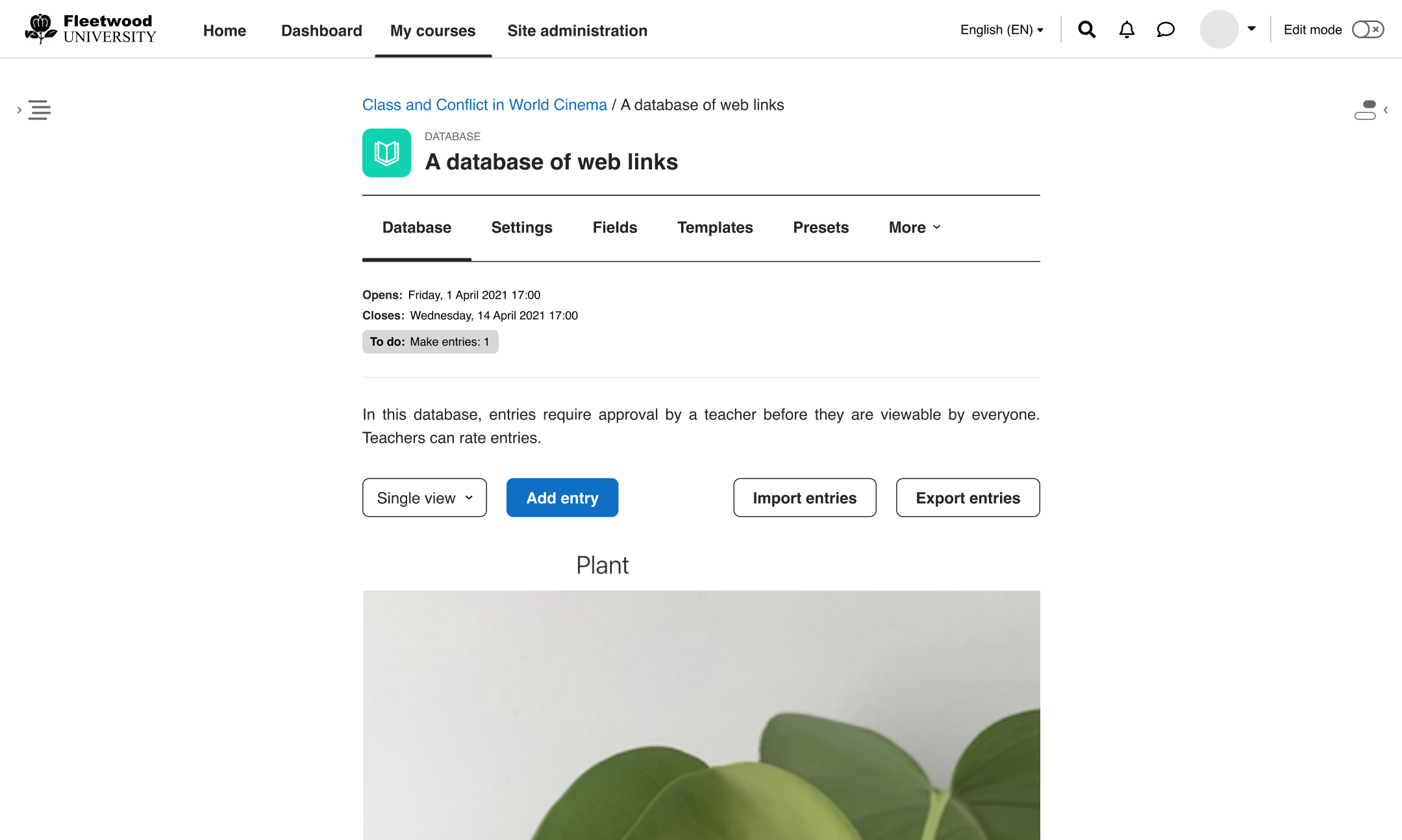
Below is an example of a tertiary navigation in the database activity.
All of the core activities have been updated to follow these guidelines. Please take a look to see how you can format your activity in a similar fashion.
Page header (Context header)
Work here will primarily focus on user interactions with the context header such as automatic hiding and displaying of elements depending on the users' scrolling and page position. Other changes will include rearranging elements, modifying font sizing, weight and spacing around the current page name.
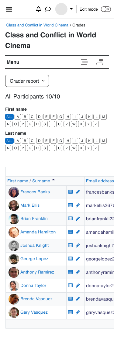
The below image shows the page header on a mobile device as the desktop viewport examples can be seen in the prior images.
Mobile view page header
Breadcrumbs
Breadcrumbs are being changed to follow the guidelines set in Nielsen Norman Group - Breadcrumbs: 11 Design Guidelines
A few of the changes being implemented:
- Remove entries without any links
- Remove the link from the last item in the list as this defines the page a user is already on
- Remove breadcrumbs from the course index page as this can be accessed via the primary navigation links as a new root page.
- Remove breadcrumbs from site admin pages as navigation can be done via the secondary navigation
User stories
These are the user stories that this project aims to address.
For the student
| Student user stories | Acceptance criteria / confirmation |
|---|---|
| As a learner, I want to easily move between courses and activities so that I can focus on learning. | I should be able to easily see my list of courses in a predictable place and be able to jump from one course to another or one activity to another at speed. |
| As a learner, I want to view my grades within a course so that I know how I am doing. | Within the course context I should be able to click straight through to my grade overview. |
| As a learner, I want to view my grades for a forum activity, so that I can receive feedback on my participation. | Within a forum activity I should be able to view my grades using the existing forum grading functionality. |
For the course creator / teacher
| Course creator / teacher user stories | Acceptance criteria / confirmation |
|---|---|
| As a teacher, I want to easily move between courses and activities so that I can focus on course creation or facilitation. | I should be able to easily see my list of courses in a predictable place and be able to jump from one course to another at speed. |
| As a teacher, I want to easily access the course settings so that I can make changes as necessary. | Within a course, the course settings should be easily available. |
| As a teacher, I want to easily access activity settings so that I can make changes as necessary. | Within a course activity or resource, the settings should be easily available. |
| As a teacher, I want to easily access course reports so that I can review my students' activity. | Within a course, the reports should be easily available. |
| As a teacher, I want to easily access the course gradebook so that I can check my students' grades. | Within a course, the gradebook should be easily available. |
| As a teacher, I want to easily grade a student's forum posts, so that I can provide them with feedback on their participation. | Within a forum activity, I can open the forum grading functionality and give each students a grade. |
| As a teacher, I want to be able to easily add new content or modify existing content in a course so that I can update the course as necessary. | Within a course, I can easily turn on course editing to add or edit activities and resources. |
For the administrator
| Administrator user stories | Acceptance criteria / confirmation |
|---|---|
| As a site administrator, I want to be able to easily access site administration settings so that I can make changes as necessary. | Links to the site administration settings still appear in easily findable locations for site administrators. |
Common user stories
| User story | Acceptance criteria / confirmation |
|---|---|
| As any user, I want to see other participants within a course so that I can contact them. | Within the course I can easily find a navigation item for participants. |
| As any user, I want to be able to navigate around the site using assistive technologies. | The new navigation meets WCAG 2.1 AA and can be used with screen readers and other assistive technologies. |
| As any user, I want to see an overview of all of my courses so that I can easily access a particular course. | I can navigate to a page that contains the courses I am currently enrolled in or have access to. |
| As any user, I want to easily navigate to a course I am enrolled in so that I can continue my learning. | I can easily find my desired course to review its content. |
| As any user, I want to quickly navigate to the site home page so that I can find other relevant content. | I am able to navigate to the site home page easily and quickly. |
| As any user, I want to be able to go from one activity back to the course page so that I can easily find another activity. | As any user, I should be able to use the context header bar within an activity or resource to navigate back to the course page. |
| As any user, I want to navigate back to the section the activity is in so that I can find other activities in the same section. | As any user, I should be able to use the context header bar within an activity to navigate back to the section of the course that the current activity is placed in. |
| As any user, I can search a forum so that I can find relevant posts or discussions before making a new post. | I can still search forums in a similar or identical way as I currently can (pre Moodle 4.0). |
Code architecture
Global and settings navigation are a true source of the internal navigation system. The new structure will be grouped into 2 broad components - primary and secondary navigation. The structure are for display purposes and can be interpreted by the different themes as they please.
The 2 components cover the following:
- 'primary' navigation items across the top of the page with the site header. This has 2 sub-components:
- views/primary - Contains the base nodes for a vanilla moodle install. Based on current designs these are - Home, Dashboard, My Courses, Site Admin
- output/primary - An amalgamation of everything that can appear on the top of the page which includes the base nodes within view/primary as well as user, lang and custom menu items.
- 'secondary' navigation items across the top of the page content within the context header
Based on user testing and UX research, it was decided that an ordered set of nodes be defined and shown within the secondary navigation at a site/course/module level. This was based on most used items, common items between modules as well as existing functionality.
The current idea is to provide mapping constructs within the secondary nav class which would cherry-pick navigation nodes based on their keys, from the global and settings navigation trees. This way, we avoid creating any additional callbacks and CRUD statements.
The current idea is to create a view based class system where views/*_navigation classes extend the existing navigation_node class. The idea behind this new structure is that the system and third party theme developers can easily fetch a representation of the current navigation within a given context and immediately render out only the view they want as opposed to fetching the entire navigation for the page.
The primary & secondary navigation classes are representations of the navigation within a given context. The instances of these navigation views will be capable of accepting navigation items appended to them within plugins; however, plugins will not be able to remove existing navigation_node‘s.
Assuming a label 'Custom label' has been added. This can only be done via the custommenuitems in site admin by an authorised user. This is picked up output/primary.php and is still displayed at the top of the page.
Any additional tabs to be added in the secondary navigation must be added to the settings navigation via the existing callbacks. The location of additional nodes/tabs depends on the following:
- The order defined in the mapping construct in the secondary navigation class
- The number of items displayed
- The width of the viewport
- Whether the new tab is forced to reside within the more menu.
Consideration given to third party plugins
The new navigation classes will leverage the existing global and setting navigation and nodes defined in them. This provides access to callbacks that are already implemented for both course module plugins and local plugins that modify what navigation_node’s populate the either navigation view.
This means that both core and third party Moodle theme plugins will not be able to mutate / modify any received new navigation views as the only accessible functions publicly defined would be to fetch a representation of the navigation to be output by the theme in a template.
As previously mentioned the secondary navigation is context based
If a core OR third party Moodle plugin require a custom view/order for the nodes it is recommended to ship the plugin with a secondary class within the namespace and is only applicable to course modules
mod_{pluginname}\local\views
The process for calling these new navigation views is similar to existing methods of calling navigation, there'll be a new properties added to the lib/pagelib.php called primarynavigation & secondarynavigation. These properties will be used in conjunction with magic_get_*nav() to create a new primary_navigation or secondary_navigation and trigger the initialization method.
To view a similar calling method, view how the navigation is called within any of the columns files within the boost theme where it calls flatnav.
Further reading
More technical discussion can be found within issues in the navigation epic MDL-69588 or in the specification document (releasing soon)
