Unilabel module
| Unilabel module | |
|---|---|
| Type | Resource module |
| Set | N/A |
| Downloads | https://moodle.org/plugins/mod_unilabel |
| Issues | https://github.com/grabs/moodle-mod_unilabel |
| Discussion | https://github.com/grabs/moodle-mod_unilabel/issues |
| Maintainer(s) | Andreas Grabs |
Overview
The Moodle plugin "mod_unilabel" enables you to include some nice formated text on a course page or the Front page. There are 5 different content types included (extendable sub plugins):
Installation
Usage
The configuration consists of two steps (except the "Simple text" type).
- ) The creation of a new instance by using the Activity chooser.
- ) The configuration of the content depending on the content type you chose in the first step.
Description of the content types
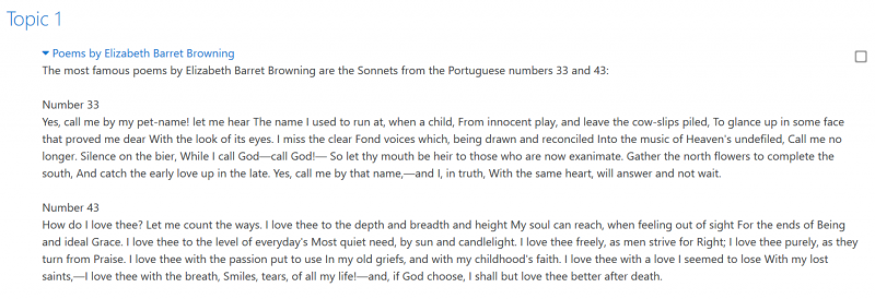
Simple text
This content type just shows the label as you already know.

Collapsed text
The collapsed text originally shows the user only the text that you entered in the title. This text is highlighted as a hyperlink and has a small triangle at the left side to indicate that it can be expanded.
When the user click on the collapsed text, it will expand to reveal all the content.
This content type offers you two options:
- ) a folded content
- ) a modal dialog containing the content.
Both types can be used with or without animation
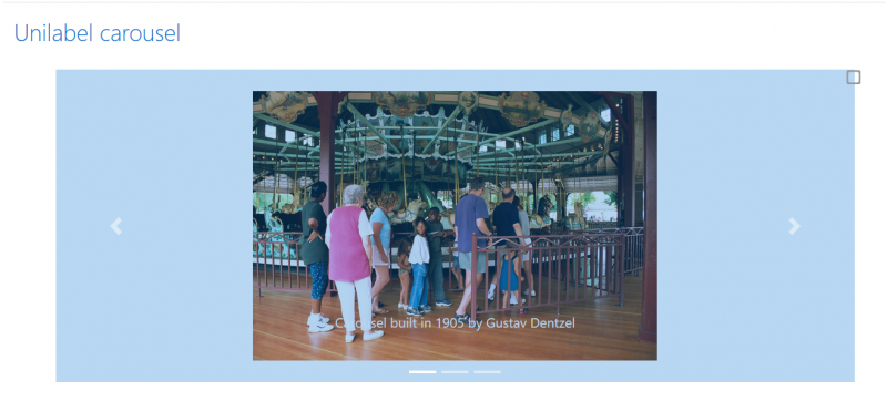
Carousel
In this content type you can define a series of images.
- Each image is shown in a slide show.
- You can also define a caption to each image that is show inside the slide item.
- For each image you can define a URL what makes the image to a clickable button.
- The carousel is by default responsive to different screen sizes.
- To optimize the responsivity to each of the images you can assigne a mobile optimized image.
- This mobile image is shown on small devices smaller than 768 px.
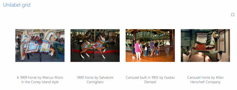
Grid
- In this content type you can define a series of images and contents/URLs.
- The grid is by default responsive to different screen sizes.
- You can set a column count for the grid to define how many tiles are shown in one row.
- On smaller screens the column count is reduced by a half of the defined count.
- On mobile devices like cellphones only one column is shown.
- To optimize the responsivity to each of the images you can assign a mobile optimized image.
- This mobile image is shown on small devices smaller than 768 px.
- If you have defined a content for a slide the content is shown as a modal dialog if you click the slide.
- If you have defined a URL for a slide on click, the URL is loaded.
- Mainly intended to show on the Front page it shows the titles and images of selected courses.
- The presentation can be a carousel or a grid.
- Each Item is a clickable button that brings the user to the related course.
- Mainly intended to show on the Front page. It shows the description of topics of a selected course.
- The topics will be shown as carousel or as grid.
- If you click on such a shown topic, a modal dialog shows the topic content.


