Read the whole story:
- Frank Ralf/Moodle HTML
- Frank Ralf/Semantic HTML2
- Course Categories - The Ugly Duckling
- Frank Ralf/Semantic HTML4
- Frank Ralf/Semantic HTML5
Course Categories - The Ugly Duckling
While trying to solve the problem of theming "Nested Categories" I had a closer look at the code for that section - not a nice sight...
The original code
This is how the section looks (this time the theme is Formal White for a change):
And that's the original code (available for download):
<html>
<head>
<title>Course Categories - Original Code</title>
<link rel="stylesheet" type="text/css" href="pix/styles_002.css">
<link rel="stylesheet" type="text/css" href="pix/styles.css">
</head>
<body>
Course Categories - Original Code
Course categories
<tbody>

</tbody>


     <a href="/course/category.php?id=2">Moodle Features</a>


    1


<tbody>

</tbody>


     <img class="spacer" src="pix/spacer.gif" alt="" height="10" width="20">


     <a href="/course/category.php?id=3">Quizzes</a>


    1


<tbody>

</tbody>


     <a href="/course/category.php?id=1">Miscellaneous</a>


    4
</body>
</html>
Discussion
That's quite a lot of markup for such less text...
- spacer.gif
- lots of tables - with only one row - merely for layout purposes
- empty table cells (with only one <br>)
- deprecated "valign" attribute
Now let's start making this ugly duckling into a graceful swan. This time we won't go for a radical approach as with the Site Admin Block before but try instead a stepwise approach to make the code leaner and more manageable.
One table to rule them all
Note that there are three separate tables, each with only one row. So we keep only the outer table definition to make this into one table with three rows:
A first attempt
That's the code:
<html>
<head>
<title>Course Categories - Mod 1: Only one table</title>
<link rel="stylesheet" type="text/css" href="pix/styles_002.css">
<link rel="stylesheet" type="text/css" href="pix/styles.css">
</head>
<body>
Course Categories - Mod 1: Only one table
Course categories
<tbody>


</tbody>


     <a href="/course/category.php?id=2">Moodle Features</a>


    1


     <img class="spacer" src="pix/spacer.gif" alt="" height="10" width="20">


     <a href="/course/category.php?id=3">Quizzes</a>


    1


     <a href="/course/category.php?id=1">Miscellaneous</a>


    4
</body>
</html>
And here's the screenshot:
Not quite, what we wanted. To see what's going on we add the following CSS to the head section of our file to outline the individual table cells:
<style type="text/css">
</style>
The curse of the spacer.gif
We see that there's an additional table cell in the second row, the one used for indenting the sub-categories:
<img class="spacer" src="pix/spacer.gif" alt="" height="10" width="20">
In a case of total overkill the indentation is achieved using three deprecated methods:
- using an additional - empty - table cell
- adding a <br> tag to the empty cell, because some browsers will collapse empty cells (so no indentation achieved)
- using an invisible image, the infamous spacer.gif
And because this breaks the overall table layout (as seen above) there follows the need to wrap each single table row in its own table...
Solution 1: Adding columns
We could add columns to the not indented table rows by using the colspan attribute so the columns will line up again (shown here only for the first row):
The code:
<a href="/course/category.php?id=2">Moodle Features</a>
1
But that might get us into trouble if there are more and nested sub-categories as we have to keep tap how many columns we actually need and change colspan accordingly.
Solution 2: Get rid of the spacer.gif
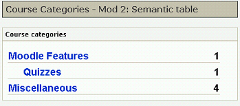
A better approach is to just delete the whole table cell with the spacer.gif, and everything lines up again:
But now all indentation is lost! We go for a semantic approach and add a class "sub_category" to the second row:
<a href="/course/category.php?id=3">Quizzes</a>
1
Now that we have this class we can use it as selector to put the indentation back in place with the following CSS:
tr.sub_category a {
  padding-left: 1.5em;
}
 Voilá! The same look as before but with leaner and more semantic HTML.
One step further
Now that we can style our sub-categories with CSS we don't have to restrict ourselves to indentation. For example with a few more lines of CSS we can also make the sub-category display in a smaller font with a different color and a different background (as requested in the above mentioned forum posting):
tr.sub_category {
 background-color: silver;
 font-size: 0.9em;
}
tr.sub_category a {
 color: fuchsia;
 padding-left: 1.5em;
}
More cleaning up
We can clean up the code even more without sacrificing on options for styling and theming:
- delete the "valign" attribute
- adjust margins, padding and line-hight
And we might further try to make this into really elegant semantic code using nested lists as with the Site Admin block... Stay tuned!
Clearing the tables
Clearing the tables turns out to be a bit tricky so we need another page for that: Frank Ralf/Semantic HTML4.


