Boost Campus theme
| Boost Campus theme | |
|---|---|
| Type | Theme |
| Set | N/A |
| Downloads | https://moodle.org/plugins/theme_boost_campus |
| Issues | https://github.com/moodleuulm/moodle-theme_boost_campus/issues |
| Discussion | https://github.com/moodleuulm/moodle-theme_boost_campus |
| Maintainer(s) | Ulm University |
Description
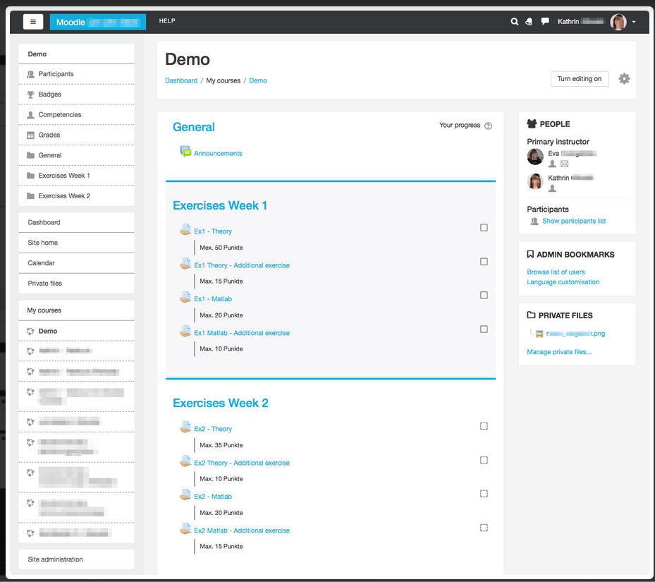
Moodle Boost child theme which is intended to meet the needs of university campuses and adds several features and improvements
Images
Requirements
This plugin requires Moodle 3.2+ and works up to Moodle 3.11.
This theme is Moodle 3.x only and will not be upgraded for Moodle 4.x. Please use the successor "Boost Union": https://moodle.org/plugins/theme_boost_union
Motivation for this theme
Moodle installations on university campuses have certain constraints which are not completely covered by the Boost theme in Moodle core. We implemented this Boost child theme to accommodate these needs as much as possible while keeping the functionality from Boost from Moodle core as much as possible as well.
Installation
Install the plugin like any other theme to folder /theme/boost_campus
See Installing plugins for details on installing Moodle plugins
Usage & Settings
After installing the theme, it does not do anything to Moodle yet.
To configure the theme and its behaviour, please visit: Site administration ►Appearance ►Themes ►Boost Campus.
There, you find multiple settings tabs:
1. Tab "General Settings"
In this tab there are the following settings:
Theme presets
Theme preset
This setting is already available in the Moodle core theme Boost. For more information how to use it, please have a look at the official Moodle documentation: Boost theme
Additional theme preset files
This setting is already available in the Moodle core theme Boost. For more information how to use it, please have a look at the official Moodle documentation: Boost theme
Brand colors
Brand color
This setting is already available in the Moodle core theme Boost. For more information how to use it, please have a look at the official Moodle documentation: Boost theme
Brand success color
This color is used for example in regards to form valiations.
Brand info color
This color is used for example for availabiity information of course activities or resources. Brand warning color
This color is used for example for warning texts.
Brand danger color
This color is used for example in regards to form valiations.
Favicon
This setting allows you to upload an image (.ico or .png format) that your browser will display as a favicon.
2. Tab "Advanced Settings"
In this tab there are the following settings:
Raw initial SCSS
This setting is already available in the Moodle core theme Boost. For more information how to use it, please have a look at the official Moodle documentation: Boost theme
Raw SCSS
This setting is already available in the Moodle core theme Boost. For more information how to use it, please have a look at the official Moodle documentation: Boost theme
Catch keyboard commands
The following settings are intended to serve the needs for advanced users, especially if your Moodle instance has a large footer. Advanced users are likely to use keyboard shortcuts to navigate through the sites. They may use this for reaching the end of the page in the intention to get fast to the most recent topic in the course (for adding content or grading latest activities). If the footer is not quite small, they would need to scroll up again. With these settings you can enable that the following shortcuts are caught and would only scroll to the bottom of the main course content.
End key
This setting will catch the "End" key (should work on all main browsers and operating systems), prevent the default scrolling to the bottom of the web page and changes the behavior to scroll only to the bottom of the main course content.
Cmd + Arrow down shortcut
This setting will catch the "Cmd + Arrow down" shortcut (MAC), prevent the default scrolling to the bottom of the web page and changes the behavior to scroll only to the bottom of the main course content.
Ctrl + Arrow down shortcut
This setting will catch the "Ctrl + Arrow down" shortcut (Windows), prevent the default scrolling to the bottom of the web page and changes the behavior to scroll only to the bottom of the main course content.
3. Tab "Course Layout Settings"
Section 0: Title
This setting can change the behaviour Moodle displays the title for the first course section. Moodle does not display it as long as the default title for this section is set. As soon as a user changes the title, it will appear. With this setting (option is checked), you can achieve a consistent behaviour by always showing the title for section 0.
Course edit button
With this setting you can add an additional course edit on / off button to the course header for faster accessibility. This the same way as it was displayed before theme_boost.
Position of switch role information
With this setting you can choose the place where the information to which role a user has switched is being displayed. If not checked (default value), the role information will be displayed right beneath the user's name in the user menu (like in theme Boost). If checked, this information - together with a link to switch back - will be displayed beneath the course, as this functionality is course related.
Course settings
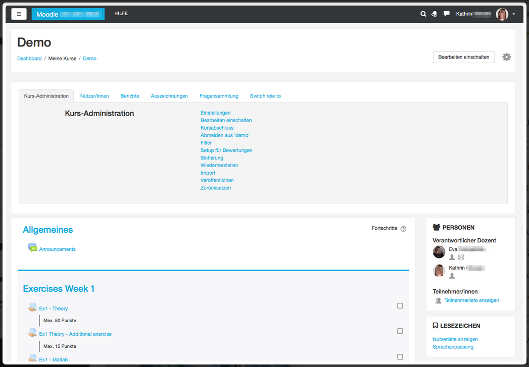
In course settings menu
With this setting you can change the displaying of the course context menu. In Boost, there is a popup context menu right next to the cog icon and clicking on the "More..." menu item will lead the user to another page with all course settings. By enabling this setting the settings will occur directly beneath the course header. Please note that this change does not affect users who have switched off javascript in their browsers - they will still get the behaviour from Moodle core with a popup course context menu.
Move "Switch role to..." to the course settings
With this setting you can move the "Switch role to..." link as a new tab from the user menu to the in-course course menu. The role switching is a feature which is used in course context and thus it is better to place it in the course settings menu than in the user menu. Please note that this setting won't have any effect if you do not activate the "In course settings menu" above.
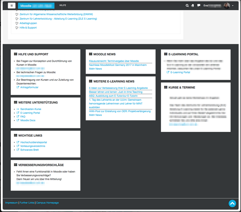
You can chose if you want to enable the possibility to place blocks into the footer. If enabled, you can choose between one, two or three block columns. These columns are only displayed on large screens. On small screens the columns will be automatically reduced to one column for better readability and layout.
Moodle provides some default links in the footer: Link to the Moodle docs, login information, and a link to the webpage start. With these three settings you can decide if you want to hide specific links because you think that your users won't need them in your instance. If checked, the link will not be displayed in the footer. If not checked (default), it will be shown.
5. Tab "Additional Layout Settings"
Badgearea
Badge area items
With this widget you can upload your images that will be displayed in the additional badge area region. The images will be sorted and displayed alphabetically by the filename. To remove this region, simply delete all uploaded images.
Badge area item links
With this optional setting you can add links to your uploaded images. Each line consists of the file identifier (the file name) the a link URL, separated by pipe characters. Each link declaration needs to be written in a new line. For example: moodle.jpg|http://moodle.org You can declare links for an abitrary amount of your uploaded images. The links will be added only to those badges that match their filename with the identifier declared in this setting.
Badge area items maximal height
With this setting you can change the height in pixels for your uploaded badges. All images will have the same maximum height and their width will be resized proportionally. The default value is set to 100 pixels.
Footnote
Whatever you add to this textarea will be displayed beneath the footer on every page that renders the theme standard footer (for layouts "columns2", "login" and "maintenance"). Content in this area could be for example the copyright, the terms of use and the name of your organisation.
Default homepage on top
By checking this setting the default homepage link (Dashboard or Site home) will always be located at the top of the nav drawer. By default, this is already the case on every Moodle page except for course pages. There, the current course and its contents are placed on top. This might break user's expectations for the placement of the default homepage link.
6. Tab "Design Settings"
Login Page
Login page background images
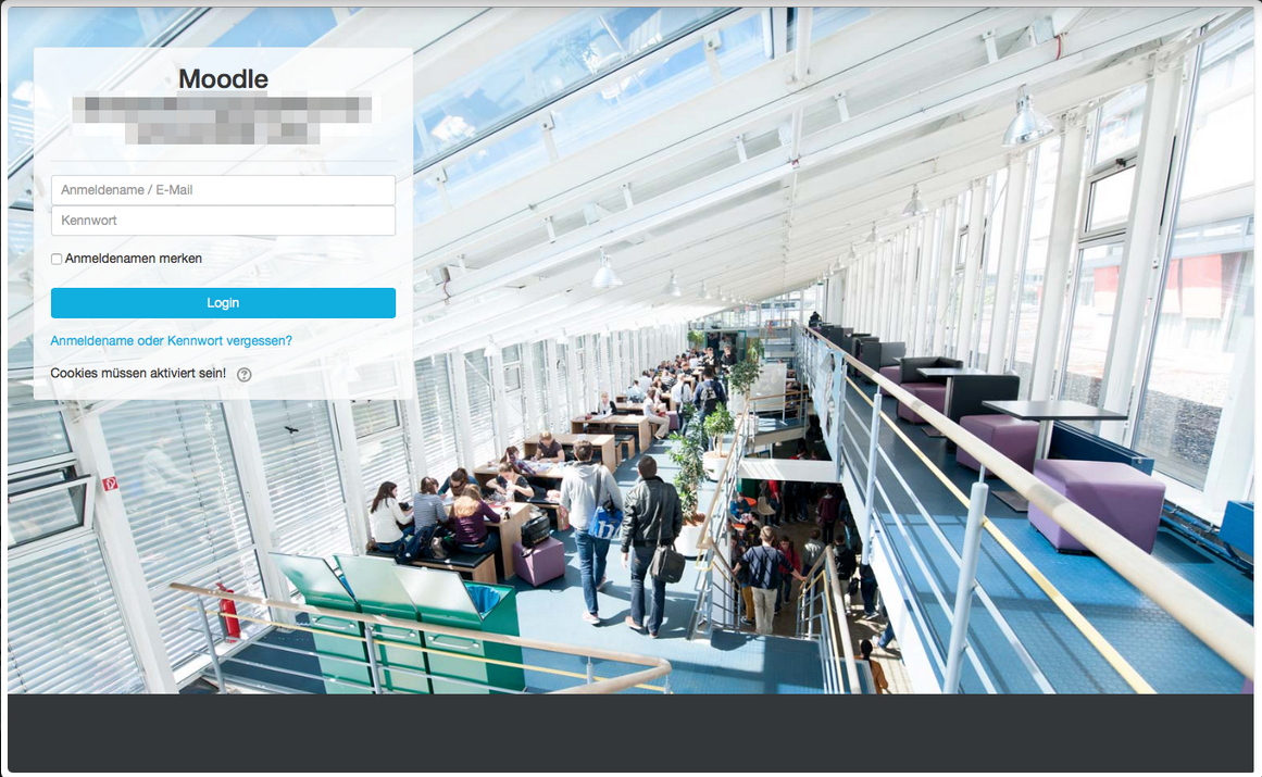
In this setting you can add up to 10 files as a background image for the login page. One of these images will be picked randomly and delivered when the user visits the login page.
Login form
With this setting you can optimize the login form to fit to a greater variety background images (if checked). This means that the login form will be moved to the left of the login page, will get smaller in width and will get a background that let the background image shine through. The login form will be placed on the left because many images have their main content rather in the center and so we keep this content visible. Note: You can also activate this setting if no background images are uploaded, of course.
Fonts
Font files
With this dialogue you can upload own font files. The upload is resricted to the font files of type .eot, .woff, .woff2, .ttf and .svg.
Important: To be able to use the uploaded fonts within this theme, you have to add related code to your "Raw SCSS" area in the tab "Advanced Settings"! First you have to add all font-faces correctly and then you can set the font as font-family to any tag. Set it for the body tag to use it all over the instance. With the following expamle you can see how the SCSS code should look like. Of course you have to adapt it for your individual font and the number and type of uploaded files.
 /* your-font-regular - latin */
@font-face {
       font-family: "Your Font";
       font-style: normal;
       font-weight: 400;
       /* IE9 Compat Modes */
       src: url("/pluginfile.php/1/theme_boost_campus/fontfiles/0/your-font-latin-regular.eot");
       src: local("Your Font"), local("YourFont-Regular"),
              /* IE6-IE8 */
               url("/pluginfile.php/1/theme_boost_campus/fontfiles/0/your-font-latin-regular.eot?#iefix") format("embedded-opentype"),
               /* Super Modern Browsers */
               url("/pluginfile.php/1/theme_boost_campus/fontfiles/0/your-font-latin-regular.woff2") format("woff2"),
               /* Modern Browsers */
               url("/pluginfile.php/1/theme_boost_campus/fontfiles/0/your-font-latin-regular.woff") format("woff"),
               /* Safari, Android, iOS */
               url("/pluginfile.php/1/theme_boost_campus/fontfiles/0/your-font-latin-regular.ttf") format("truetype"),
               /* Legacy iOS */
               url("/pluginfile.php/1/theme_boost_campus/fontfiles/0/your-font-latin-regular.svg#YourFont") format("svg");
\}
/* your-font-italic - latin */
@font-face {
       font-family: "Your Font";
       font-style: italic;
       font-weight: 400;
       src: url("/pluginfile.php/1/theme_boost_campus/fontfiles/0/your-font-latin-italic.eot");
       src: local("Your Font Italic"), local("YourFont-Italic"),
               url("/pluginfile.php/1/theme_boost_campus/fontfiles/0/your-font-latin-italic.eot?#iefix") format("embedded-opentype"),
               url("/pluginfile.php/1/theme_boost_campus/fontfiles/0/your-font-latin-italic.woff2") format("woff2"),
               url("/pluginfile.php/1/theme_boost_campus/fontfiles/0/your-font-latin-italic.woff") format("woff"),
               url("/pluginfile.php/1/theme_boost_campus/fontfiles/0/your-font-latin-italic.ttf") format("truetype"),
               url("/pluginfile.php/1/theme_boost_campus/fontfiles/0/your-font-latin-italic.svg#YourFont") format("svg");
}
/* your-font-700 - latin */
@font-face {
       font-family: "Your Font";
       font-style: normal;
       font-weight: 700;
       src: url("/pluginfile.php/1/theme_boost_campus/fontfiles/0/your-font-latin-700.eot");
       src: local("Your Font Bold"), local("YourFont-Bold"),
               url("/pluginfile.php/1/theme_boost_campus/fontfiles/0/your-font-latin-700.eot?#iefix") format("embedded-opentype"),
               url("/pluginfile.php/1/theme_boost_campus/fontfiles/0/your-font-latin-700.woff2") format("woff2"),
               url("/pluginfile.php/1/theme_boost_campus/fontfiles/0/your-font-latin-700.woff") format("woff"),
               url("/pluginfile.php/1/theme_boost_campus/fontfiles/0/your-font-latin-700.ttf") format("truetype"),
               url("/pluginfile.php/1/theme_boost_campus/fontfiles/0/your-font-latin-700.svg#YourFont") format("svg");
}
/* your-font-700italic - latin */
@font-face {
       font-family: "Your Font";
       font-style: italic;
       font-weight: 700;
       src: url("/pluginfile.php/1/theme_boost_campus/fontfiles/0/your-font-latin-700italic.eot");
       src: local("Your Font Bold Italic"), local("YourFont-BoldItalic"),
               url("/pluginfile.php/1/theme_boost_campus/fontfiles/0/your-font-latin-700-italic.eot?#iefix") format("embedded-opentype"),
               url("/pluginfile.php/1/theme_boost_campus/fontfiles/0/your-font-latin-700-italic.woff2") format("woff2"),
               url("/pluginfile.php/1/theme_boost_campus/fontfiles/0/your-font-latin-700-italic.woff") format("woff"),
               url("/pluginfile.php/1/theme_boost_campus/fontfiles/0/your-font-latin-700-italic.ttf") format("truetype"),
               url("/pluginfile.php/1/theme_boost_campus/fontfiles/0/your-font-latin-700-italic.svg#YourFont") format("svg");
}
body {
font-family: "Your Font";
}
Please note: The code itself and the URLs have to fit exactly to your uploaded files, unless the fonts cannot be loaded! As the font files will be delivered with an expires header to the client but currently without a timestamp in the URL, emptying the Moodle cache unfortunately will not force a reload of the font files on the client side.
Blocks
Block icon
With this setting you can add a default Font Awesome icon in front of the block title. If checked, we additionally provide individual icon replacements for many Moodle core blocks and also some widely used blocks. You also can change the icons easily for each block individually in your raw SCSS via the change of the Font Awesome content. For all available icons please visit http://fontawesome.io/icons/ and use the Unicode value of the icon to replace the default one. The code to change the icon looks like this example change for the block "People": .block_people .card-block .card-title::before { content: '\f0c0' ; }.
Dark navbar
By enabling this setting you can invert the default light navbar to a dark one with white links.
Further improvements to Boost core theme
Apart from the features which can be configured in the theme's settings, we have added some more improvements which are simply there without any settings: Font Awesome
To be able to use icons provided by Font Awesome it is added to theme_boost_campus.
We improved the code of the new flatnavigation nay-drawer menu items to be uniformly. Furthermore, we improved the layout of the menu by styling borders, icons and margins. Now a user can recognize faster what items belong together to a parent node.
Course settings icon
The course settings icon will now be displayed on all sites that renders the course header. This improves the accessibility to those settings as there is not an onmipresent block anymore.
Back to top button
We added a back to top button that appears in the right bottom corner when the user scrolls down the page. With a click on it the page scrolls back to top smoothly and the button will disappear again.
Design
- Added Font Awesome icons to mailto and broken links. Furthermore, colored broken link in red for fast recognizability.
Course Design
- Used the brand color as border color.
- Improved highlighting of a highlighted section.
- Improved recognisability of hidden activities by gray scaling the icon.
- Improved paddings and margins for better alignment and better delineation of sections.
- Designed description and intro boxes.
- Designed blockquotes.
- Improved design of maintenance warning to be more visible.
Categories overview page
Improved font sizes and weights on category overview page for better readability.
How this theme works
This Boost child theme is implemented with minimal code duplication in mind. It inherits / requires as much code as possible from theme_boost and only implements the extended or modified functionalities.
Plugin repositories
This plugin is published and regularly updated in the Moodle plugins repository: http://moodle.org/plugins/view/theme_boost_campus
The latest development version can be found on GitHub: https://github.com/moodleuulm/moodle-theme_boost_campus
Bug and problem reports / Support requests
This plugin is carefully developed and thoroughly tested, but bugs and problems can always appear.
Please report bugs and problems on GitHub: https://github.com/moodleuulm/moodle-theme_boost_campus/issues
We will do our best to solve your problems, but please note that due to limited resources we can't always provide per-case support.
Feature proposals
Due to limited resources, the functionality of this plugin is primarily implemented for our own local needs and published as-is to the community. We are aware that members of the community will have other needs and would love to see them solved by this plugin.
Please issue feature proposals on GitHub: https://github.com/moodleuulm/moodle-theme_boost_campus/issues
Please create pull requests on GitHub: https://github.com/moodleuulm/moodle-theme_boost_campus/pulls
We are always interested to read about your feature proposals or even get a pull request from you, but please accept that we can handle your issues only as feature proposals and not as feature requests.
Moodle release support
Due to limited resources, this plugin is only maintained for the most recent major release of Moodle. However, previous versions of this plugin which work in legacy major releases of Moodle are still available as-is without any further updates in the Moodle Plugins repository.
There may be several weeks after a new major release of Moodle has been published until we can do a compatibility check and fix problems if necessary. If you encounter problems with a new major release of Moodle - or can confirm that this plugin still works with a new major release - please let us know on GitHub.
If you are running a legacy version of Moodle, but want or need to run the latest version of this plugin, you can get the latest version of the plugin, remove the line starting with $plugin->requires from version.php and use this latest plugin version then on your legacy Moodle. However, please note that you will run this setup completely at your own risk. We can't support this approach in any way and there is an undeniable risk for erratic behavior.
Translating this plugin
This Moodle plugin is shipped with an English language pack only. All translations into other languages must be managed through AMOS by what they will become part of Moodle's official language pack.
As the plugin creator, we manage the translation into German for our own local needs on AMOS. Please contribute your translation into all other languages in AMOS where they will be reviewed by the official language pack maintainers for Moodle.
Right-to-left support
This plugin has not been tested with Moodle's support for right-to-left (RTL) languages. If you want to use this plugin with a RTL language and it doesn't work as-is, you are free to send us a pull request on GitHub with modifications.
PHP7 Support
Since Moodle 3.0, Moodle core basically supports PHP7. Please note that PHP7 support is on our roadmap for this plugin, but it has not yet been thoroughly tested for PHP7 support and we are still running it in production on PHP5. If you encounter any success or failure with this plugin and PHP7, please let us know.
Copyright
Ulm University kiz - Media Department Team Web & Teaching Support Kathrin Osswald


