Blocks/Add-on/GISMO/overview
| Blocks/Add-on/GISMO/overview | |
|---|---|
| Type | Block, GISMO |
| Set | N/A |
| Downloads | https://moodle.org/plugins/view.php?plugin=block_gismo |
| Issues | https://sourceforge.net/p/gismo/tickets/ |
| Discussion | https://sourceforge.net/p/gismo/code/ci/master/tree/ |
| Maintainer(s) | Christian Milani |
- Managing blocks
- Block settings
- Activities
- Activity results
- Admin bookmarks
- Administration
- Blog menu
- Blog tags
- Calendar
- Comments
- Course completion status
- Course overview
- Course/site summary
- Courses
- Feedback
- Flickr
- Global search
- HTML
- Latest announcements
- Latest badges
- Learning plans
- Login
- Logged in user
- Main menu
- Mentees
- Navigation
- Network servers
- Online users
- Private files
- Quiz results
- Random glossary entry
- Recent activity
- Recent blog entries
- Recently accessed courses
- Recently accessed items
- Remote RSS feeds
- Search forums
- Section links
- Self completion
- Social activities
- Starred courses
- Tags
- Timeline
- Upcoming events
- YouTube
- Blocks FAQ
What is GISMO?
You are the instructor of one or more courses given at distance with the Moodle Course Management System. Maybe your students are hundreds of kilometers away, or maybe your students are local, but you see them in classroom only once or twice per semester. As you are the instructor of your course, you may probably what to know what is happening to your students: Are they reading materials? Are they regularly accessing the course? Are there quizzes or assignments particularly problematic? Are their submissions performed in due time? If this is your case, GISMO can help you. GISMO is a graphical interactive student monitoring and tracking system tool that extracts tracking data from the Moodle Course Management System, and generates useful graphical representations that can be explored by course instructors to examine various aspects of distance students.
How to get and install the software
To install the software you need to ask the administrator of your local Moodle platform to install the block. GISMO application can be downloaded by the Internet at the following address: http://sourceforge.net/projects/gismo/ Once your administrator has installed the software, you are ready to use it.
Starting the GISMO
GISMO appears like any other Moodle's block. You need to turn on the editing modality and add GISMO to your course. This block is visible only to the instructors of the course. Then you can click on the "GISMO" link that appears within the GISMO block to start the application.
Graphical representations
In this section we describe each graphical representation that can be generated with GISMO. These can be activated by clicking on the menu items. There are 3 main categories of visualizations:
- Students
- Resources
- Activities
For each category there is a specific item in the menu bar. We will illustrate each of them in the following sections.
Welcome page
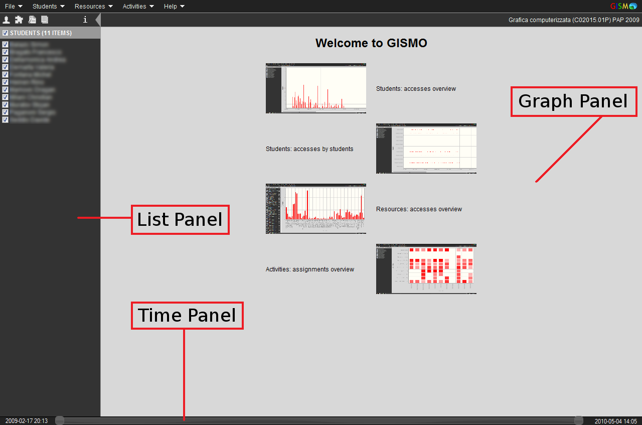
The Figure 'Welcome page' represents the welcome page of GISMO. As you can see, there are 3 different areas in the user interface:
- Graph Panel: graphs are drawn on this panel.
- List Panel: contains a list of students, resources, quizzes, and assignments of the monitored course. For each list the instructor can select/deselect data to visualize.
- Time Panel: using this panel the instructor can reduce the selection on time and restrict the graph to a specific range of dates.
Students: Accesses by students
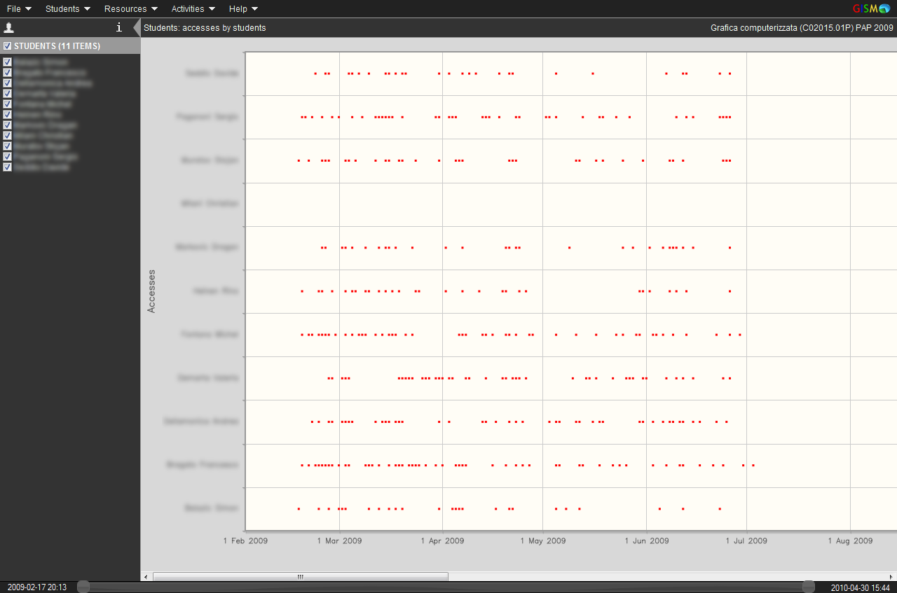
The Figure [Students:Accesses by students] reports a graph on the students' accesses to the course. A simple matrix formed by studentsÕ names (on Y-axis) and dates of the course (on X-axis) is used to represent the course accesses. A corresponding mark represents at least one access to the course made by the student on the selected date.
Students: Accesses overview
The Figure [Students:Accesses overview] reports a histogram that shows the global number of hits to the course made by students on each date.
With the previous two graphs, the instructor has an overview, at a glance, of the global accesses made by students to the course with a clear identification of patterns and trends, as well as information about the attendance of a specific student of the course.
Students: Accesses overview on resources
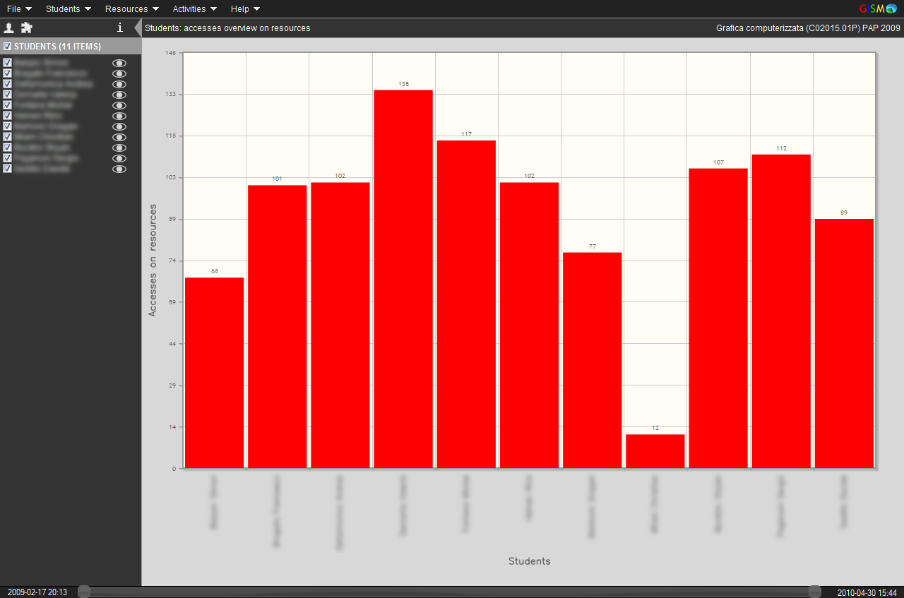
The image in Figure [Students: Accesses overview on resources] represents the global number of accesses made by students (in X-axis) to all the resources of the course (Y-axis). If the user click the "eye icon" in the left menu he can see the details for a specific student. This leads to the following representation.
Students: Student details on resources
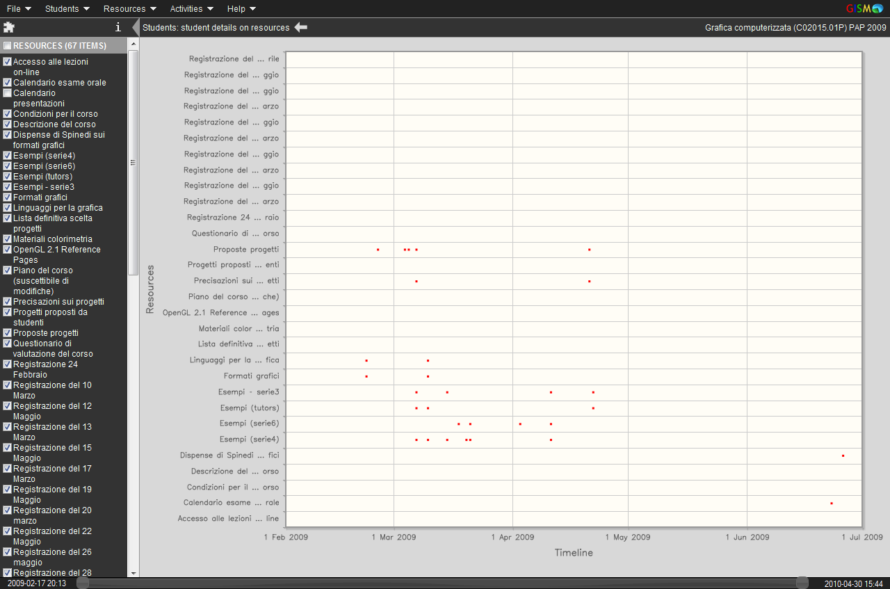
The Figure [Students: Student details on resources] reports an overview of the accesses of a student on the course's resources. Dates are represented on the X-axis; resources are represented on the Y-axis.
Resources: Students overview
Instructors could also be interested in having the details on what resources were accessed by all the students and when. A specific representation is intended to provide this information. The Figure [Resources: Students overview] reports student names on the Y-axis, and resource names on the X-axis. A mark is depicted if the student accessed this resource, and the color of the mark ranges from light-red to dark-red according to the number of times he/she accessed this resource.
Resources:Accesses overview
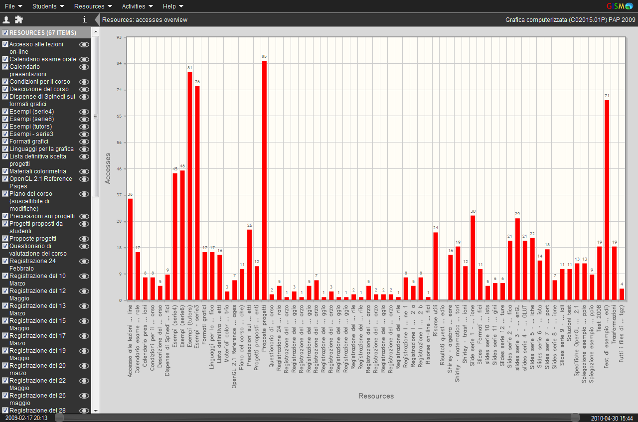
The image in Figure [Resource accesses overview] represents the global number of accesses made by students to each resource of the course (X-axis). Each bar of the histogram represents a particular resource of the course. If the user click the "eye icon" in the left menu he can see the details for a specific resource. This leads to the following representation.
Resources: Resource details on students
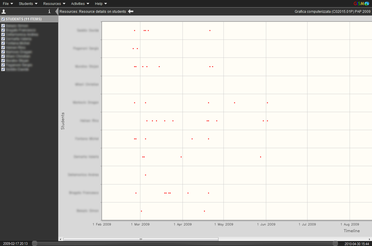
The Figure [Resources: Resource details on students] reports an overview of the accesses of students to this particular resource. Dates are represented on the X-axis; students are represented on the Y-axis.
Activities: Assignments/Quizzes overview
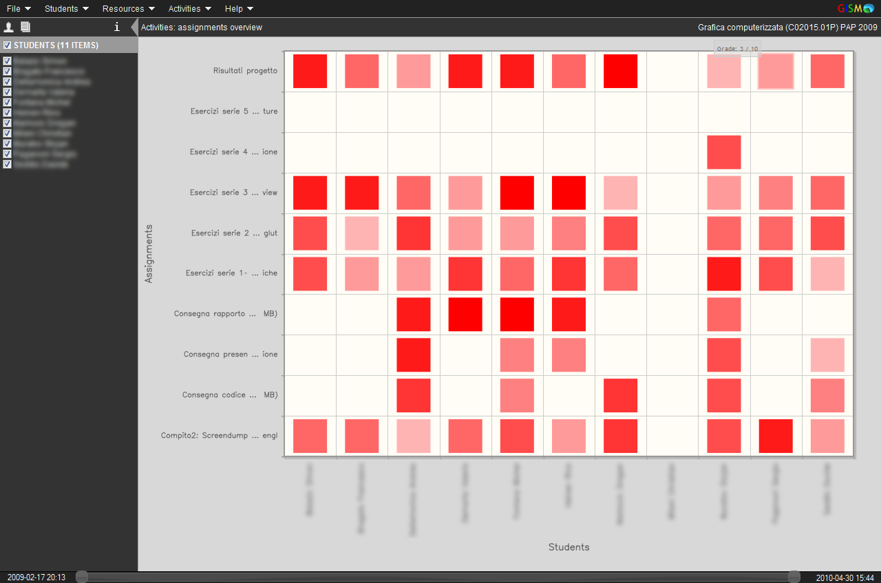
The graph in Figure [Activities: Assignments overview] is indented to visually indicate the grades received by students on assignments and quizzes. On the X-axis we mapped the assignments (or quizzes in the graphs dedicated to quizzes) and marks denote students submissions. An empty square means a submission not graded, while a coloured square reports the grade: a lower grade is depicted with a light colour, a high grade is depicted with a dark colour.
