Big Select List
| Warning: This page is no longer in use. The information contained on the page should NOT be seen as relevant or reliable. |
Moodle User Interface Guidelines > Big Select List
Problem
User needs to select one or more items from a potentially very large master list.
Forces: factors that affect selection
- If there are too many items in a list from which a user has to find items to select, finding what they need becomes difficult
- The largest Moodle sites have hundreds of thousands of users, tens of thousands of courses, and some courses contain over a thousand students.
- If there is a list with radio buttons it can be searched with the browser's find functionality, if the user knows it
- The SELECT element in HTML can have multiple items in it selected by pushing an additional key on the keyboard while clicking with the mouse
- requires quite intricate hand coordination which is probably too much for some of our users
- the selection is easily lost by accident
- users might not know about the additional key
- A list with too many elements on it is very slow to load
- A complete list of all options becomes awkward to work with before it reaches 100 entries, even if it is sorted alphabetically.
- If interaction with the list (adding selection, searching) requires a new page load, it easily becomes very slow and it becomes less apparent what the application did in reaction to the user's action
- Some users may not have javascript support on, so it cannot be depended on
Solution
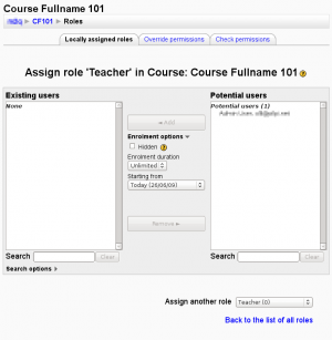
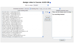
- Put two select boxes side by side and buttons for adding and removing elements between them.
- Under each select box, add a text field and a 'Search' button next to it. (In Moodle 1.9, only under the select box on the right)
Users can select one or more elements in one of the select lists, and press [◀ Add] or [Remove ▶] to move them to the other list.
Users can write a search term (which fields of the user's profile does this search?) and trigger the [Search] to have the list only show those users with data matching the search terms. This is the only way to use the UI in case there are too many users in the list and they can not be listed all at once.
Examples and implementation
TODO: Further explain the example below.
Assign course roles UI


- Assign role 'x' in Course: y
TODO: Create Big Select List Implementation
Bulk User actions
See http://moodle.org/mod/forum/discuss.php?d=126884#p565022
"Another data point for the "Big Select List": the bulk user actions page has a similar but different interface. The positions of the "selected" and "available" users are swapped, the "filter" (rather than search) box is at the very top, and the add/remove buttons are below the lists, rather than between the lists. "
Groups: Add/remove users
An extended variation which also shows which groups a given user is in already.
Further information / Sources
TODO: Anyone, if you know of any, please add references if you know any other place this kind of an UI is discussed or described. Was it created originally for Moodle?