Dataform Manage CSS
- Overview
- Activity administration
- Building an activity
- CSS tips and tricks
- JS tips and tricks
- Activating RSS
- Activity workflow
- Grading
Overview
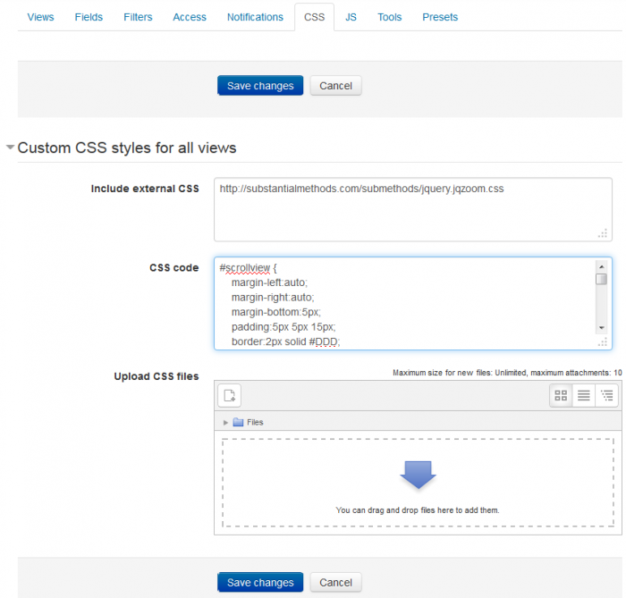
You can use CSS to manipulate the layout and styles of entries and content in any of the Dataform views. Any html element in the designated view, that has an id or a CSS class can be assigned specialized styles by including the style definitions in the CSS tab.

Settings
Include external CSS
You can specify a list of urls to external CSS files and these files will be loaded to the Dataform view page.
Enter CSS code
You can enter CSS definitions directly.
Upload CSS files
You can upload CSS files into the Dataform files area in Moodle's file system. These files become part of the Dataform instance to which they are uploaded and are included in Dataform presets and backups.
Tips and Tricks
Expand/Collapse content
You can make content in the Dataform view collapsible by a combination of html and css.
The html part will typically be in the view templates. We need a designated container element. It can be a div or a table cell (td). We assign to the container element the class "collapsiblecontent". Then we add in this container a label, a checkbox element and a div element where we put all the content which we want to make collapsible.
 <div class="collapsiblecontent">
    <label for="node1[[entryid]]">Click to show/hide content</label>
    <input type="checkbox" id="node1[[entryid]]" />
    <div>
        ... Collapsible content goes here ...
    </div>
 </div>
In the css tab we add the following css. We hide the immediate sibling element of the checkbox input element. We show this element if the checkbox is checked. We hide the checkbox input. We assign a pointer cursor to the label so that it feels like a clickable element.
/* Collapsible content */
.collapsiblecontent > input + * {
display: none;
}
.collapsiblecontent > input:checked + * {
display: block;
}
.collapsiblecontent > input {
display: none;
}
.collapsiblecontent > label {
cursor: pointer;
}
The way it works is quite simple. When the label is clicked the hidden checkbox is checked/unchecked and the content is expanded/collapsed respectively.
I've extracted this approach from the internet. Further more complex variations are also available.