New features: Difference between revisions
Mary Cooch (talk | contribs) (drag and drop text) |
Mary Cooch (talk | contribs) (link to page documentation) |
||
| Line 47: | Line 47: | ||
|} | |} | ||
====Drag and drop media onto the course page==== | ====Drag and drop media onto the course page==== | ||
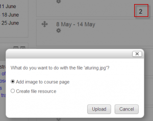
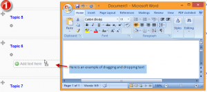
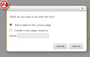
You can now drag an image or some text onto your course page and choose whether to display it embedded in a label or as a clickable resource. See the [[Label|Label documentation]] for more information. | You can now drag an image or some text onto your course page and choose whether to display it embedded in a label or as a clickable resource. See the [[Label|Label documentation]] and [[Using Page|Page documentation]] for more information. | ||
{| | {| | ||
Revision as of 10:03, 8 May 2013
Moodle 2.5 brings a lot of exciting new features for teachers, students and administrators. This page highlights a few of the most interesting!
Full details of the release, with technical information, can be found in the Moodle 2.5 Release notes.
(Click any screenshot below to see it enlarged)
For teachers and students:
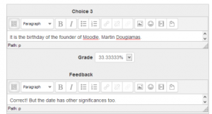
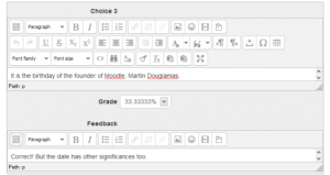
Forms are much shorter
Moodle has a lot of settings and features, which means some of our forms have been getting rather long. We know this is daunting for new users!
We've made changes so that non-essential settings on forms are collapsed by default, yet you can quickly access them when you need them.
The rich text editor is collapsed and can be expanded:
In a similar space-saver, you can choose whether or not to enable the rich text editor when creating quiz questions:
Other improvements to the user interface
Reports are in the Administration block
Reports have moved and can now be seen in the newly named Administration block, (formerly Settings.)
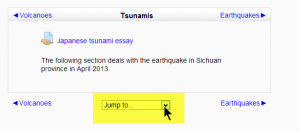
Quickly "Jump to.." another section
If you're using the 'one section per page' setting, you can now move to other sections from a drop down menu:
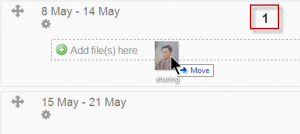
Drag and drop media onto the course page
You can now drag an image or some text onto your course page and choose whether to display it embedded in a label or as a clickable resource. See the Label documentation and Page documentation for more information.
Badges
Badges are a nice way to acknowledge good work, and it's now possible for teachers to award course badges based on a variety of chosen criteria. These badges are fully compatible with Mozilla Open Badges. See the Badges documentation for more information.
This blog post has some interesting reflection on when badges might be most appropriate: The Badges of Oz
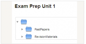
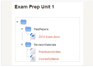
Folders can be displayed inline on a course page
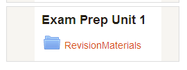
You can now choose whether to have a folder show its contents in a separate screen, as previously, or to have it display them inline with any subfolders expanded:
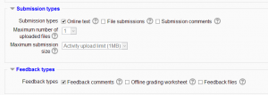
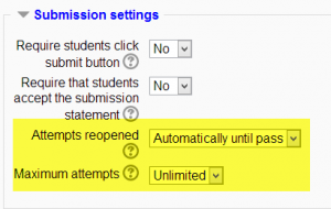
Assignment enhancements
Along with neater options for choosing submission and feedback types, resubmitting options are much improved. See the Assignment documentation for more information.
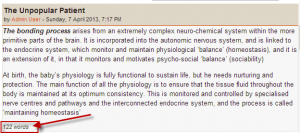
Word count in forum posts
A new setting in forums will display the number of words in a post:
Templates for Essay question types
When using the Essay question type in a quiz, you can now set a template which appears in the students' text editor for scaffolding their response:
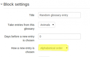
Glossary block enhancements
You can now use a global glossary in the random glossary block, and you can display the entries in alphabetical order:
Search the list of enrolled users
A new search box makes finding users in very large courses much easier:
For administrators:
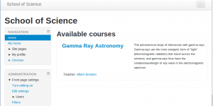
New themes suited to all screen sizes
Many of your favourite sites around the web these days use Bootstrap as a base framework and now Moodle does too! We have a new 'base' theme called "Bootstrapbase" that implements the basics, and a new usable theme called 'Clean' which extends it with some simple configuration options and also functions as a good template example for developing your own Bootstrap-based themes. It also (along with Afterburner) allows you to upload a logo directly from the file picker)
Bootstrapbase allows us to responsively reformat the layout according to the screensize of the device used - on phone or tablet screens blocks move to the bottom, freeing up space for the main content at the top. In the future we hope everyone will want to migrate their Moodle themes to be Bootstrap-based.
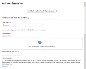
Install add-ons from inside Moodle
It's now possible to install add-ons from within Moodle, rather than accessing folders on the server; useful for those admins who do not have FTP access. Add-ons can be uploaded and installed from a zip file or located and installed from the Moodle plugins directory:
See also
- Category:New features - list of pages documenting new features in Moodle 2.5


