Standard themes: Difference between revisions
Mary Cooch (talk | contribs) (link to Mary Evans' post) |
|||
| (32 intermediate revisions by 6 users not shown) | |||
| Line 1: | Line 1: | ||
{{Themes}} | {{Themes}} | ||
==Standard themes== | |||
Moodle has two standard themes: ''Clean'', a responsive, bootstrap based theme which is used as default, and ''More'', a theme customisable from within the admin interface. | |||
[[File:CLEAN.png|center|thumb|500px|'Clean', the default theme]] | |||
Other themes, including themes which were standard in previous versions of Moodle, are available from the [https://moodle.org/plugins/browse.php?list=category&id=3 Themes section of the Moodle plugins directory]. | |||
'''''NOTE:''' If you were using a previous core theme or one based on a previous core theme and you are upgrading to Moodle 2.7, make sure you reinstall the relevant theme(s) before running the upgrade.'' | |||
==Theme selector== | ==Theme selector== | ||
An administrator can set a theme for the site in '' | An administrator can set a theme for the site in ''Administration > Site administration > Appearance > Themes > Theme selector''. | ||
Different themes may be set according to 'device type' - default, legacy (for older browsers), mobile and tablet. | Different themes may be set according to 'device type' - default, legacy (for older browsers), mobile and tablet. | ||
Go to '' | Go to ''Administration > Site administration > Appearance > Themes > Theme selector'' | ||
*Click on the "Select theme" button next to the type you wish to change | *Click on the "Select theme" button next to the type you wish to change | ||
*Scroll down to see the previews of the available themes and click on the "Use theme" button to chose the theme | *Scroll down to see the previews of the available themes and click on the "Use theme" button to chose the theme | ||
| Line 15: | Line 26: | ||
Note 2: The selected theme may be overridden if user/course or category themes have been allowed in the [[Theme settings]]. | Note 2: The selected theme may be overridden if user/course or category themes have been allowed in the [[Theme settings]]. | ||
== | ==Customising the 'More' theme== | ||
{{New features}} | |||
[[File:MORE.png|center|thumb|500px|The customisable 'More' theme.]] | |||
The 'More' theme allows administrators to customise it from ''Site administration>Appearance>Themes>More''. | |||
Options are: | |||
*'''Text colour/Link colour''' - these may be selected either by typing in the code or by clicking into the colour picker. | |||
*'''Background colour/Background image''' - a background colour may be selected as above or an image of your choice uploaded. (Note: the image will override the background colour.) | |||
*'''Background repeat/position/fixed''' - decide here how you wish your image to be repeated; its position or if you want it to be fixed to the page. | |||
*'''Main content background colour/Secondary background colour''' - these may be selected either by typing in the code or by clicking into the colour picker. (The secondary background colour includes blocks and the navigation bar.) | |||
*'''Invert navbar''' - checking this will swap the text and background colour of the navigation bar between black and white. | |||
*'''Logo''' - a custom logo may be uploaded here | |||
*'''Custom CSS/Footnote''' - custom CSS and footer text may be added and will be reflected throughout the site. | |||
Pro tip: When specifying colours, you can even use advanced colours with transparency values such as '''rgba(255,255,255,0.8)''' | |||
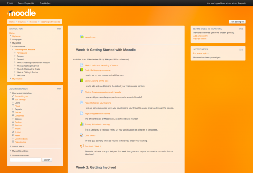
[[File:moodle27-orange.png|center|500px|'More' with an orange image backound, a logo and custom colours.]] | |||
'More' with an orange image backound, a logo and custom colours. | |||
===Mount Orange: example of a customised More theme=== | |||
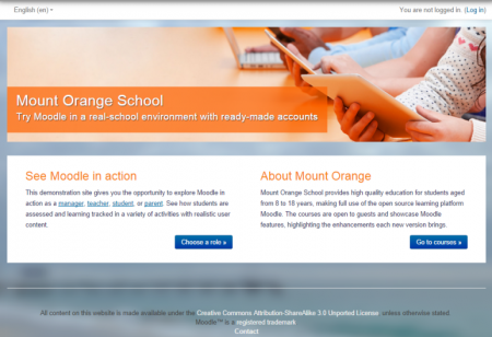
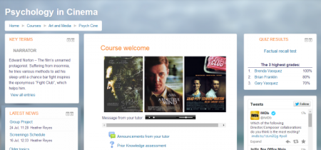
The theme on the [http://school.demo.moodle.net School demo site] is based on settings from tracker MDLSITE-3095 and MDLSITE-3245 | |||
{| | |||
| [[File:MountOrangeFrontPage.png|thumb|450px|Front page view]] | |||
| [[File:SchoolDemoMore.png|thumb|450px|Course view]] | |||
|} | |||
====More theme page settings==== | |||
*Text colour: ##595959 | |||
*Link colour: #0070a8 | |||
*Background colour: #93abc3 | |||
*Background image [https://docs.moodle.org/27/en/File:bg6.png bg6.png] | |||
*Background repeat: No repeat | |||
*Background position: Left bottom | |||
*Background fixed: Yes | |||
*Main content background colour: #fff | |||
*Secondary background colour: #fff | |||
*Invert navbar: No | |||
*Logo: None | |||
*CUSTOM CSS: | |||
body { | |||
background-size: cover; | |||
} | |||
h1, h2, h3, h4, h5, h6 { | |||
color: #f98012; | |||
font-weight: normal; | |||
} | |||
#page-header h1 { | |||
color: #fff; | |||
font-weight: bold; | |||
text-shadow: 0px 1px 1px rgba(0, 0, 0, 0.2); | |||
} | |||
.block .header h2 { | |||
color: #f98012; | |||
font-weight: normal; | |||
} | |||
#page-footer { | |||
color: #444; | |||
} | |||
#page-footer a { | |||
color: #eee; | |||
} | |||
.jschooser .choosercontainer #chooseform .instruction, | |||
.jschooser .choosercontainer #chooseform .typesummary { | |||
background-color: #fff; | |||
} | |||
.choosercontainer #chooseform .selected { | |||
background-color: #fff; | |||
} | |||
#page-site-index #page-header { | |||
display:none; | |||
} | |||
#page-site-index #region-main { | |||
padding: 0; | |||
border: 0; | |||
border-radius: 0; | |||
box-shadow: none; | |||
background-color: transparent; | |||
} | |||
#page-site-index .label { | |||
padding: 0; | |||
} | |||
#page-site-index .activity > div { | |||
padding: 0; | |||
} | |||
#page-site-index .mod-indent-outer { | |||
padding-left: 0; | |||
} | |||
#page-site-index .contentwithoutlink { | |||
padding-right: 0; | |||
} | |||
.frontpage.container-fluid { | |||
padding: 0; | |||
} | |||
.frontpage .hero-unit { | |||
padding:0; | |||
border-radius:0; | |||
background: transparent no-repeat right bottom / cover; | |||
line-height: 250px; | |||
} | |||
.frontpage .hero-unit .texts { | |||
color: #fff; | |||
letter-spacing: .5px; | |||
background-color: rgba(255, 99, 0, 0.70); | |||
padding: 0 20px; | |||
margin-bottom:20px; | |||
display: inline-block; | |||
vertical-align: bottom; | |||
} | |||
.frontpage .hero-unit h2 { | |||
color: #fff; | |||
font-size: 32px; | |||
font-weight: 200; | |||
text-shadow: 1px 1px 1px #444; | |||
margin-bottom: 0; | |||
} | |||
.frontpage .hero-unit .lead { | |||
text-shadow: 1px 1px 1px #333; | |||
} | |||
.frontpage .row-fluid { | |||
line-height: 24px; | |||
background-color: #fff; | |||
padding: 10px 20px 20px; | |||
box-sizing: border-box; | |||
} | |||
.frontpage .fp-block { | |||
padding: 10px 20px 0; | |||
} | |||
.frontpage h3 { | |||
font-size: 26px; | |||
line-height: 30px; | |||
font-weight: 200; | |||
} | |||
.frontpage .button { | |||
text-align: right; | |||
} | |||
=== | ====Front page topic summary settings==== | ||
(Note: these settings allow you to have a large image and two text boxes. Upload your banner image via the image icon in the text editor. Switch to code view and copy its URL.) | |||
=== | <nowiki> <div class="frontpage container-fluid"> | ||
<div class="hero-unit" style="background-image: url('INSERT THE FULL URL OF YOUR UPLOADED BANNER HERE.jpg');"> | |||
<div class="texts"> | |||
<h2>SITE TITLE HERE</h2> | |||
<p class="lead">TAG LINE HERE</p> | |||
</div> | |||
</div> | |||
</nowiki> | |||
== | <nowiki> | ||
<div class="row-fluid"> | |||
<div class="fp-block span6"> | |||
<h3>LEFT TEXT BOX TITLE</h3> | |||
<p>Lorem ipsum dolor sit amet, consectetur adipisicing elit, sed do eiusmod tempor incididunt ut labore et dolore magna aliqua. Ut enim ad minim veniam, quis nostrud exercitation ullamco laboris nisi ut aliquip ex ea commodo consequat. Duis aute irure dolor In reprehenderit in voluptate velit esse cillum dolore eu fugiat nulla pariatur. Excepteur sint occaecat cupidatat non proident, sunt in culpa qui officia deserunt mollit anim id est laborum.</p> | |||
<p class="button"><a class="btn btn-primary" href="#">read more »</a></p> | |||
</div> | |||
</nowiki> | |||
== | <nowiki> | ||
<div class="fp-block span6"> | |||
<h3>RIGHT TEXT BOX TITLE</h3> | |||
<p>Lorem ipsum dolor sit amet, consectetur adipisicing elit, sed do eiusmod tempor incididunt ut labore et dolore magna aliqua. Ut enim ad minim veniam, quis nostrud exercitation ullamco laboris nisi ut aliquip ex ea commodo consequat. Duis aute irure dolor in reprehenderit in voluptate velit esse cillum dolore eu fugiat nulla pariatur. Excepteur sint occaecat cupidatat non proident, sunt in culpa qui officia deserunt mollit anim id est laborum.</p> | |||
<p class="button"><a class="btn btn-primary" href="#">read more »</a></p> | |||
</div> | |||
</div> | |||
</div> | |||
< | </nowiki> | ||
=====Taking it further===== | |||
For more advanced customisations, see the post by Mary Evans: [https://moodle.org/mod/forum/discuss.php?d=267662 Adding marketing spots to the front page.] | |||
==See also== | ==See also== | ||
*[http://youtu.be/OUTzAFItLx4 Moodle HQ video on themes] | |||
* [[Theme credits]] | * [[Theme credits]] | ||
* Using Moodle [http://moodle.org/mod/forum/discuss.php?d=189573 What counts as a 'legacy' device type?] forum discussion | * Using Moodle [http://moodle.org/mod/forum/discuss.php?d=189573 What counts as a 'legacy' device type?] forum discussion | ||
[[de:Standard-Designs]] | [[de:Standard-Designs]] | ||
[[es:Temas estándar]] | |||
Latest revision as of 15:28, 23 September 2014
Standard themes
Moodle has two standard themes: Clean, a responsive, bootstrap based theme which is used as default, and More, a theme customisable from within the admin interface.
Other themes, including themes which were standard in previous versions of Moodle, are available from the Themes section of the Moodle plugins directory.
NOTE: If you were using a previous core theme or one based on a previous core theme and you are upgrading to Moodle 2.7, make sure you reinstall the relevant theme(s) before running the upgrade.
Theme selector
An administrator can set a theme for the site in Administration > Site administration > Appearance > Themes > Theme selector.
Different themes may be set according to 'device type' - default, legacy (for older browsers), mobile and tablet.
Go to Administration > Site administration > Appearance > Themes > Theme selector
- Click on the "Select theme" button next to the type you wish to change
- Scroll down to see the previews of the available themes and click on the "Use theme" button to chose the theme
- The next screen will provide information about the theme. Click "Continue"
Note 1: Moodle caches themes so if you don't immediately see changed settings that you were expecting, click the "Clear theme caches" button at the top of the Theme selector page.
Note 2: The selected theme may be overridden if user/course or category themes have been allowed in the Theme settings.
Customising the 'More' theme
New feature
in Moodle 2.7!
The 'More' theme allows administrators to customise it from Site administration>Appearance>Themes>More.
Options are:
- Text colour/Link colour - these may be selected either by typing in the code or by clicking into the colour picker.
- Background colour/Background image - a background colour may be selected as above or an image of your choice uploaded. (Note: the image will override the background colour.)
- Background repeat/position/fixed - decide here how you wish your image to be repeated; its position or if you want it to be fixed to the page.
- Main content background colour/Secondary background colour - these may be selected either by typing in the code or by clicking into the colour picker. (The secondary background colour includes blocks and the navigation bar.)
- Invert navbar - checking this will swap the text and background colour of the navigation bar between black and white.
- Logo - a custom logo may be uploaded here
- Custom CSS/Footnote - custom CSS and footer text may be added and will be reflected throughout the site.
Pro tip: When specifying colours, you can even use advanced colours with transparency values such as rgba(255,255,255,0.8)
'More' with an orange image backound, a logo and custom colours.
Mount Orange: example of a customised More theme
The theme on the School demo site is based on settings from tracker MDLSITE-3095 and MDLSITE-3245
More theme page settings
- Text colour: ##595959
- Link colour: #0070a8
- Background colour: #93abc3
- Background image bg6.png
- Background repeat: No repeat
- Background position: Left bottom
- Background fixed: Yes
- Main content background colour: #fff
- Secondary background colour: #fff
- Invert navbar: No
- Logo: None
- CUSTOM CSS:
body {
   background-size: cover;
}
h1, h2, h3, h4, h5, h6 {
   color: #f98012;
   font-weight: normal;
}
#page-header h1 {
   color: #fff;
   font-weight: bold;
   text-shadow: 0px 1px 1px rgba(0, 0, 0, 0.2);
}
.block .header h2 {
   color: #f98012;
   font-weight: normal;
}
#page-footer {
   color: #444;
}
#page-footer a {
   color: #eee;
}

.jschooser .choosercontainer #chooseform .instruction,
.jschooser .choosercontainer #chooseform .typesummary {
   background-color: #fff;
}
.choosercontainer #chooseform .selected {
   background-color: #fff;
}

#page-site-index #page-header {
   display:none;
}
#page-site-index #region-main {
   padding: 0;
   border: 0;
   border-radius: 0;
   box-shadow: none;
   background-color: transparent;
}
#page-site-index .label {
   padding: 0;
}
#page-site-index .activity > div {
   padding: 0;
}
#page-site-index .mod-indent-outer {
   padding-left: 0;
}
#page-site-index .contentwithoutlink {
   padding-right: 0;
}

.frontpage.container-fluid {
   padding: 0;
}
.frontpage .hero-unit {
   padding:0;
   border-radius:0;
   background: transparent no-repeat right bottom / cover;
   line-height: 250px;
}
.frontpage .hero-unit .texts {
   color: #fff;
   letter-spacing: .5px;
   background-color: rgba(255, 99, 0, 0.70);
   padding: 0 20px;
   margin-bottom:20px;
   display: inline-block;
   vertical-align: bottom;
}
.frontpage .hero-unit h2 {
   color: #fff;
   font-size: 32px;
   font-weight: 200;
   text-shadow: 1px 1px 1px #444;
   margin-bottom: 0;
}
.frontpage .hero-unit .lead {
   text-shadow: 1px 1px 1px #333;
}
.frontpage .row-fluid {
   line-height: 24px;
   background-color: #fff;
   padding: 10px 20px 20px;
   box-sizing: border-box;
}
.frontpage .fp-block {
   padding: 10px 20px 0;
}
.frontpage h3 {
   font-size: 26px;
   line-height: 30px;
   font-weight: 200;
}
.frontpage .button {
   text-align: right;
}
Front page topic summary settings
(Note: these settings allow you to have a large image and two text boxes. Upload your banner image via the image icon in the text editor. Switch to code view and copy its URL.)
<div class="frontpage container-fluid"> <div class="hero-unit" style="background-image: url('INSERT THE FULL URL OF YOUR UPLOADED BANNER HERE.jpg');"> <div class="texts"> <h2>SITE TITLE HERE</h2> <p class="lead">TAG LINE HERE</p> </div> </div>
<div class="row-fluid"> <div class="fp-block span6"> <h3>LEFT TEXT BOX TITLE</h3> <p>Lorem ipsum dolor sit amet, consectetur adipisicing elit, sed do eiusmod tempor incididunt ut labore et dolore magna aliqua. Ut enim ad minim veniam, quis nostrud exercitation ullamco laboris nisi ut aliquip ex ea commodo consequat. Duis aute irure dolor In reprehenderit in voluptate velit esse cillum dolore eu fugiat nulla pariatur. Excepteur sint occaecat cupidatat non proident, sunt in culpa qui officia deserunt mollit anim id est laborum.</p> <p class="button"><a class="btn btn-primary" href="#">read more »</a></p> </div>
<div class="fp-block span6"> <h3>RIGHT TEXT BOX TITLE</h3> <p>Lorem ipsum dolor sit amet, consectetur adipisicing elit, sed do eiusmod tempor incididunt ut labore et dolore magna aliqua. Ut enim ad minim veniam, quis nostrud exercitation ullamco laboris nisi ut aliquip ex ea commodo consequat. Duis aute irure dolor in reprehenderit in voluptate velit esse cillum dolore eu fugiat nulla pariatur. Excepteur sint occaecat cupidatat non proident, sunt in culpa qui officia deserunt mollit anim id est laborum.</p> <p class="button"><a class="btn btn-primary" href="#">read more »</a></p> </div> </div> </div>
Taking it further
For more advanced customisations, see the post by Mary Evans: Adding marketing spots to the front page.
See also
- Moodle HQ video on themes
- Theme credits
- Using Moodle What counts as a 'legacy' device type? forum discussion


