Dataformfield checkbox
- Building an activity
- Activity settings
- Activity administration
- Activating RSS
- Activity workflow
- Applications
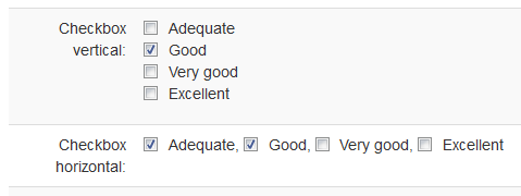
Allows the user to select options by ticking checkboxes.
Features
- One or more textual options.
- Updating option text in field configuration preserves user selection.
- Changing option position in field configuration preserves user selection.
- Can allow adding new options from the entry form.
- Available for grade calculation.
Settings
General settings
Name
Short name for the field. Since the field name is used in field patterns, long convoluted names may make the view template less readable.
Description
Short description of the field purpose and characteristics to allow managers to see at a glance what each field is intended for. This description is displayed only in the field management list.
Visibile
To whom the field (label and content in browse and editing modes) is visible when displaying entries (in views that contain the field pattern).
- Managers only - Users with manageentries capability.
- Owner and managers - Users with manageentries capability and the entry author.
- Everyone - All users.
Editable
Whether the field content can be updated by an entry author without manageentries capability.
Template
The field template allows for creating a complex display of the field content by interpreting patterns of the field if included in the template. For example, with a number field called Number and the field template defined as 'You have earned [[Number]] credits.' and an entry where the number value is 47 the pattern [[Number@]] would be displayed as 'You have earned 47 credits.' The field template can also be used as a simple label for the field (rather than labels as static content in the view template) with the advantage that it observes the field visibility and is hidden if the field is set to be hidden. The field template can be added to the view by means of the [[fieldname@]] pattern.
Field specific settings
Options
List of options, one per line. Example:
Good
Very good
Excellent
Options separator
The options display separator.
- New line – Options are displayed vertically.
- Space – Options are displayed horizontally separated by a space.
- Comma – Options are displayed horizontally separated by a comma.
- Comma and space – Options are displayed horizontally separated by comma and space.
Default values
List of options to be selected by default when editing a new entry.
Allow adding options
Whether new options can be added from the entry form (requires including the respective field pattern to the entry template).
Patterns
Common field patterns
[[fieldname@]]
Displays the field label/template.
Field specific patterns
[[fieldname]]
Displays input checkboxes in editing and the selected options in browsing.
[[fieldname:addnew]]
Displays input text box in editing for specifying a new option.
[[fieldname:options]]
Displays all the options in browsing.
Sort / Search
The following field elements are available for defining sort and search criteria in Dataform Filters:
Sort
- Content – The textual content of the field.
Search
- Content – The textual content of the field.
Import / Export
Import settings
Allow adding options
Determines whether imported options that are not already defined in the field configuration will be added to the configuration.
Import format
A list of textual options separated by #
Example:
Good#Very good
