admin/setting/themesettingfordson
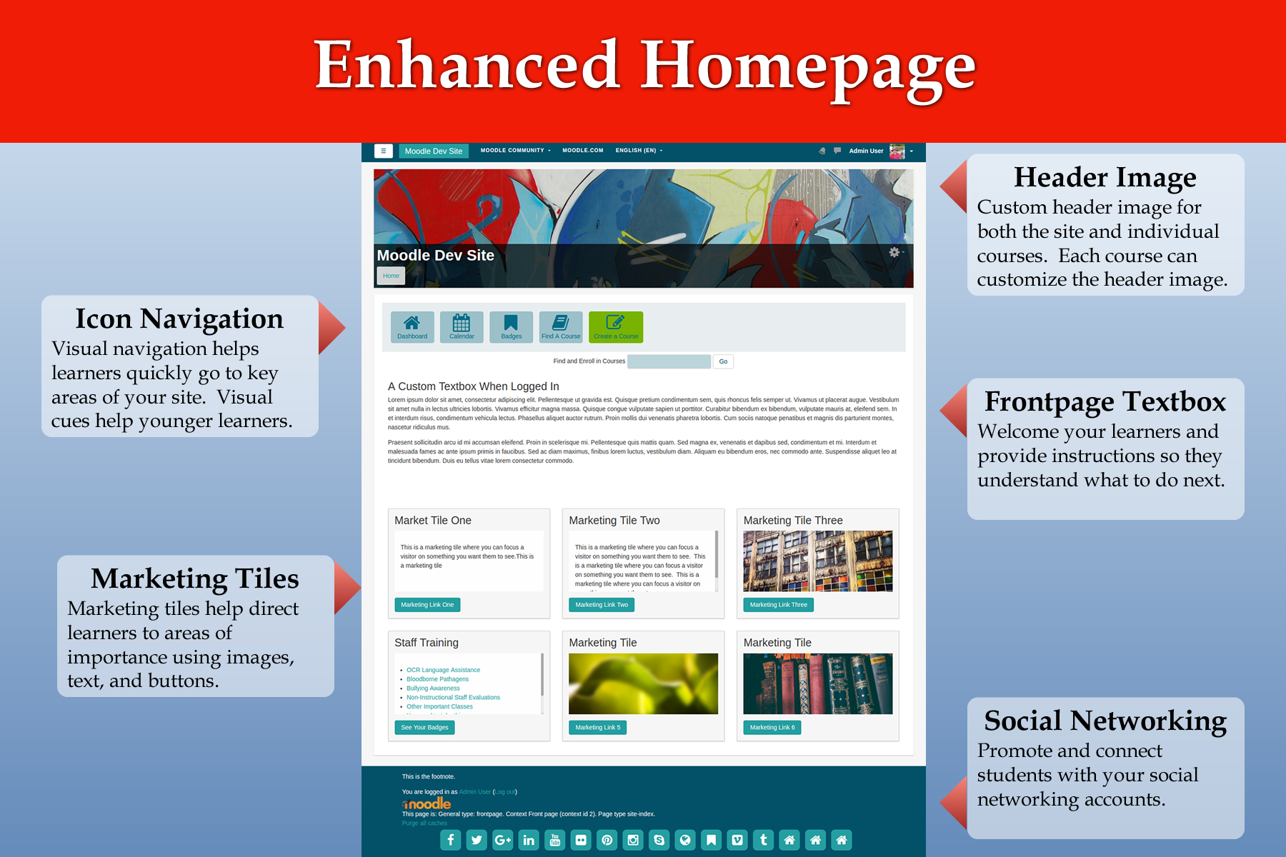
Fordson es un tema hijo del Tema Boost. Tiene como características una página inicial mejorada, selectores de color para los principales elementos de la página, soporte para pre-configuraciones, imágenes personalizadas para encabezado, tanto para cursos como para el sitio principal.
Hay siete páginas para Fordson: Pre-configuraciones, Colores, Configuraciones de Imágenes de Encabezado y Curso, Áreas de Contenido, Redes Sociales, Navegación por Ïconos y Mosaicos de Publicidad. Esta página de documentación que Usted está leyendo ahora cubrirá cada una de esas páginas.
Pre-configuraciones
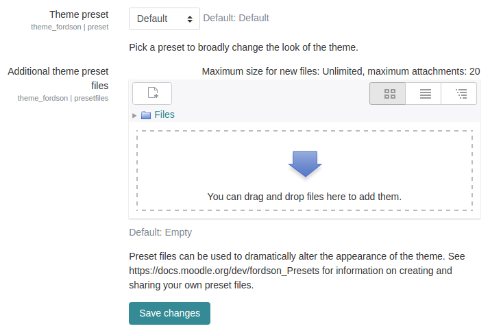
Pestaña de Pre-configuraciones de Fordson
Choose from several included presets or upload your own. The Fordson theme has several elements in the layout which are not included with the default Boost theme. These elements are included in the SCSS folder in the styles.scss file. This ensures that basic styling for marketing tiles, icon navigation, and other elements will carry over when using other presets. A listing of these changes should be included here.
Colores
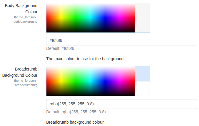
Pestaña de Colores de Fordson
The colours tab allows you to quickly change the look of the major elements of the page. Text, links, background colors are all included. Along with this, some standard bootstrap elements common to presets are also included. Once you upload a preset you most likely can alter some of the colors using the Fordson Colour tab.
It is recommended you remove all color settings when exploring presets so that the Fordson color choosers do not alter the preset styles.
Configuraciones de Imágenes de Encabezado y Curso
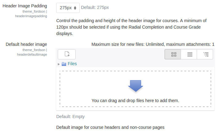
Pestaña de Configuraciones de Imágenes de Encabezado y Curso de Fordson
Upload a default header image, body background image, and/or login image. The default header image is used at the top of every page. The height of the header can be set using the dropdown setting. If a teacher uploads an image file to their course summary files area then it will replace the default image for that course. This allows teachers to customize their course without having to use a new theme.
Áreas de Contenido
Áreas de Contenido de Fordson
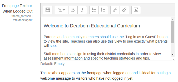
There are four areas for custom content: Frontpage Logged in Textbox, Frontpage Logged Out Textbox, Alert, and Footnote. Using the frontpage textboxes you can provide a message or instructions for visitors based on whether they are authenticated or just visiting. The alert box is useful for maintenance or other notices that users must see. The alert message appears on the site homepage just below the icon navigation area. The footnote appears in the footer of the page.
Redes Sociales
Pestaña de Navegación por Íconos de Fordson
The icon navigation is a unique navigation used in our themes. It is a great way to quickly get learners into main areas of your site. The icons, button, text, and color help draw attention to this style of navigation. There are three settings for each icon and you can create up to eight icons in total. The first element to creating an icon button is the actual icon which comes from Font-Awesome. Use any of these icons found here: http://fontawesome.io/cheatsheet/ just remember to remove the "fa-". Next enter in text which will appear below the icon. Try to keep it to one or two words. Finally, you must provide a link. It can be a link to anywhere. You can link to anywhere including outside websites just enter the proper URL. If your Moodle site is in a subdirectory the default URL will not work. Please adjust the URL to reflect the subdirectory. Example if "moodle" was your subdirectory folder then the URL would need to be changed to /moodle/my/.
In addition to the 8 icons there are two special icons: Course Creator Button and Slide Icon Button. The course creator button will appear when a user has the capability to create courses. If you use LDAP you can make all staff members "Course Creators" when they login to Moodle. If this is the case, this button will appear for them and quickly help them begin creating a new course. The slide icon button is a toggle button that will either show or hide a custom textbox. When pressed, the slide textbox reveals itself by sliding down from the icon navigation bar. This is ideal for featured courses, staff trainings, and other helpful information.
Mosaicos de Publicidad
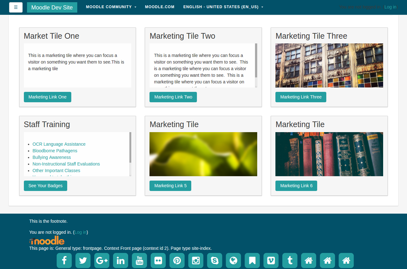
estos tienen alturas fijas, lo que significa que si el contenido fuera demasiado grande, Usted obtendrá lindas barras de desplazamiento como se observa debajo en los Cursos para el personal (Staff training).
