Styling and customising the dock
Moodle 2.0
The dock is a new addition to Moodle 2.0, it allows the user to move blocks from the flow of the page onto a special bar that is displayed in a constant position on the side of the page by default. This document looks at how to style the dock using CSS, as well as how to customise or manipulate it within JavaScript.
Styling the dock
Styling the dock is really no different to styling anything else within a web site however there are a couple of things that may slow you down and reading the following document may help you in your understanding of how the dock works and how you should go about styling it.
The following items are things that you should be aware of before starting to style the dock:
- When a block is docked the dock attempts to ensure that existing styles for the block are still applied by adding the standard block .block_blockname. Because of this trick we don't need to look at the actual content of a docked item it will always be the same as the block.
- The dock remembers what blocks are docked by saving the user's choices within the database using AJAX calls. This can be looked at to minimise display jumping within a theme's layoutfile. Read on to learn how.
- The dock uses CSS classes to transition the different states. These CSS classes control things such as the whether the dock is visible, whether the panel is visible, and how we know which item is being viewed. Read the section on state classes to learn more about these.
- The structure of the dock is built entirely by JavaScript. Because of this you will need a tool such as FireBug to inspect it within a page as it won't be there until JavaScript has run.
- Although the base theme doesn't support the dock it does contain some core CSS to structure the dock by default.
So lets get started and look at the structure.
The structure of the dock
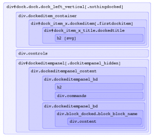
The first image to the left graphically describes the hierarchical structure of the dock. The first thing you will notice about this image is that it doesn't describe what each element is for. It is just to illustrate the html structure without at styles or transformation.
So what are the important elements here?
- div#dock.dock.dock_left_vertical
- This is the bar on the left. Positioned by default to be fixed position in the top left hand corner of the screen and 30px wide.
- div.dockeditem_container
- This box contains all of the buttons which when clicked or hovered over will display the docked item. Or more technically causing the docked item panel to be shown.
- div#dock_item_x.dockeditem
- This represents one of possibly several docked item buttons containing the title of the docked item. There are two things to note about this element: First it is repeated for every docked item. Second the x within the id is the item instance and should not be used for styling.
- div.controls
- This contains any special controls for the dock and by default is displayed at the bottom of the dock. As of Moodle 2 Preview Release the only control here is to undock all docked items.
- div#dockeditempanel
- This is the panel in which docked items are shown. Although it is within the dock is it positioned outside of the page relative to the button for the item it is currently showing. This element is based loosely off the YUI3 overlay.
The layout of the dock
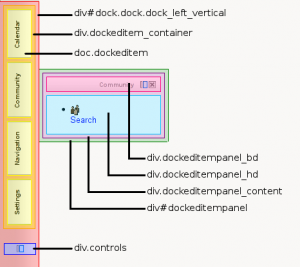
The second image on the left shows the layout of these elements within the standard theme.
So what has gone on here? First up ignore the bright colours and margins. I have put these colours in simply to highlight everything and ensure there is space between elements so I can show them apart.
- div#dock
- So immediately you notice that the dock is in the top left of the screen and the is fixed width. This is achieved by setting a strict with of 30px and setting the position of the #dock to fixed. The reason that everything is within the one #dock element is because it makes positioning everything very simple, now that we have set the position of #dock we don't need to worry about anything other than the panel which we'll get to shortly. You should also note that because of the strict width and position you need to be careful when applying styles to this element as it can have nasty effects on everything else.
- div.dockeditem_container
- Next you should notice that the .dockeditem_container doesn't extend to the bottom of the dock. Because there is not special positioning here it is behaving as div's normally do and this is the perfect place to really start styling your dock.
- div.controls
- After that within the structure we have div.controls. This element is positioned absolutely at the bottom of the dock, is 100% wide (so the full width of the dock) and uses text-align:center to ensure that the controls are centred.
- div.dockeditem
- Simply representing a button that can be hovered over or clicked to display the docked item the only important thing to note about this is that you should change the cursor to a pointer so that it is clear you can interact with it.
- div#dockeditempanel
- After #dock this is the most serious element in the dock. This element will contain the docked item and needs to positioned to the left of the dock and at the same height as the title of the item that is being displayed. Luckily you don't need to worry about the top position of the element that will be automatically adjusted by JavaScript however you will need to push the element to the left. This can be done easily by setting the position of the element to relative, and then setting left to 100%. Note you shouldn't style this element unless you know what you are doing, like the main dock element the smallest change can cause some terrible effects.
- div.dockeditempanel_container
- This element is there specifically to give you the themer an easy place to start styling the panel.
- div.dockeditempanel_hd
- This element contains the title of the docked item plus controls to undock or close it.
- div.dockeditempanel_bd
- Contains is the main content area for the panel.
State classes
There are several state classes that the dock makes use of to achieve things such as the visibility of the dock, visibility of the panel, and which item is active. The following table illustrates where these state classes are used.
| Element | Class | Description | Default CSS |
|---|---|---|---|
| body | has_dock | This class is added to the body element when the dock is visible. | Margin-left: 30px |
| #dock | nothingdocked | This class is added to the dock when there is nothing docked. | visibility: hidden; display: none; |
| #dock | .dock_position_style | A special class is added to describe the docks desired position e.g. dock_left_vertical | |
| .dockeditem | activeitem | This class is added to the item that is currently being shown. | Change the background colour |
| .dockeditem | firstdockitem | This class is added to the first dock item. | |
| .dockeditem h2 | filterrotate | Added when the title is being rotated by an IE filter [Internet Explorer only] | |
| #dockeditempanel | dockitempanel_hidden | Added to the panel when it is not being shown. | visibility: hidden; display: none; |
| .dockeditempanel_content | oversized_content | Added when the panel required scrolling to show everything. | Set the overflow method |
The core CSS
As mentioned in the key points at the start of this document the base theme although not supporting the dock does contain structural CSS that ensure the dock is functional on all themes that choose to support it.
Lets look at the CSS within theme/base/style/dock.css, this is the core structural CSS for the dock.
/* Put a margin on the body if the dock is shown */
body.has_dock {margin-left:30px;}
Well this is very simple, if the dock is being shown apply a 30px margin to the body. This is done to ensure that the dock doesn't overlap the body.
/** For the dock itself */
- dock {width:30px;position:fixed;top:0px;left:0px;height:100%;background-color:#FFF;border-right:1px solid #000;z-index:11000;}
- dock.nothingdocked {visibility: hidden;display:none;}
These two rules style the dock itself. Note the second rule is only applied when nothing is docked in which case we will hide the empty dock.
- dock .dockeditem .firstdockitem {margin-top:1em;}
- dock .dockeditem .dockedtitle {border-bottom:1px solid #000;border-top:1px solid #000;cursor:pointer;}
- dock .dockeditem .dockedtitle h2 {font-size:0.8em;line-height:100%;text-align:center;}
- dock .dockeditem .dockedtitle .filterrotate {margin-left:8px;}
The four rules above style the buttons that will show the docked items. Each docked item has one. The styles being used here arn't doing anything to special other than setting the cursor to pointer so that it is recognised as an actionable element.
- dock .controls {position:absolute;bottom:1em;text-align:center;width:100%;}
- dock .controls img {cursor:pointer;}
Very simply this bit of CSS. It is positioning the controls for the dock at the bottom centre of the dock.
/** For the panel the docked blocks are shown in */
- dockeditempanel {min-width:200px;position:relative;z-index:12000;left:100%;}
- dockeditempanel.dockitempanel_hidden {display:none;}
These two lines are applied to the docked item panel's base element and are VERY important to the operation of the dock. They ensure that when shown the panel is top the left of the dock and that when it is not being displayed it is not visible.
- dockeditempanel .dockeditempanel_content {background-color:#fff;border:1px solid #000;z-index:12050;}
- dockeditempanel .dockeditempanel_bd {overflow:auto;width:auto;}
- dockeditempanel .dockeditempanel_bd .block_docked {margin:10px;}
- dockeditempanel .dockeditempanel_hd {border-bottom:1px solid #000;text-align:right;}
- dockeditempanel .dockeditempanel_hd h2 {display:inline;margin:0;padding-right:1em;}
- dockeditempanel .dockeditempanel_hd .commands {display:inline;}
- dockeditempanel .dockeditempanel_hd .commands img {margin-right:2px;vertical-align:middle;}
The above lines of CSS are used to style the internal content of the panel. Note the styles for the block will be applied as if it were not docked.
And that is it!
Whilst things don't look to difficult when styling things if you don't think carefully about where you are applying styles you can quickly dig yourself a big hole. I would suggest going slowly at first when applying more styles and making sure you don't apply too many styles to the base elements #dock and #dockeditempanel.
Customising the dock
Under construction
Where to start
Under construction
Extending the dock through events
Under construction
Using custom methods for the dock
Under construction

