Quiz UI redesign - Design specification: Difference between revisions
| Line 24: | Line 24: | ||
You can view the discovered issues, based on which UI conclusions were made, here: [[Quiz_UI_redesign_-_prototype_testing_report]] | You can view the discovered issues, based on which UI conclusions were made, here: [[Quiz_UI_redesign_-_prototype_testing_report]] | ||
The order of the tabs was untested, but I have seen people struggle with it. However, it was not changed before some concrete testing results show up, allowing to think about /how/ it should be changed. Facilitating the order of a most-often workflow of a user (create exam -> set order -> info (+ edit info) -> preview -> grade ) probably would not be a bad idea, but so far it is just guesses. Also related to tabs, one of the test subjects had visible problems recognizing which tab is active, and s/he was frustrated since in the prototype it was impossible to swicth between tabs to find out. | The order of the tabs was untested, but I have seen people struggle with it. However, it was not changed before some concrete testing results show up, allowing to think about /how/ it should be changed. Facilitating the order of a most-often workflow of a user (create exam -> set order -> info (+ edit info) -> preview -> grade ) probably would not be a bad idea, but so far it is just guesses. | ||
Also related to tabs, one of the test subjects had visible problems recognizing which tab is active, and s/he was frustrated since in the prototype it was impossible to swicth between tabs to find out. This is why in the prototypes, the background colour of the active tab is clear white, like the background of the rest of the page, and the backgrounds of the other tabs have been made significantly darker. | |||
== Work based on scenarios == | == Work based on scenarios == | ||
Revision as of 18:46, 27 June 2008
Back to Quiz_UI_redesign
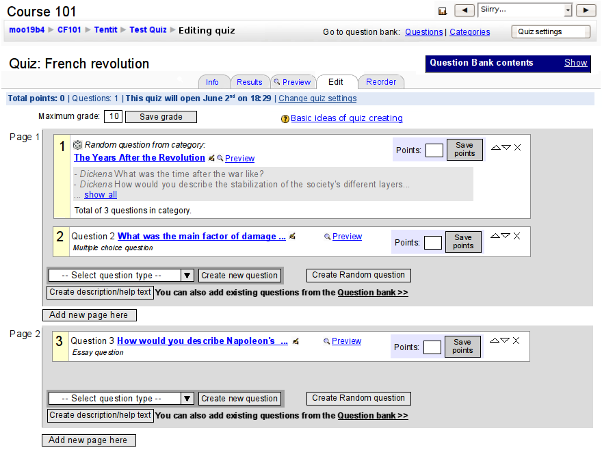
I will let the mockups speak for themselves :)
Background
In the end, I decided to take rather more of a conservative approach with the presentation of random questions, compared to the original prototype. That is, random questions are not edited in-place in the quiz, but instead a quick link is provided to display the questions in the question bank window.
The main reason for this conclusion was the fact that with in-place editing of even random questions, there was no way of communicating the relationship for multiple random questions from the same category in a quiz. That is, it would not be obvious enough to the user, whether or not when they edited something in a random question, the other random question would also change.
I am not completely satisfied with all the choices. Namely, there is still too much clutter, especially in the question bank window. Nevertheless, I decided that concistency with the old interface is important to the degree that all the old functionality should be preserved. There are two exceptions to this. Deleting questions, as well as moving question to another context or another category, have been removed in the exam view, since these are not directly related to exam editing, but are question bank operations.
This also will mean that the question bank view of the exam editing screen is separated from the independent question bank editing screen. In terms of communicating the information structures of the application to the user, I see this as a positive thing. While we preserve the functionality of the question bank that is needed when editing a quiz, we still use a minimal question bank contents -window that communicates the fact that the question bank is not an equal citizen when editing a quiz but a tool - albeit an important one - used for building the quiz. This is a clear enhancement compared to the old Quiz UI.
The design decision of whether or not to allow more direct, in-place editing of single question right in the quiz was a hard one. However, I did not see direct editing a crucial feature of the user interface, although it would make the interaction more seamless. Since it would introduce another mode in the UI and would potentially make editing of single questions inconsistent with editing random questions, I dropped that plan at this point. It will be however, if seen beneficial enough, straightforward to add it at a later point.
Work based on prototype testing
You can view the discovered issues, based on which UI conclusions were made, here: Quiz_UI_redesign_-_prototype_testing_report
The order of the tabs was untested, but I have seen people struggle with it. However, it was not changed before some concrete testing results show up, allowing to think about /how/ it should be changed. Facilitating the order of a most-often workflow of a user (create exam -> set order -> info (+ edit info) -> preview -> grade ) probably would not be a bad idea, but so far it is just guesses.
Also related to tabs, one of the test subjects had visible problems recognizing which tab is active, and s/he was frustrated since in the prototype it was impossible to swicth between tabs to find out. This is why in the prototypes, the background colour of the active tab is clear white, like the background of the rest of the page, and the backgrounds of the other tabs have been made significantly darker.
Work based on scenarios
The scenarios that were gathered during April and May have been taken into account in the new user interface to the extent I saw applicable. However, most of it turned out to be higher-level understanding that would onl be applicable after the functional requirement specs of the software were first changed; an excellent example of this is the various needs of different levels of metadata various users showed.
The status bar is one important addition I made which was supported by the scenarios interviews. It turned out that when a teacher creates exams/quizzes, it is for many a task that requires rather intense concentration. On the other hand, it also became clear that today's teaching world does not make it very easy for teachers to isolate long periods of concentrating just on quiz/exam creating.
Thus, the UI should support the teacher's memory: when a teacher gets interrupted, it should be as easy as possible to continue where they left of. That is, it needs to be visible at a glance what the exam's/quiz's current status is, and showing at least whether the exam is open and if not, when it will be (ans possibly, when it will close) is the bare minimum to reach for this. Ideas about what else might be wise to show in the status display, are welcomed.
What is interesting about the OOo-prototype tests is that although the instructions gave the users the idea that they need to create the questions into a category first and then add that category as a random question into an exam, all of them successfully created a random question with the "create random question" button.
Implementation
The dialogs require a greybox-style dialog. This amount of modality is widely accepted as the best way to do modal dialogs on the web, since they do not lock the entire browser window. Without javascript, the same dialog can be used as a new page, which, when submitted, is returned to the page from which the modal dialog was launched.