Navigation overhaul specification
| Renderer consistency | |
|---|---|
| Project state | Specification |
| Tracker issue | https://tracker.moodle.org/browse/MDL-45774 |
| Discussion | https://moodle.org/mod/forum/view.php?f=1161 |
| Assignee | Frédéric Massart, Jetha Chan |
Note: This page is a work-in-progress. Feedback and suggested improvements are welcome. Please join the discussion on moodle.org or use the page comments.
Navigation throughout Moodle is often confusing and needs some improvement. With this in mind, a specification has been prepared, defining what problems were identified and how they will be solved. Particular focus will be placed upon improving the experience of students, teachers, and users unfamiliar to Moodle.
What can be improved
Common complaints leveled at Moodle include:
- Unnecessary steep learning curve
- Features or options not being discovered
- General frustration - clunkiness, a certain je ne sais quoi
Sometimes when navigating from one place to another, the state of the tree in the navigation block completely changes. A good example of this is when going from a course to a module - upon arrival in a module, the Administration block will display a collapsed 'Course administration' node and a new expanded 'Module administration' node, as illustrated below.
Consistency should be improved here, as it is unlikely that a user unfamiliar with the system will understand sudden collapsing of or additional nodes.
Feature placement
It is our opinion that some navigation nodes contain things that you wouldn't expect, and don't contain things that you 'would expect. For example:
- 'My profile settings' contains 'Blogs', 'Badges' or 'Messaging'. These are not strictly related to your profile, they are related to your user account.
- What can be found under 'Site pages'?
- Notes
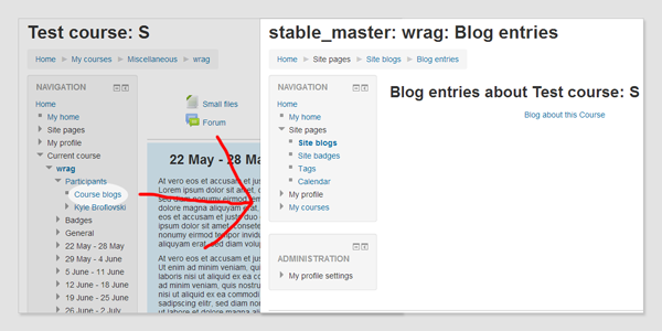
- In order to view Notes taken on a course level, I first need to click on 'Participants', and once the page is loaded I can see new entries in the navigation node 'Participants'. Why is this the case? Most users will not be aware of those links and will miss out on that feature, we feel.
Bad naming
Proper naming of the navigation helps the user remembering where to find what they are looking for. It also helps them to discover features that they would not otherwise be aware of, e.g. 'Calendar', hidden under 'Site pages'. If a user has no understanding of what 'Site pages' is, it is unlikely that they will expand it.
Another popular(?) example of bad naming is the link 'My grades' under 'Course administration' in the 'Administration' block. 'A student is not administrating anything, his grades are not a setting.'
Context jumps
The breadcrumb and navigation sometimes jump from one context to another. For instance, as a student when you click on 'Administration > Course administration > My grades', the navigation node on which you appear to be after clicking is 'Administration > Grade administration > User report'.
It is also possible for the user to jump from a course context to a site context, leaving the course (different breadcrumb, different navigation) without realising it and instantly feeling lost. A common reaction would be to use the 'Back' button of their browser to recover from it rather than trying to understand what happened. This behaviour can be observed when visiting someone's profile, viewing some reports, etc...
In order for users to feel comfortable and confident, and to not feel lost in Moodle's complex page hierarchy, we need to prevent situations where they feel lost and frustrated.
Overwhelming the user
Both the navigation block and the administration block can potentially have lots of nodes in them, resulting in what is popularly derided as the "scroll of death". We posit that a good navigation system should be simple and concise, and not necessarily contain the entire site map.
The goal
We seek to provide navigation that is:
- Simpler
- Intuitive
- Easy to learn
Leading to myriad benefits, including but not limited to:
- Efficiency
- Less trial and error when looking for something
- Common expectations being met
- Pages being found where you expect them to be
- A reduction in confusion and general frustration
- Less resistance
- New users feeling more confident using the product
Some risk does present itself; by changing large sections of the product, we risk alienating existing experienced Moodle users, frustrated at not finding pages where they used to be. On the other hand, re-learning the navigation should be straightforward, painless and at the very least easier than learning it the first time. User documentation will also suffer in the interim, as screenshots, navigation patterns and other training materials will have to be updated.
Rough ideas
The following is a list of ideas gathered from discussions and resources both internal and external to HQ:
- A student should be able to quickly access his courses, grades, settings, profile from a static place in the UI. This would remove the need for them to expand nodes in both the 'Navigation' block and the 'Administration' block.
- The different nodes of the 'Administration' block could be displayed on a 'Preferences' page.
- e.g. the 'Course administration' items could be listed on a page, each node being a title and each of its elements listed underneath. By moving administration settings to a single page, we obviate the need for the 'Administration' block entirely.
- A teacher should be able to quickly access the 'Options' of a course through a static node, the same way a user can access anything associated to his account.
- Similarly for modules, an easy dropdown to access module preferences and more frequently used options could be created.
- Breadcrumb-based navigation to reduce and perhaps entirely remove the the need for the nested and cumbersome Navigation block.
- This could be problematic in regards to creating problems with accessing site pages, or pages which do not clearly have a hierarchical position. This could be addressed by providing 'in context' links. For instance, adding a new block entry should be available from the Blog page.
- Providing a sitemap page to counter the lack of 'Navigation' block when something is not easily accessible.
- Ability to 'Star' some pages to quickly access favourites.
- Develop a 'Smart search' to easily access the content in the current course, other courses, etc… and the admin settings for admins.
- Populating my/ page with more useful content for the user itself.
- A new profile page on which is displayed the 'public' information of the user. Their forum interactions, their blog, their reports, ...
- Providing an API to modules to implement their own navigation, thus not required to inject links in the navigation block like 'Chat' is doing or 'Quiz' used to do (Results report). This navigation would be displayed in a standard fashion across modules. (Tabs like in wiki?)
- When hovering a user's name, a menu could appear with a few details and links to their profile, etc... (like Jira does).
Analysis of popular themes
Although most of those themes do not change anything about the navigation itself, a few have implemented a user menu. Usually displayed at the top most right of the screen, it contains links to quickly access user specific pages. The most common links are:
- View profile
- Edit profile
- Logout
Less popular links are:
- Calendar
- My private files
- My home
The solutions
To achieve our goal we have to remove the need for the administration and navigation blocks. This is a long process that needs to be broken down into sub-solutions. Some will need to be developed simultaneously to avoid half-baked temporary solutions. Those solutions can be split into two categories: 'User', and 'Course'.
User solutions:
- A user menu
- A user preferences page
- A new profile page
- Revisiting 'My home' page
Course solutions:
- Handling of course profiles
- A course 'Quick access' menu
- An administration page per module
- An administration page for the course
- Dedicated solution to access reports
- Alternative site and course navigation
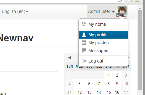
The user menu is a dropdown containing links to pages specific to user. They are context independent and will always point to the same pages. The user menu can always be found at the same place in the user interface and will contain the following links:
- My home
- My profile
- My grades
- Messages
- Logout
Benefits
- Gives quick and intuitive access to the user specific pages
- Trimming down 'Navigation > My profile'
- Emphasises the page 'My home'
User preferences page
A link to that page would be placed in the user menu. That page will contain most of what the user has control over on a site level. Their mailing preferences, changing their password, etc... but reorganised.
Benefits
- We can remove 'My profile settings' from the 'Administration' block.
- The settings are all reachable from one place.
- New pages will help the user understanding what settings they have control over.
A new profile page
By adding new content to the profile page, we can trim a bit more the navigation block. The profile page is supposed to contain anything you could find about a user, and there will be links to their blog, forum interactions, notes, to send them a message, etc...
We will keep the distinction between the full profile and the course profiles, at this stage we only improve the site profile because the course profiles need more thoughts and are tied to the course solutions.
Benefits
- Trimming down 'Navigation > My profile'
- Answering concerns of the 'User preferences page'
- Bonus: the profile page has a reason to be visited
Revisiting 'My home' page
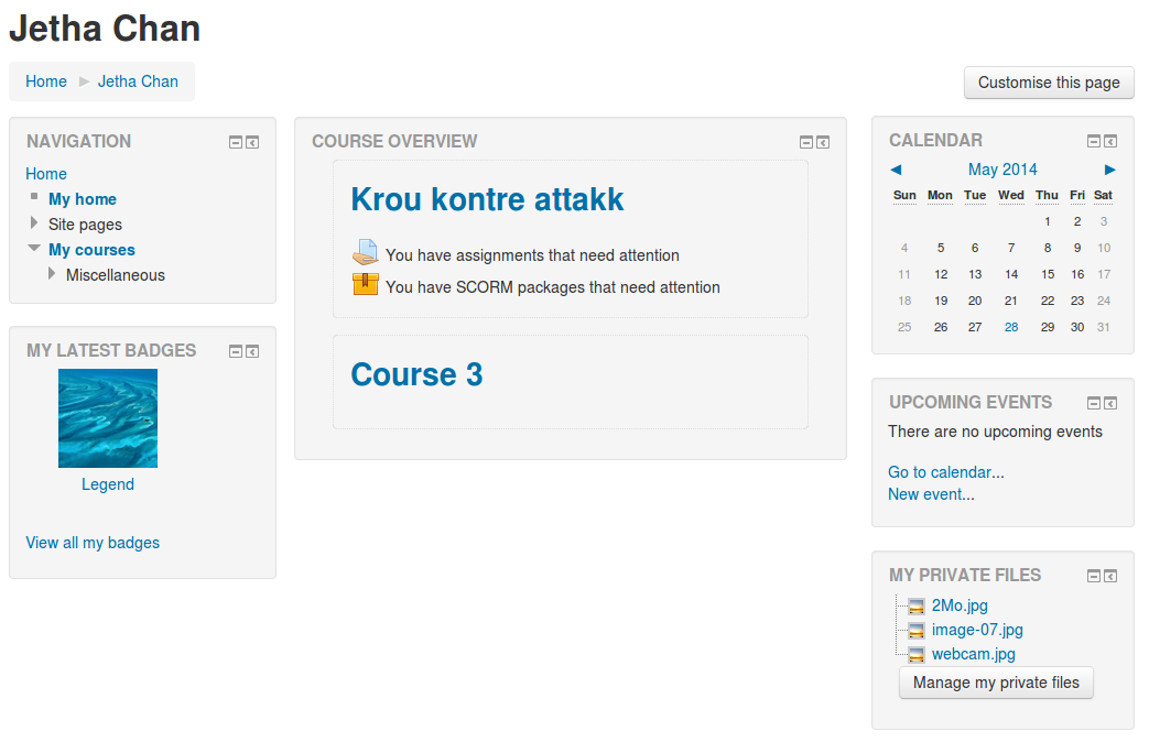
The My/ page is underused and does not contain enough valuable information for the users to visit it. We will update it to include more user-specific content. It will contain:
- My courses
- My private files
- The calendar and upcoming events
- My latest badges
Benefits
- Trimming down 'Navigation > My profile', at this point it should be empty
- Making the my/ page more interesting and valuable
Handling of course profiles
We need to remove the confusion between site and course profiles, only a few more informations should be available when viewing a 'Course profile', but we do not need an entirely different profile for that purpose. The course specific information will be accessible from the user profile, but be in the context of the site profile.
Benefits
- No more course profile pages
In order to remove the need for the nodes 'Participants' and 'Badges' from the 'Course' entry in the 'Navigation block', and the 'Grades' entry in the 'Course administration' node (for students), we will implement a new 'Quick access' menu for the course. This menu will be accessible on any page within a course, or module.
This menu will only contain links to the 3 entries mentioned above. If later on we add more links to that list, the additional (and less important) entries will be displayed in a dropdown, or a in a 'More' page.
A new grades page will be created for students to access their course grades.
It is important to keep the visible elements of this menu to a minimum. Not more than 3 elements should be displayed at a time. An exception can be made for users with more privileges who will see a 'Settings' (or 'Administration') link, and perhaps a 'Reports' one when we will work on them (see the following the other solutions below).
To unenrol yourself from a course, you would not look into the 'Course administration' node, you would rather find a link on 'My home' page next to the list of courses to unenrol yourself from them.
Benefits
- Trimming the navigation block
- Removing the 'Course administration' node for students
- Dedicated grades page for the students
- Quick access to the most important pages of a course
An administration page per module
The same way we would have a 'Preferences' page for the user, the administration page for the module would list everything that was originally in the 'Module administration' node, but reorganised to be more intuitive. A link to that page would be placed somewhere in the general UI.
Modules currently using the 'Adminstration' block to inject new pages into their module should be updated to provide a module navigation instead. It could be a list of links in the module page, or a module navigation such as tabs, this is probably tied to the solution 'Alternative site and course navigation'.
Benefits
- Intuitive access to all the module administration pages
- Self-contained and self-explanatory
- Removes the need for the 'Module administration' node
Concerns
- Potentially more clicks-to-destination
An administration page for the course
The same way we would have a 'Preferences' page for the user, the administration page for the course would list everything that was originally in the 'Course administration' node, but reorganised to be more intuitive. A link to that page will be added to the course 'Quick access' menu.
Benefits
- Intuitive access to all the course administration pages
- Self-contained and self-explanatory
- No more 'Course administration' node
Concerns
- Potentially more clicks-to-destination
- Reports would be accessible from that page until 'Dedicated solution to access reports' is implemented
Dedicated solution to access reports
Reports are the black sheep of the navigation, nobody agrees on where they should be and they are moved around every so often. Perhaps nobody agrees because they do not belong either in the navigation or the administration block.
Currently they are accessed from the 'Administration' block, and as we are moving the content of the block to administration pages, that is where they will end up. This is surely not better (perhaps even worse) than where they were before, so why not thinking once and for all where they should be.
/!\ Solution needed!

Idea: We could add a 'Report' menu to the course 'Quick access' menu
Goals
- Standardised way to access reports
- A navigation that does not jump somewhere else when viewing a report
Now that everything has been sorted out, we should now be able to remove the navigation block - but first we'll need to sort out how to navigate at both the site and course levels.
Site level It is envisaged that the frontpage would just be an entry point, with the navigation node 'Site pages' displayed in a block specific to those site pages. Upon leaving the context of the 'Site', you will be in a course; most users will not go back to the front page, except to find some information specific to their institution. To navigate between their courses, teachers and students could refer to their my/ page.
Alternatively, pages like 'Participants', 'Badges' or 'Tags' could be accessed from their context, for instance in a 'Online users' block which would link to 'All participants'. The same applies for 'Calendar', but is already the case because of its block.
Course level The site-level concept should disappear as soon as you get in a course; the student or teacher would then focus 100% on the course they are browsing rather than being distracted by site elements. This behavior is currently exhibited by the base and standard themes in 2.6 and before.
The course format will become responsible for most of the navigation in the course, allowing course formats to:
- Inject block(s) to navigate between sections
- Inject block(s) to navigate between modules
- Inject block(s) that does/do both of the above (very similar to the course node in the navigation block)
- Inject links 'Go to next activity', 'Go back to course', ... into module views.
The course format will also have control over the course 'Quick access' menu, in which it could inject/remove items if they wanted to.
The node 'Switch role' will be removed from the administration block, necessitating a 'Switch role' block to be added to the course to unlock that functionality. This block would only be displayed to users having the capabilities to switch role.
Future of the Administration block
At this point, the administration block will not be displayed to any user, except those users possessing elevated privileges. Administrators, managers or course creators will still have access to the administration block but it will only contain the 'Site administration' node.
Implementation details
User context
All the pages in a user context will have their own layout wherein the header includes the name of the user in a standardised way, along with some information and a link to message them, and their preferences if the logged in user has the capabilities to edit them. A renderer will be responsible for creating the header, and will use the user ID found from the context defined on that page.
The navigation within the context pages will be:
- For your own context
- Home > Your Name > Page you are on. Clicking on 'Your Name' will lead you to 'My home'.
- For other users' context
- Home > Users > User Name > Page you are on. Clicking on 'User Name' will lead you to their profile.
Rules
The user header contains very simplistic information about the user, and a few links to very common actions in regard to other users. For instance it can implement a link to send a message to the user, because you might want to be able to do that regardless of what user context page you are visiting. But, 'Edit profile' should not be in it, because it is only relevant to the profile. It is very important to keep the number of available actions to a minimum, because having too many options would defeat the purpose of the simplicity and efficiency it is trying to achieve.
The new user menu would be a new renderer, called from the layout files as it was the case for the login info renderer. The content of the user menu is fixed and not configurable, however it is possible to override the renderer from a theme to change its layout and content.
Design
Placed on the top right of the site, the name of the user is displayed next to a user icon. The dropdown is displayed when the user clicks the icon or the name. On smaller screens only a user icon is displayed, and expands to reveal its content. When expanded the name of the user logged in is displayed.
When the user is not logged in, a login link is displayed, regardless of the screen size.
My grades
The 'My grades' page will display the overall grades of the student in all their visible courses. The ordering can be changed, but the default would be alphabetical.
Login as
When logged in as someone else, the 'Logout' entry becomes 'Return to Admin User'.
Switch role
When the user role is switched, the 'Logout' entry becomes 'Return to my normal role'. And the name of the user is appended with the role they switch to, e.g. 'Admin User (teacher)'.
At this stage we could trim the navigation block, but we decide not to remove anything just yet as it would create more confusion: some nodes would accessible from the user menu, and others from the navigation block.
Rules
For it to be used, the user menu needs to be as short as possible and not being cluttered with additional links. It should contain what has been decided upon above, and not be changed - as users will acclimatise to it, adding and removing nodes should not be looked upon lightly. In any case, it should not contain more than 6 links, and should always contain:
- My home
- My profile
- Preferences
- Logout
These are very important to the user as they target user context-specific pages and nothing related to the site structure or the course. A link to 'My courses' would be redundant as this information should be covered in the 'My home' page.
A user preferences page
The preferences page is a list of links to sub-preferences page. The page will be generated from the navigation node 'My profile settings', though we will have to re-organise them so that each link belongs to a parent node. A link to the preferences page is added to the user menu.
Re-organisation
- User account
- Edit profile
- Account settings
- Change password
- Security keys
- Messaging
- Blogs
- Preferences
- External blogs
- Register an external blog
- Badges
- Manage my badges
- Preferences
- Backpack settings
The preferences page displays headings (the setting nodes) under which the links to the sub-pages will be displayed.
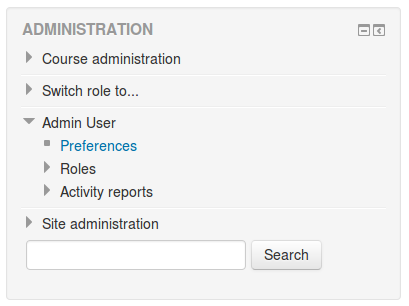
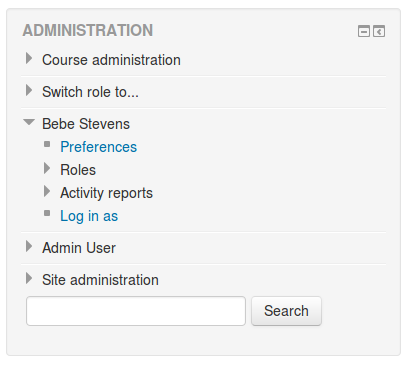
The nodes 'Roles' and 'Activity reports' will not be part of this page, because they are context based: they point to the course or site context depending on the page we are on. They will remain in the navigation block, but only when the user has the capability to view them. When the only node in the 'My profile settings' node is 'Preferences', then 'My profile settings' is not displayed. Here is an example when you have the capability to view the reports and roles.
Naming
The 'My profile settings' node becomes the name of the user: 'Frédéric Massart'. The 'Profile settings for Jetha Chan' becomes 'Jetha Chan'.
Breadcrumb
Each of the sub-pages should be checked to ensure that they are in the right hierarchy, the breadcrumb always looks like '(User context nav) > Preferences > Preference heading > Page I am on'.
Another user's preferences
The node 'Profile settings for User B' can be used to edit someone's settings. The content is similar to 'My profile settings', except that the node will always be displayed regardless of the presence of 'Roles' or 'Activity reports'. Currently there is no other way for a user with elevated privileges to access someone's preferences, but sooner or later the preferences will be accessible from their profiles.
Repositories
At present, repositories are configurable from the Navigation block - this is a good opportunity to move them to the 'Preferences' page.
Rules
Every link in this page should belong to a section, the sections are only headers that help the users finding what they are looking for. A plugin that adds user preferences related to its features should define a new heading and add its links to that heading. The heading is never clickable.
A new profile page
For now we will only be focussing on the site profile of the user. Later on, we will be solving the problems linked to the course context, for instances the links to 'Blog' or 'Forum interactions' automatically filtered to only display the blog posts in the course.
Content
The contact details will be displayed in such a way that they do not look like a list any more. For instance, everyone knows what an email address is, there is no need to prefix it with 'Email address:'.
The badges will be displayed on the profile too.
Links
- Edit profile (If this is your profile)
- Blog
- Forum interactions
- Notes (If you have the capability to)
- Preferences (If you have the capability to and are viewing someone's profile)
- Send a message
- Login as (If you have the capability to)
We can start trimming the node 'My profile' a bit, but some nodes will remain until we sort out the 'My' page. When doing so, it is important to make sure that the nodes 'Home > Some course > Participants > User B' still contain everything it does right now, because those links point to course-based pages, and would not be accessible otherwise.
Rules
The profile page contains everything about the user that is public. In other words, a content specific to the user should not be displayed on the profile at all, because it would never be accessible to another user, e.g. 'Private files'.
There are exceptions to this rule, badges for example. As a setting allows you to define whether or not your badges are on your profile, you might not be able to see them there, so they should be available on your dashboard.
For content controlled by permissions (and not preferences), they should remain on the profile. Take 'Blog' as an example, an administrator can prevent blog entries from another user to be accessed depending on your role. As the user does not have any information about the roles of the other users, the blog link is displayed on the profile, but other users will not see it. Having a blog block on the 'My home' page would not be useful because it simply duplicates the access points, for no apparent reason to the user.
Revisiting 'My home' page
We need to add more default blocks to the existing page, the different available blocks will be:
- My courses (already there)
- My private files (already there)
- The calendar
- Upcoming events
- My latest badges
We need to add a link to 'My latest badges' to the page listing all the badges.
We can now remove 'My profile' (or now called 'Jetha Chan') from the navigation block entirely. But it has to still be accessible under the node of a user in a course tree.
The node 'My courses' is also removed, users should be used to using their dashboard to access their courses.
Rules
The 'My home' page contains everything about a user that is private and not accessible to other users. For instance, your calendar events or your private files. The list of courses you are enrolled in are an exception, they could be displayed on the user profile, but because they are so important and need to be layed out in useful fashion, they will be part of the 'My home' page.
This page does not need to link to pages which are already accessible from the 'User menu', for instance the profile.
Course context
Pending
- Handling of course profiles
- An administration page per module
- An administration page for the course
- Accessing course grades for students
- Dedicated solution to access reports
- Alternative site and course navigation
- Checking for inconsistencies in the breadcrumb jumping from one place to another.
Roadmap
User context
- The user menu
- Implementing the user 'header' for user context pages
- The preferences page
- The new profile page
- Revisiting 'My home'
Course context
To be defined.
Related links
- Navigation experiment
- Navigation prototyping 2.7
- MDL-34838: Navigation inconsistencies
- Minimal by Moodlerooms
- Users’ personalised profiles


