Creating different custom menu bars for different courses: Creating different menu bars
This tutorials explains how to create different custom menu bars for different courses in a Moodle site
This level of technical knowledge is moderate to advanced, as the tutorial involves some previous knowledge of php and css.
Before starting this tutorial, you should be familiar with the following contents:
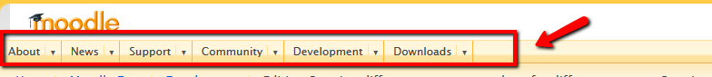
The custom menu bar is the horizontal bar displayed on top of the screen, usually after the Moodle logo:

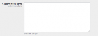
The name 'custom menu' bar comes from the fact that, in Moodle 2.0, the links displayed on that bar can be easily customised by the administrator of a Moodle site through the menu:
Appearance->Themes-> Theme settings and then, configuring the 'Custom menu items' box:

The links added in that box are used to created a custom menu object, which is a structured collection of custom_menu_item nodes that can be rendered by the core renderer. If you want a more technical explanation, the custom menu object is built according to the configuration of $CFG->custommenuitems, and custommenuitems take all the links added to that box.
Most of the Moodle sites use the same custom menu bar throughout the whole site, which means that the links added to the 'Custom menu items' box are displayed in ALL the courses. This is probably fine in most of the cases, however:
Wouldn't it be great if, within the same Moodle site, we could display different custom menu bar for different courses ?
Why would you want to do that?... Imagine, for instance, that you want to display different links in the custom menu bar for a specific course (or for a specific category in Moodle)
Moodle 2.0 includes a core theme -Afterburner - that supports their own 'Custom menu items' box, in addition to the general box in the Theme settings menu. This is because the theme Afterburner renders its on custom menu object by overriding the function render_custom_menu in /moodle/lib/outputrenderers. php. In plan English: Afterburner overrides the part of the code that tells Moodle how to build the custom menu items.
We can therefore use the same renderer that Afterburner uses in order to create a different custom menu bar for specific courses while using our own Moodle theme.
This is, step by step, the process that we are going to follow:
- Creating a child theme that inherits the CSS styles and pagelayout from our Moodle theme.
- Enable a specific 'Custom menu box' for our child theme
- Overriding the renderer custom_menu of the core renderer and using the same custom_menu renderer of Afterburner's
- Creating a menu.css file to display the custom menu items in our child theme
- Enabling Course themes in our Moodle site
- Selecting the child theme as the theme of those courses that require a different custom menu bar.
This is not the only way of doing it: alternatively, you could override the renderer custom menu in your Moodle theme and the child theme will inherit the renderer. However, for Moodle users who do not have an in-depth knowledge of how themes and renderers work, it is probably wiser not to mess around with the main theme and try the code modifications with a child theme.
The following sections explain each of the six steps in detail.
Creating a child theme
In order to create a child theme, just follow the same instructions that for creating a new theme, but you will not have to worry about the css files in:
child_theme/styles.
Make sure that the config.php file of your child theme includes the following lines:
$THEME->parents = array(
'parent theme', 'granparent theme','base');
The next step is to open the config.php file and add the following configuration option to it (at the bottom):
$THEME->rendererfactory = 'theme_overridden_renderer_factory';
If you are already using a custom renderer, you will already have this line.
And that is! Now we move on to extending the custom menu.
Notice: In addition to settings.php, it is a good practice that you also create your own version.php file for your child theme as specified at * Themes 2.0 creating your first theme
You need to create a file called 'settings.php' in the root folder of your child theme (i.e. /theme/child_theme/). Add the following code to settings.php:
<?php
/**
* Settings for the child theme
*/
defined('MOODLE_INTERNAL') || die;
if ($ADMIN->fulltree) {


$name = 'theme_child_theme/customcss';
$title = get_string('customcss','theme_child_theme');
$description = get_string('customcssdesc', 'theme_child_theme');
$setting = new admin_setting_configtextarea($name, $title, $description, );
$settings->add($setting);
 // Theme overrides custom menu setting...
   $name = 'theme_child_theme/custommenuitems';
   $title = get_string('custommenuitems', 'admin');
   $description = get_string('configcustommenuitems', 'admin');
   $default = ;
   $setting = new admin_setting_configtextarea($name, $title, $description, $default);
   $settings->add($setting);
}
?>
Remember to replace the string '_child_theme' with the name of your own child theme.
Since we are going to use the same renderer that the theme Afterburner uses, you need to copy the file renderers.php into your child theme root folder. Open renderers.php and replace the text string _afterburner_ with the name of your own child theme.
As we are overriding the renderer custom_menu in the child theme, we need to tweak a bit the layout files that the child theme has inherited from its parent theme. Layout files are kept in the folder /layout of the parent theme. The number of layout files depends on the theme that you are using. Open each of the layout files and replace the line:
$custommenu = $OUTPUT->custom_menu();
with the following code:
$custommenu = $OUTPUT->custom_menu($PAGE->theme->settings->custommenuitems);
$hascustommenu = (empty($PAGE->layout_options['nocustommenu']) && !empty($custommenu));
In Moodle 2.2, there is an extra step required so that the renderer in the child theme can work. You need to modify function custom_menu located in the file /moodle/lib/outputrenderers.php. By default the function custom_menu returns the custom menu as a string including the links that were added to the Administration > Appearance > Themes > Theme settings 'Custom menu item' box. We need to modify that function to allow that different strings can be passed. By defaul, the function custom_menu only looks for links at the general Theme settings 'Custom menu box'. It is now time to tell the function that, if the child theme supports its own 'Custom menu item' box, then use the links defined in that specific box in order to generate the custom menu string.
Open the file outputrenderers.php and replace the function:
public function custom_menu
with the following code:
public function custom_menu($custommenuitems = ) {
       global $CFG;
       if (empty($custommenuitems) && !empty($CFG->custommenuitems)) {
           $custommenuitems = $CFG->custommenuitems;
       }
       if (empty($custommenuitems)) {
           return ;
       }
       $custommenu = new custom_menu($custommenuitems, current_language());
       return $this->render_custom_menu($custommenu);
   }
We just follow the explanation provided at [https://tracker.moodle.org/browse/MDL-31043 MDL-31043] to change the code.
Note that tracker issue MDL-31043 has been fixed for Moodle 2.3 and above, so you do not have to change the content of outputrenderers.php for recent versions.
This step is probably the most difficult bit of this tutorial. If you have a look to the code of the file renderers.php which we have re-used from the theme Afterburner, you will notice that the custom menu nodes are now renderred in a different way that the core renderer that we have overridden does.
In particular, have a look at the function:
protected function render_custom_menu(custom_menu $menu)
This functions renders a custom menu object which does not make use of the YUI3 menunav widget that the original renderer used, and that means trouble. In plain English: it is very likely that the menu.css file that your child theme has inhereted from the parent theme (and that defines the appareance/style of the custom menu bar) is not working once the renderer is overridden.
The easiest solution is to import the menu.css file that Afterburner utilities and customize the css according to your main parent theme.The file is called afterburner_menu.css. You need to replace the style properties of the classes and id selectors listed in afterburner_menu.css with the properties of your own theme. This can be an overwhelming task if you do not master CSS.
In order to help you with that task, here a simplified menu.css template, based on afterburner_menu, that you can copy and complete adding the css properties of the custom menu bar in your main theme. Just replace the properties of the attributes hightlighted with the properties of your own theme:
- custommenu {
   width: 100%;
   margin: 0;
   padding: 0;
   clear:both;
   height: 25px; /*Replace this value with the height of your theme custom menu bar */
   background: #000000; /*Replace this value with the background color of your theme custom menu bar */
   margin:0;
}
- custommenu ul li {
 /
 border-right: 1px solid #ccc; /*replace this value with the border css of your theme custom menu bar */
    height: 25px; /*This fixed the height of all the items/nodes in the custom menu bar, if there is more than one navigation level (meaning, links preceded by -Moodle or --Moodle in the custom menu item box. In principle this value should be the same that the height of #custommenu, but you may want to increase the value depending on the amount of text in custom menu items */

     background: #000000;/*Replace this value with the background color of your theme custom menu bar */
}


/*
Dropdown Menu - MCG taken from afteburner_menu.css to generate the dropdown menu
*/
ul.dropdown span.customitem {
   padding:0;
   border:0;
   width: 100%;
 /*First region of the custom menu bar */
}
ul.dropdown span.customitem {
   padding:0;
   width: 100%;
}
ul.dropdown li a,
ul.dropdown span.customitem a {
padding:3px 20px; /* center the text in custom menu items */
/*Replace those values with the font properties of your theme's custom menu bar */
font-family:arial, helvetica, sans-serif;
font-size:90% ;
}
ul.dropdown span.customitem a:hover {
border: 0;
 background-color: #fff; /*Replace this value with the hover background color of your theme's custom menu bar */
}
- custommenu ul.dropdown ul {
   padding:0;
   width:auto;
}
- custommenu ul.dropdown ul a {
padding:4px 18px;
}
- custommenu ul.dropdown > li span a {
height:16px;
}
ul.dropdown,
ul.dropdown li,
ul.dropdown ul {
   list-style:none;
   margin:0;
   padding:0;
}
ul.dropdown {
   position:relative;
   top:0px;
   z-index:597;
   float:left;
}
ul.dropdown li {
   float:left;
   line-height:1.3em; /*This aligns the text within the custom menu item boxes */
   vertical-align:middle;

   zoom:1 !important;
}
ul.dropdown li.hover,
ul.dropdown li:hover {
   position:relative;
   z-index:599;
   cursor:default;
}
ul.dropdown ul {
   position:absolute;
   top:100%;z-index:598;
   left:0;
   right:auto;
   margin-top: -1px;
}
ul.dropdown ul li {
   float:none;
     background-color: #000000; /*default color for custom menu items with no children nodes(sub-navigation levels). Replace this property with your own color settings */
   border-width: 1px;
   border-style: solid;
     border-color: #fff; /*Color of the border between children nodes. Replace this property with your own color settings */
   padding:0;
}
ul.dropdown ul ul {
   top:0;
   right:auto;
   left:100%;
   margin-top:0;
   border-top:none;
   border-left:none;
   font-weight:normal;
}
ul.dropdown li:hover > ul {
visibility:visible;
 color: #fff; /*Color shown when hovering the custom menu item, replace it with your own color settings */
}
ul.dropdown span,
ul.dropdown span a,
ul.dropdown li.clickable-with-children > a {
   width:auto;
   padding:2px 6px 4px 20px;
 color: #fff;
/*color shown when the custom menu items have children or subnavigation nodes. Replace this color with your own color settings*/
}
ul.dropdown ul span,
ul.dropdown ul span a,
ul.dropdown ul li.clickable-with-children > a {
background-color:#000000; /* Color shown when the custom menu items have children or subnavigation nodes. Replace this color with your own color settings*/
background-image: url(submenu);
   background-position:100% 50%;
   background-repeat:no-repeat;
}
ul.dropdown ul ul span,
ul.dropdown ul ul span a,
ul.dropdown ul ul li.clickable-with-children > a {
background-color:#000000; /*MCG background colour of impares children*/
background-image: url(submenu);
   background-position:100% 50%;
   background-repeat:no-repeat;
}
ul.dropdown a:link, ul.dropdown a:visited {
     color: white; /*MCG font colour without hovering, for all levels */
   text-decoration: none;
 /*MCG play with margin-top here if you need to align the text vertically */
}


ul.dropdown a:hover { /*MCG this fixes the hover colours for navigation level menus with NO children */
   border:0;
   background-color: #fff;
   color: #036;
 cursor: pointer;
}
ul.dropdown ul ul li {
}
ul.dropdown ul ul ul li {
 /*MCG doesn't alter*/
}
ul.dropdown li a,
ul.dropdown span,
ul.dropdown span a {
border: none;
 /*MCG change colour of the first level of navigation , without hovering */
}
ul.dropdown ul li a,
ul.dropdown ul span,
ul.dropdown ul span a {
border: 0;
 /*MCG backgrounds colour of second level of navigation with children, without hovering */
}
ul.dropdown ul ul li a,
ul.dropdown ul ul span,
ul.dropdown ul ul span a {
border:0;
 /*MCG modifies the background colour of the third level of navigation, without hovering */
}
ul.dropdown ul ul ul li a,
ul.dropdown ul ul ul span,
ul.dropdown ul ul ul span a {
border:0;
 /*MCG modifies the background colour of the fourthlevel of navigation, without hovering */
}
ul.dropdown a,ul.dropdown span{
display:block; /*MCG display an element as a block */
}
ul.dropdown ul a {
width:200px; /*MCG xxx-yyy make this bigger or smaller so that the text of the different navigation levels can be displayed in one row */
padding:2px 0 4px 5px;
 /*fixes the width and padding of the different navigation level */
}
ul.dropdown ul a.open:hover {
background-color: #fff;}
/*MCG I want to keep original colours, as they are smarter than Aridhias */
ul.dropdown ul li:hover > span,
ul.dropdown ul li:hover > span a {
   background-color:#fff;
   background-image:url(menu/ab-arrowover);
   color: #036;
 cursor: pointer;
}
ul.dropdown li.clickable-with-children:hover > a {
background-image:url(menu/ab-arrowover);
 background-color:#fff;
color: #036;
cursor: pointer;
}
ul.dropdown *.open,
ul.dropdown li:hover > span,
ul.dropdown li:hover > span a {
 background-color:#fff;
   background-image:url(menu/ab-arrowover);
   color: #036;
 cursor: pointer;
}
ul.dropdown ul ul *.open,
ul.dropdown ul ul li:hover > span,
ul.dropdown ul ul li:hover > span a {
  background-color:#fff;
   background-image:url(menu/ab-arrowover);
   color: #036;
 cursor: pointer;
}