Standard themes
Standard themes
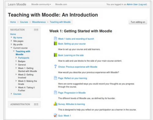
Moodle has two standard themes: Clean, a responsive, bootstrap based theme which is used as default, and More, a theme customisable from within the admin interface.
Other themes, including themes which were standard in previous versions of Moodle, are available from the Themes section of the Moodle plugins directory.
NOTE: If you were using a previous core theme or one based on a previous core theme and you are upgrading to Moodle 2.7, make sure you reinstall the relevant theme(s) before running the upgrade.
Theme selector
An administrator can set a theme for the site in Administration > Site administration > Appearance > Themes > Theme selector.
Different themes may be set according to 'device type' - default, legacy (for older browsers), mobile and tablet.
Go to Administration > Site administration > Appearance > Themes > Theme selector
- Click on the "Select theme" button next to the type you wish to change
- Scroll down to see the previews of the available themes and click on the "Use theme" button to chose the theme
- The next screen will provide information about the theme. Click "Continue"
Note 1: Moodle caches themes so if you don't immediately see changed settings that you were expecting, click the "Clear theme caches" button at the top of the Theme selector page.
Note 2: The selected theme may be overridden if user/course or category themes have been allowed in the Theme settings.
Customising the 'More' theme
The 'More' theme allows administrators to customise it from Site administration>Appearance>Themes>More.
Options are:
- Text colour/Link colour - these may be selected either by typing in the code or by clicking into the colour picker.
- Background colour/Background image - a background colour may be selected as above or an image of your choice uploaded. (Note: the image will override the background colour.)
- Background repeat/position/fixed - decide here how you wish your image to be repeated; its position or if you want it to be fixed to the page.
- Main content background colour/Secondary background colour - these may be selected either by typing in the code or by clicking into the colour picker. (The secondary background colour includes blocks and the navigation bar.)
- Invert navbar - checking this will swap the text and background colour of the navigation bar between black and white.
- Logo - a custom logo may be uploaded here
- Custom CSS/Footnote - custom CSS and footer text may be added and will be reflected throughout the site.
Pro tip: When specifying colours, you can even use advanced colours with transparency values such as rgba(255,255,255,0.8)
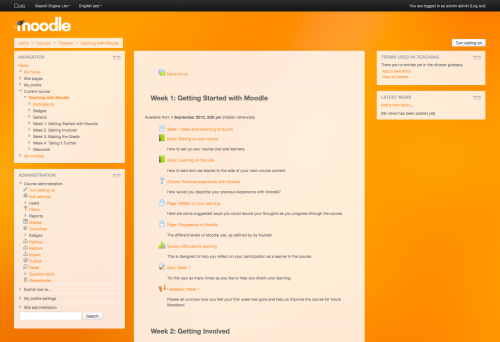
'More' with an orange image backound, a logo and custom colours.
Example of a customised More theme
The theme on the School demo site is based on settings from tracker MDLSITE-3095.
- Text colour: ##595959
- Link colour: #0070a8
- Background colour: #93abc3
- Background image bg6.png
- Background repeat: No repeat
- Background position: Left bottom
- Background fixed: Yes
- Main content background colour: #fff
- Secondary background colour: #fff
- Invert navbar: No
- Logo: None
- CUSTOM CSS:
body { background-size: cover; }
h1, h2, h3, h4, h5, h6 { color: #f98012;
font-weight: normal; }
#page-header h1 {
color: #fff;
font-weight: bold;
text-shadow: 0px 1px 1px rgba(0, 0, 0, 0.2); }
.block .header h2 {
color: #f98012;
font-weight: normal; }
#page-footer { color: #444; }
#page-footer a { color: #eee; }
See also
- Moodle HQ video on themes
- Theme credits
- Using Moodle What counts as a 'legacy' device type? forum discussion


