admin/setting/themesettingfordson: Difference between revisions
m (Add comment) |
|||
| Line 60: | Line 60: | ||
== Marketing Tiles == | == Marketing Tiles == | ||
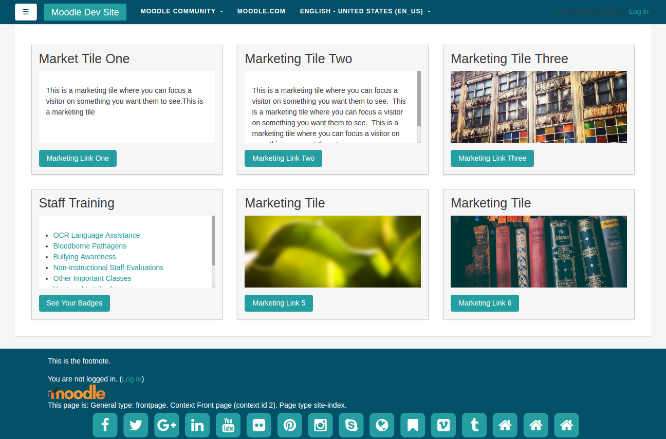
These have fixed heights, which means if the content is too big, you get nice scroll bars as in the 'Staff courses' below. | |||
[[File:marketingtiles.png]] | [[File:marketingtiles.png]] | ||
Revision as of 06:12, 23 December 2016
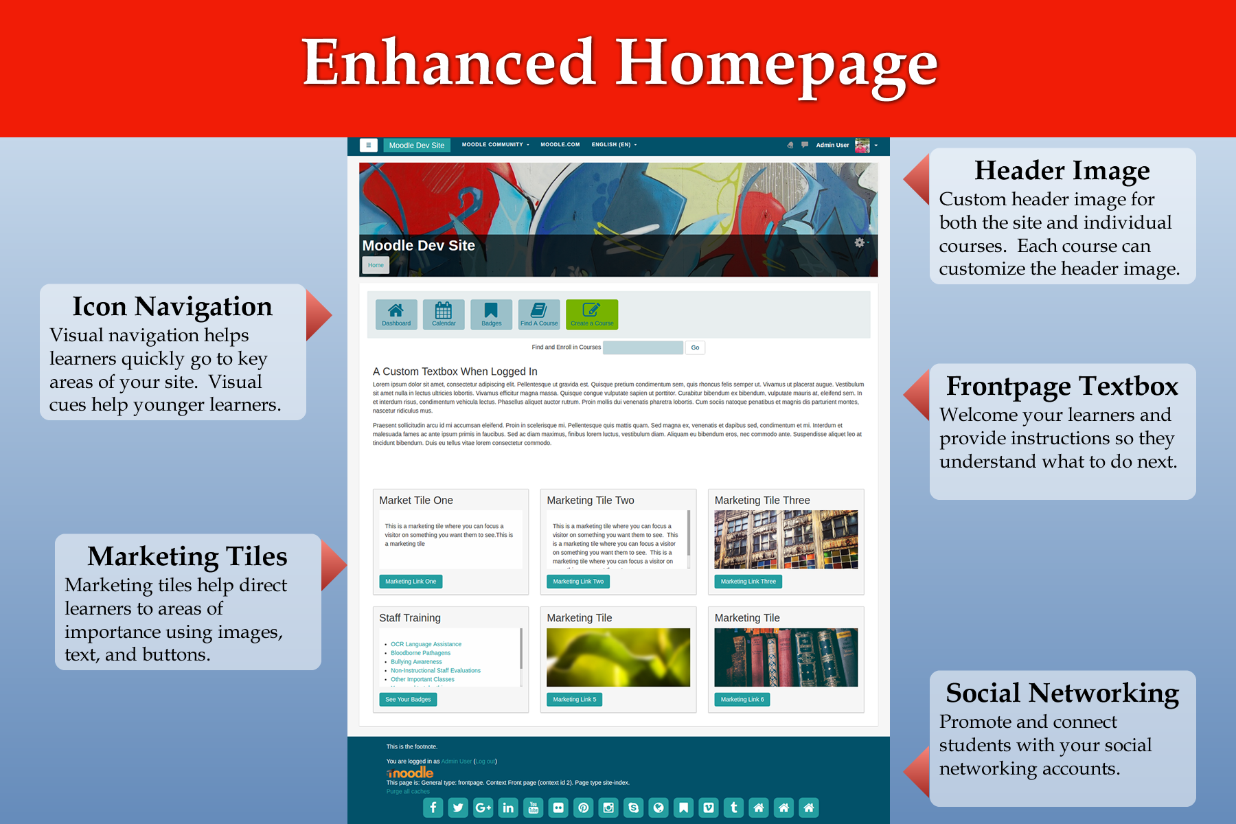
Fordson is a child theme of Boost. It features an enhanced homepage, color choosers for all major elements of the page, preset support, custom header images for both courses and the main site. There are seven pages for Fordson: Presets, Colours, Heading and Course Image Settings, Content Areas, Social Networking, Icon Navigation, and Marketing Tiles. This page will cover each of these pages.
Presets
Fordson Preset Tab
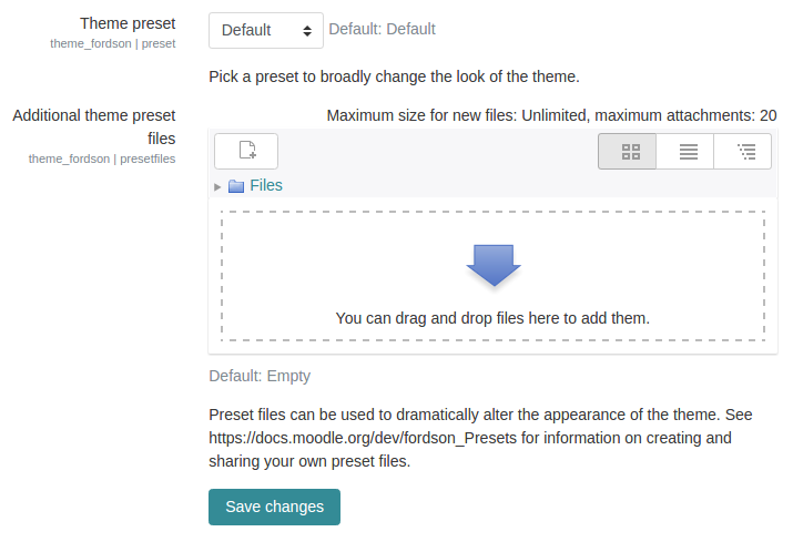
Choose from several included presets or upload your own. The Fordson theme has several elements in the layout which are not included with the default Boost theme. These elements are included in the SCSS folder in the styles.scss file. This ensures that basic styling for marketing tiles, icon navigation, and other elements will carry over when using other presets. A listing of these changes should be included here.
Colours
Fordson Colours Tab
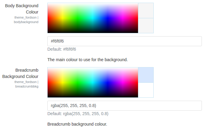
The colours tab allows you to quickly change the look of the major elements of the page. Text, links, background colors are all included. Along with this, some standard bootstrap elements common to presets are also included. Once you upload a preset you most likely can alter some of the colors using the Fordson Colour tab.
It is recommended you remove all color settings when exploring presets so that the Fordson color choosers do not alter the preset styles.
Heading and Course Image Settings
Fordson Heading and Course Image Settings Tab
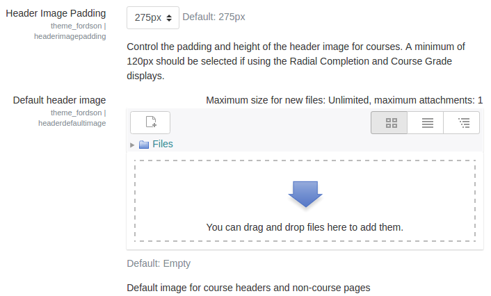
Upload a default header image, body background image, and/or login image. The default header image is used at the top of every page. The height of the header can be set using the dropdown setting. If a teacher uploads an image file to their course summary files area then it will replace the default image for that course. This allows teachers to customize their course without having to use a new theme.
Content Areas
Fordson Content Areas
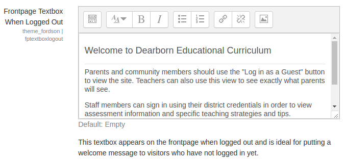
There are four areas for custom content: Frontpage Logged in Textbox, Frontpage Logged Out Textbox, Alert, and Footnote. Using the frontpage textboxes you can provide a message or instructions for visitors based on whether they are authenticated or just visiting. The alert box is useful for maintenance or other notices that users must see. The alert message appears on the site homepage just below the icon navigation area. The footnote appears in the footer of the page.
Social Networking
Fordson Icon Navigation Tab
The icon navigation is a unique navigation used in our themes. It is a great way to quickly get learners into main areas of your site. The icons, button, text, and color help draw attention to this style of navigation. There are three settings for each icon and you can create up to eight icons in total. The first element to creating an icon button is the actual icon which comes from Font-Awesome. Use any of these icons found here: http://fontawesome.io/cheatsheet/ just remember to remove the "fa-". Next enter in text which will appear below the icon. Try to keep it to one or two words. Finally, you must provide a link. It can be a link to anywhere. You can link to anywhere including outside websites just enter the proper URL. If your Moodle site is in a subdirectory the default URL will not work. Please adjust the URL to reflect the subdirectory. Example if "moodle" was your subdirectory folder then the URL would need to be changed to /moodle/my/.
In addition to the 8 icons there are two special icons: Course Creator Button and Slide Icon Button. The course creator button will appear when a user has the capability to create courses. If you use LDAP you can make all staff members "Course Creators" when they login to Moodle. If this is the case, this button will appear for them and quickly help them begin creating a new course. The slide icon button is a toggle button that will either show or hide a custom textbox. When pressed, the slide textbox reveals itself by sliding down from the icon navigation bar. This is ideal for featured courses, staff trainings, and other helpful information.
Marketing Tiles
These have fixed heights, which means if the content is too big, you get nice scroll bars as in the 'Staff courses' below.
