Adaptable theme: Difference between revisions
(→Screenshots: tweaked) |
m (Update details) |
||
| (3 intermediate revisions by one other user not shown) | |||
| Line 3: | Line 3: | ||
|type = Theme | |type = Theme | ||
|entry = https://moodle.org/plugins/theme_adaptable | |entry = https://moodle.org/plugins/theme_adaptable | ||
|tracker = https:// | |tracker = https://gitlab.com/jezhops/moodle-theme_adaptable/-/issues | ||
|discussion = https://moodle.org/mod/forum/ | |discussion = [https://moodle.org/mod/forum/view.php?id=46 Themes Forum] | ||
|maintainer = [[User:Jez H|Jez H]] | |maintainer = [[User:Jez H|Jez H]], [[User:Gareth_Barnard|G Barnard]] | ||
|float = right | |float = right | ||
}} | }} | ||
This is a [[:Category:Contributed_code|contributed (third party)]] highly customisable two column theme designed to work in a range of different situations. It is based on the popular [https://moodle.org/plugins/theme_bcu BCU theme]. '''Adaptable has all the features of BCU''' along with many new features. | This is a [[:Category:Contributed_code|contributed (third party)]] highly customisable two column theme designed to work in a range of different situations. It is based on the popular [https://moodle.org/plugins/theme_bcu BCU theme]. '''Adaptable has all the features of BCU''' along with many new features. | ||
==Features== | ==Features== | ||
'''Layout Builders!''' You can now define a custom layout in the admin settings for: | '''Layout Builders!''' You can now define a custom layout in the admin settings for: | ||
* Block Regions (drag and drop) | * Block Regions (drag and drop) | ||
* Marketing Blocks | * Marketing Blocks | ||
| Line 37: | Line 35: | ||
* [https://en.wikipedia.org/wiki/Favicon Favicon] uploader | * [https://en.wikipedia.org/wiki/Favicon Favicon] uploader | ||
* Background image uploader | * Background image uploader | ||
In addition, many fields (menus, news items, alerts and help links) can be targeted using custom profile fields, thus it is possible to present different users with different navigation items and notices. | In addition, many fields (menus, news items, alerts and help links) can be targeted using custom profile fields, thus it is possible to present different users with different navigation items and notices. | ||
It is also possible for individual users to customise where they want top menu navigation to appear (disable, [[My home|home pages]] only, sitewide) using custom profile fields. | It is also possible for individual users to customise where they want top menu navigation to appear (disable, [[My home|home pages]] only, sitewide) using custom profile fields. | ||
==Demo Video== | ==Demo Video== | ||
[https://youtu.be/7bSDmp_gYqw YouTube video] | [https://youtu.be/7bSDmp_gYqw YouTube video] | ||
==Demo site== | ==Demo site== | ||
[http://3-bits.com/demo/adaptable/ http://3-bits.com/demo/adaptable/] | [http://3-bits.com/demo/adaptable/ http://3-bits.com/demo/adaptable/] | ||
==Screenshots== | ==Screenshots== | ||
<gallery mode=packed heights=300px style="text-align:left"> | <gallery mode=packed heights=300px style="text-align:left"> | ||
File: adaptable_layout.png|Adaptable theme layout | |||
File:adaptable-select.png|Adaptable select | File:adaptable-select.png|Adaptable select | ||
File:adaptable-front-page.png|adaptable-front-page | File:adaptable-front-page.png|adaptable-front-page | ||
| Line 60: | Line 54: | ||
File:adaptable-mobile-social-on.PNG|adaptable-mobile-social-on | File:adaptable-mobile-social-on.PNG|adaptable-mobile-social-on | ||
</gallery> | </gallery> | ||
==Download== | ==Download== | ||
From the [https://moodle.org/plugins/theme_adaptable Moodle plugins database]. | From the [https://moodle.org/plugins/theme_adaptable Moodle plugins database]. | ||
==Installation== | ==Installation== | ||
There are several ways to install the Adaptable theme. | There are several ways to install the Adaptable theme. | ||
* Review [[Installing_plugins#Installing_a_plugin]] Plugin installation section | * Review [[Installing_plugins#Installing_a_plugin]] Plugin installation section | ||
* Make sure the Adaptable theme is compatible with your Moodle version | * Make sure the Adaptable theme is compatible with your Moodle version | ||
* After installing the Adaptable theme, [[Installing_a_new_theme|change the site theme]] on one or more devices to the Adaptable theme | * After installing the Adaptable theme, [[Installing_a_new_theme|change the site theme]] on one or more devices to the Adaptable theme | ||
==Configuration== | ==Configuration== | ||
Adaptable has a lot of settings and may seem daunting at first, our advice is to simply install with the default settings and play with it afterwards. | Adaptable has a lot of settings and may seem daunting at first, our advice is to simply install with the default settings and play with it afterwards. | ||
| Line 75: | Line 66: | ||
With a little time you should be able to setup an attractive Moodle site with a high degree of individuality without knowing any CSS. | With a little time you should be able to setup an attractive Moodle site with a high degree of individuality without knowing any CSS. | ||
You can work on configuring the theme without it being live on your site | You can work on configuring the theme without it being live on your site by putting ''theme=adaptable'' or ''theme=clean'' into the URL. See [[Allow theme change by URL]]. | ||
==Theme settings that will be linked to by 'Moodle Docs for this page'== | ==Theme settings that will be linked to by 'Moodle Docs for this page'== | ||
===Colours=== | ===Colours=== | ||
You can select the colours that you would like to use throughout the theme. Use [https://en.wikipedia.org/wiki/Web_colors Hexadecimal color notation] or any other standard notation. As an alternate option you can use transparent and inherited as a value | You can select the colours that you would like to use throughout the theme. Use [https://en.wikipedia.org/wiki/Web_colors Hexadecimal color notation] or any other standard notation. As an alternate option you can use transparent and inherited as a value | ||
===Fonts=== | ===Fonts=== | ||
You can select the [https://en.wikipedia.org/wiki/Google_Fonts Google Fonts] that you would like to use throughout the theme. Select the subset needed (latin is always included) and enter the right font weight or the font will not displayed. | You can select the [https://en.wikipedia.org/wiki/Google_Fonts Google Fonts] that you would like to use throughout the theme. Select the subset needed (latin is always included) and enter the right font weight or the font will not displayed. | ||
===Buttons=== | ===Buttons=== | ||
Alter the appearance of buttons used in this theme. Configure as needed. | Alter the appearance of buttons used in this theme. Configure as needed. | ||
===Header=== | ===Header=== | ||
* Customize the header of this theme. | * Customize the header of this theme. | ||
* Upload your [https://en.wikipedia.org/wiki/Favicon favicon], logo, set login form in header, adjust titles in header. | * Upload your [https://en.wikipedia.org/wiki/Favicon favicon], logo, set login form in header, adjust titles in header. | ||
* You can set font size and styles for titles in the "fonts" settings page. | * You can set font size and styles for titles in the "fonts" settings page. | ||
===Header Menus=== | ===Header Menus=== | ||
* Tools Menus (in navbar) and Top Menus (upper header) can be restricted based on custom profile fields (optional). | * Tools Menus (in navbar) and Top Menus (upper header) can be restricted based on custom profile fields (optional). | ||
| Line 103: | Line 88: | ||
--German Moodle Docs|http://docs.moodle.org/de | --German Moodle Docs|http://docs.moodle.org/de | ||
Moodle.com|http://moodle.com/ | Moodle.com|http://moodle.com/ | ||
* General settings for Top Menu visibility | * General settings for Top Menu visibility | ||
** These settings allow you to control where menus appear and optionally allow users to customise their settings | ** These settings allow you to control where menus appear and optionally allow users to customise their settings | ||
===Header User=== | ===Header User=== | ||
Allows you to control all of the elements that appear in the user navigation dropdown. | Allows you to control all of the elements that appear in the user navigation dropdown. | ||
===Header Social=== | ===Header Social=== | ||
* You can disable the sitewide search box and enable social icons / links in its place. | * You can disable the sitewide search box and enable social icons / links in its place. | ||
| Line 115: | Line 97: | ||
* This should be in the format: | * This should be in the format: | ||
url|title|icon | url|title|icon | ||
** For example: | ** For example: | ||
http://localhost/moodle/course/search.php|Search Moodle|fa-search | http://localhost/moodle/course/search.php|Search Moodle|fa-search | ||
| Line 121: | Line 102: | ||
http://twitter.com/|Twitter|fa-twitter-square | http://twitter.com/|Twitter|fa-twitter-square | ||
http://instagram.com|Instagram|fa-instagram | http://instagram.com|Instagram|fa-instagram | ||
* For reference you can find the full [http://fortawesome.github.io/Font-Awesome/icons/ list of Font Awesome Icons Here] | * For reference you can find the full [http://fortawesome.github.io/Font-Awesome/icons/ list of Font Awesome Icons Here] | ||
===Header Navbar=== | ===Header Navbar=== | ||
... customize as needed ... | ... customize as needed ... | ||
===Header Tools Menu=== | ===Header Tools Menu=== | ||
... customize as needed ... | ... customize as needed ... | ||
===Block Settings=== | ===Block Settings=== | ||
... customize as needed ... | ... customize as needed ... | ||
===Block Region Builder=== | ===Block Region Builder=== | ||
* You can build your own layout for block regions on the [[Front page]]. | * You can build your own layout for block regions on the [[Front page]]. | ||
* To add content these regions you will need to [[Turn editing on]] on the [[Front page]] of Moodle. | * To add content these regions you will need to [[Turn editing on]] on the [[Front page]] of Moodle. | ||
* Then you can begin to drag/drop blocks into the regions you create! | * Then you can begin to drag/drop blocks into the regions you create! | ||
===Course Sections=== | ===Course Sections=== | ||
... customize as needed ... | ... customize as needed ... | ||
===Marketing Blocks=== | ===Marketing Blocks=== | ||
* There are two full width info boxes witht differing styles you can use. | * There are two full width info boxes witht differing styles you can use. | ||
* In addition to this there is a layout builder, allowing you to decide how many blocks you need and define your own layout. | * In addition to this there is a layout builder, allowing you to decide how many blocks you need and define your own layout. | ||
* Please see the README file that comes with this theme. | * Please see the README file that comes with this theme. | ||
===Front page Courses=== | ===Front page Courses=== | ||
Configure the way that the course boxes are rendered on the [[Front page]]. | Configure the way that the course boxes are rendered on the [[Front page]]. | ||
===Frontpage Ticker=== | ===Frontpage Ticker=== | ||
* Here you can set a news ticker to run across the [[Front page]] of your Moodle site. | * Here you can set a news ticker to run across the [[Front page]] of your Moodle site. | ||
| Line 155: | Line 127: | ||
* Note: you must not put ul tags around our list, only li. Moodles [[Text editor]] tends to add ul tags. | * Note: you must not put ul tags around our list, only li. Moodles [[Text editor]] tends to add ul tags. | ||
* If your ticker does not load properly, switch to [[HTML]] view and ensure you have only li tags: | * If your ticker does not load properly, switch to [[HTML]] view and ensure you have only li tags: | ||
<code php> | <code php> | ||
<li>News item one.....</li> | |||
<li>News item two.....</li> | |||
</code> | </code> | ||
===Frontpage Slider=== | ===Frontpage Slider=== | ||
* Upload the images, add the links and description for the carousel on the [[Front page]]. | * Upload the images, add the links and description for the carousel on the [[Front page]]. | ||
* Sample [[HTML]] for Slider Captions: | * Sample [[HTML]] for Slider Captions: | ||
<code php> | <code php> | ||
<div class="span6 col-sm-6"> | <div class="span6 col-sm-6"> | ||
| Line 170: | Line 139: | ||
<a href="#" class="submit">Please favorite our theme!</a> | <a href="#" class="submit">Please favorite our theme!</a> | ||
</code> | </code> | ||
===Alert Box=== | ===Alert Box=== | ||
* Enter and customize a text to be displayed in the top of the site as an alert. | * Enter and customize a text to be displayed in the top of the site as an alert. | ||
* It is possible to set more than one alert to target different user types. | * It is possible to set more than one alert to target different user types. | ||
* You also have the option of showing alerts sitewide or on [[My home|homepages]] only. | * You also have the option of showing alerts sitewide or on [[My home|homepages]] only. | ||
===Layout=== | ===Layout=== | ||
Set the default layout that users see. | Set the default layout that users see. | ||
===Footer=== | ===Footer=== | ||
Set the content that should appear in the footer | Set the content that should appear in the footer | ||
===Mobile Settings=== | ===Mobile Settings=== | ||
Control how your site looks on mobile devices | Control how your site looks on mobile devices | ||
===Social Wall=== | ===Social Wall=== | ||
Customise the appearance of the [https://moodle.org/plugins/format_socialwall Social Wall Course Format] (if in use on your site) | Customise the appearance of the [https://moodle.org/plugins/format_socialwall Social Wall Course Format] (if in use on your site) | ||
===Custom CSS & JS=== | ===Custom CSS & JS=== | ||
Here you can find various settings to add your own [[CSS]] and [https://en.wikipedia.org/wiki/JavaScript JavaScript] code to the theme. | Here you can find various settings to add your own [[CSS]] and [https://en.wikipedia.org/wiki/JavaScript JavaScript] code to the theme. | ||
===Analytics=== | ===Analytics=== | ||
You can setup multiple codes for [https://en.wikipedia.org/wiki/Google_Analytics Google Analytics] and targed them to user profile fields. | You can setup multiple codes for [https://en.wikipedia.org/wiki/Google_Analytics Google Analytics] and targed them to user profile fields. | ||
==Migration from BCU to Adaptable== | ==Migration from BCU to Adaptable== | ||
Advice on migrating from BCU to Adaptable can be found [https://moodle.org/mod/forum/discuss.php?d=326470 here] | Advice on migrating from BCU to Adaptable can be found [https://moodle.org/mod/forum/discuss.php?d=326470 here] | ||
==[[HTML]] code for settings and block areas== | ==[[HTML]] code for settings and block areas== | ||
Here you will find some code samples to help you to customize the Info Box and the Marketing Blocks | Here you will find some code samples to help you to customize the Info Box and the Marketing Blocks | ||
| Line 213: | Line 171: | ||
There are two possible slider styles each with different markup required: | There are two possible slider styles each with different markup required: | ||
====Original BCU Slider Markup==== | ====Original BCU Slider Markup==== | ||
<code css> | <code css> | ||
<div class="span9"> | |||
<h4>Information</h4> | |||
Lorem ipsum dolor sit amet, consectetur adipisicing elit, sed do eiusmod tempor incididunt ut labore | Lorem ipsum dolor sit amet, consectetur adipisicing elit, sed do eiusmod tempor incididunt ut labore | ||
et dolore magna aliqua. Ut enim ad minim veniam, quis nostrud exercitation ullamco laboris nisi ut aliquip | et dolore magna aliqua. Ut enim ad minim veniam, quis nostrud exercitation ullamco laboris nisi ut aliquip | ||
ex ea commodo consequat. Duis aute irure dolor in reprehenderit in voluptate velit esse cillum dolore eu fugiat nulla pariatur. | ex ea commodo consequat. Duis aute irure dolor in reprehenderit in voluptate velit esse cillum dolore eu fugiat nulla pariatur. | ||
</div> | |||
<div class="span3"> | |||
<a href="#" class="submit">2013/14 Courses <i class="fa-chevron-right fa"></i></a> | <a href="#" class="submit">2013/14 Courses <i class="fa-chevron-right fa"></i></a> | ||
</div> | |||
</code> | </code> | ||
====Coventry Style Slider Markup==== | ====Coventry Style Slider Markup==== | ||
<code css> | <code css> | ||
<div class="span6 col-sm-6"> | <div class="span6 col-sm-6"> | ||
| Line 240: | Line 190: | ||
</div> | </div> | ||
</code> | </code> | ||
===Frontpage Marketing Block HTML structure Coventry=== | ===Frontpage Marketing Block HTML structure Coventry=== | ||
<code css> | <code css> | ||
<div><img src="http://somewebsite.com/2.jpg" class="marketimage"></div> | <div><img src="http://somewebsite.com/2.jpg" class="marketimage"></div> | ||
| Line 248: | Line 196: | ||
<p>Some text below the link....</p> | <p>Some text below the link....</p> | ||
</code> | </code> | ||
===Front page Info Block=== | ===Front page Info Block=== | ||
There are two Info blocks in the frontpage located above and below the Marketing Blocks. See pix/layout.png | There are two Info blocks in the frontpage located above and below the Marketing Blocks. See pix/layout.png | ||
| Line 257: | Line 203: | ||
<code css> | <code css> | ||
<div style="text-align:center; background: #f0f0f0;"> | <div style="text-align:center; background: #f0f0f0;"> | ||
<h3 style="text-align: center;">Add your text here</h3> | |||
</div> | </div> | ||
</code> | </code> | ||
===Simple box with solid background colour, default heading h3 and white text colour=== | ===Simple box with solid background colour, default heading h3 and white text colour=== | ||
<code css> | <code css> | ||
<div style="text-align:center; background: #009688; color: #ffffff;"> | <div style="text-align:center; background: #009688; color: #ffffff;"> | ||
<h3 style="text-align: center;">Add your text here</h3> | |||
</div> | </div> | ||
</code> | </code> | ||
===Front Page Secondary Info Block Example=== | ===Front Page Secondary Info Block Example=== | ||
| Line 275: | Line 219: | ||
<code css> | <code css> | ||
<div class="span2 personpic"> | <div class="span2 personpic"> | ||
<div id="person" class="spn5"> | |||
<img src="/urltoanimage.jpg" alt="person"> | <img src="/urltoanimage.jpg" alt="person"> | ||
</div> | </div> | ||
</div> | |||
<div class="span10"> | <div class="span10"> | ||
<h4>School of Jewelry</h4> | |||
Lorem ipsum dolor sit amet, consectetur adipisicing elit, sed do eiusmod tempor incididunt ut labore et dolore magna aliqua. | Lorem ipsum dolor sit amet, consectetur adipisicing elit, sed do eiusmod tempor incididunt ut labore et dolore magna aliqua. | ||
Ut enim ad minim veniam, quis nostrud exercitation ullamco laboris nisi ut aliquip ex ea commodo consequat. | Ut enim ad minim veniam, quis nostrud exercitation ullamco laboris nisi ut aliquip ex ea commodo consequat. | ||
| Line 288: | Line 231: | ||
</div> | </div> | ||
</code> | </code> | ||
===Frontpage Marketing Block HTML=== | ===Frontpage Marketing Block HTML=== | ||
You can add up to 12 Marketing Blocks in the [[Front page]]. | You can add up to 12 Marketing Blocks in the [[Front page]]. | ||
The blocks are located automatically in rows, with a maximum of 4 blocks per row. | The blocks are located automatically in rows, with a maximum of 4 blocks per row. | ||
The full width is divided equally between the blocks. | The full width is divided equally between the blocks. | ||
===Simple Block with white background and Font Awesome icon. Using the default text colour and h3 heading=== | ===Simple Block with white background and Font Awesome icon. Using the default text colour and h3 heading=== | ||
<code css> | <code css> | ||
<div style="text-align:center; background: #ffffff; height: 240px; padding: 7px;"> | <div style="text-align:center; background: #ffffff; height: 240px; padding: 7px;"> | ||
<i class="fa fa-font fa-5x"></i> | <i class="fa fa-font fa-5x"></i> | ||
<h3 style="color: #333333;">TITLE</h3> | |||
<div style="text-align:center;">Add your text here</div> | |||
</div> | </div> | ||
</code> | </code> | ||
===Block with solid background colour, white text colour and Font Awesome icon=== | ===Block with solid background colour, white text colour and Font Awesome icon=== | ||
<code css> | <code css> | ||
<div style="text-align:center; background: #4b4b4b; color: #ffffff; height: 240px; padding: 7px;"> | <div style="text-align:center; background: #4b4b4b; color: #ffffff; height: 240px; padding: 7px;"> | ||
<i class="fa fa-th fa-5x"></i> | <i class="fa fa-th fa-5x"></i> | ||
<h3 style="color: #ffffff;">TITLE</h3> | |||
<div style="text-align:center; padding: 5px;">Add your text here</div> | |||
</div> | </div> | ||
</code> | </code> | ||
===Block with solid background, white text colour and text aligned vertically (useful for blocks 100% wide)=== | ===Block with solid background, white text colour and text aligned vertically (useful for blocks 100% wide)=== | ||
<code css> | <code css> | ||
<div style="background: #c2185b; height: 120px;"> | <div style="background: #c2185b; height: 120px;"> | ||
<h1 style="line-height: 120px; color: #ffffff; text-align: center; "><b>moodle 3.0 ready !!!</b></h1> | |||
</div> | </div> | ||
</code> | </code> | ||
===Footer Blocks=== | ===Footer Blocks=== | ||
Contact information | Contact information | ||
<code css> | <code css> | ||
<i class="fa fa-building"></i> | <i class="fa fa-building"></i> High St. 100<br> | ||
<span style="margin-left: 20px;">123456 City</span><br><br> | <span style="margin-left: 20px;">123456 City</span><br><br> | ||
<i class="fa fa-phone"></i> +12 (3)456 78 90<br> | <i class="fa fa-phone"></i> +12 (3)456 78 90<br> | ||
| Line 334: | Line 270: | ||
<code css> | <code css> | ||
<ul class="block-list white"> | <ul class="block-list white"> | ||
<li><a href="http://moodle.org/"><span class="icon-right-open-mini"></span><span>Accessibility</span></a></li> | |||
<li><a href="http://moodle.org/"><span class="icon-right-open-mini"></span><span>Moodle Help</span></a></li> | |||
<li><a href="http://moodle.org/"><span class="icon-right-open-mini"></span><span>Moodle Feedback</span></a></li> | |||
<li><a href="http://moodle.org/"><span class="icon-right-open-mini"></span><span>IT Help</span></a></li> | |||
<li><a href="http://moodle.org/"><span class="icon-right-open-mini"></span><span>IT Feedback</span></a></li> | |||
</ul> | </ul> | ||
</nowiki> | </nowiki> | ||
</code> | </code> | ||
==Credits== | ==Credits== | ||
* Adaptable is a fork of [https://moodle.org/plugins/theme_bcu BCU theme] and owes its existence to all those credited on that theme | * Adaptable is a fork of [https://moodle.org/plugins/theme_bcu BCU theme] and owes its existence to all those credited on that theme | ||
* Adaptable development was driven by [https://3-bits.com/en/ 3Bits E-Learning Solutions] and [https://en.wikipedia.org/wiki/Coventry_University Coventry University] | * Adaptable development was driven by [https://3-bits.com/en/ 3Bits E-Learning Solutions] and [https://en.wikipedia.org/wiki/Coventry_University Coventry University] | ||
| Line 351: | Line 285: | ||
* Help with renderers and other tricky stuff provided by [https://moodle.org/user/profile.php?id=713800 Mary Evans] and [https://moodle.org/user/profile.php?id=442195 Gareth J BarnardH] | * Help with renderers and other tricky stuff provided by [https://moodle.org/user/profile.php?id=713800 Mary Evans] and [https://moodle.org/user/profile.php?id=442195 Gareth J BarnardH] | ||
* Additional support provided by [http://www.newschoollearning.com/?from=@ New School Learning] | * Additional support provided by [http://www.newschoollearning.com/?from=@ New School Learning] | ||
==Support== | ==Support== | ||
Please post your questions in the [https://moodle.org/mod/forum/view.php?id=46 Themes Forum]. | Please post your questions in the [https://moodle.org/mod/forum/view.php?id=46 Themes Forum]. | ||
'''We do not provide direct support''' | '''We do not provide direct support''' | ||
==See also== | ==See also== | ||
The authors documentation page at [https://bitbucket.org/covuni/moodle-theme_adaptable https://bitbucket.org/covuni/moodle-theme_adaptable] | The authors documentation page at [https://bitbucket.org/covuni/moodle-theme_adaptable https://bitbucket.org/covuni/moodle-theme_adaptable] | ||
[[es:Tema Adaptable]] | [[es:Tema Adaptable]] | ||
Latest revision as of 17:55, 15 June 2022
| Adaptable theme | |
|---|---|
| Type | Theme |
| Set | N/A |
| Downloads | https://moodle.org/plugins/theme_adaptable |
| Issues | https://gitlab.com/jezhops/moodle-theme_adaptable/-/issues |
| Discussion | Themes Forum |
| Maintainer(s) | Jez H, Gareth Barnard |
This is a contributed (third party) highly customisable two column theme designed to work in a range of different situations. It is based on the popular BCU theme. Adaptable has all the features of BCU along with many new features.
Features
Layout Builders! You can now define a custom layout in the admin settings for:
- Block Regions (drag and drop)
- Marketing Blocks
- Footer Blocks
- Fully Customisable:
- Fonts
- Colors
- Block styles (including icons)
- Buttons (including radius)
- Choice of two JQuery sliders on home page with customisable colors
- News / Announcements Ticker on home / Dashboard
- Multiple Front page course styles
- Extensive custom menus (can be targeted to different users based on custom profile field)
- "My Courses" list can be organised to put older courses in sub menu item
- Dismissible Bootstrap Alerts
- Display sitewide notices using different Bootstrap styles
- Allow users to dismiss alerts once read (persistent between page loads / login)
- Allow re-use of alerts (display again even if user has dismissed) buy updating a "key" field
- Additional layout settings for width, slider width, padding of various elements
- Social icons or Search box in header (admin can choose between the two)
- Support for Social Wall Course Format (thanks to Chris Kenniburg for help on this)
- Mobile settings (greater control of how the theme looks on mobile devices)
- Option to add login form in header on front page
- Favicon uploader
- Background image uploader
In addition, many fields (menus, news items, alerts and help links) can be targeted using custom profile fields, thus it is possible to present different users with different navigation items and notices.
It is also possible for individual users to customise where they want top menu navigation to appear (disable, home pages only, sitewide) using custom profile fields.
Demo Video
Demo site
http://3-bits.com/demo/adaptable/
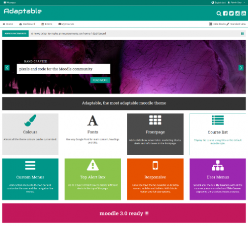
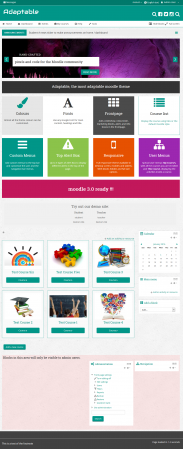
Screenshots
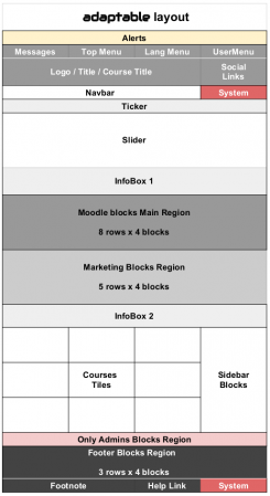
Adaptable theme layout
Adaptable select
adaptable-front-page
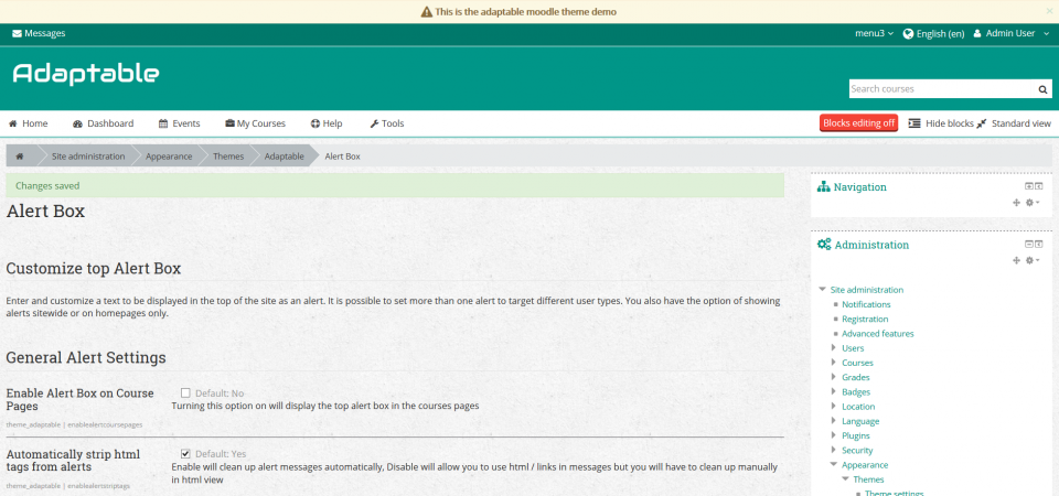
adaptable-alerts
reduced_adaptable-colors
adaptable-fonts
block-region-builder
block-region-front-page
adaptable-mobile-social-on


Download
From the Moodle plugins database.
Installation
There are several ways to install the Adaptable theme.
- Review Installing_plugins#Installing_a_plugin Plugin installation section
- Make sure the Adaptable theme is compatible with your Moodle version
- After installing the Adaptable theme, change the site theme on one or more devices to the Adaptable theme
Configuration
Adaptable has a lot of settings and may seem daunting at first, our advice is to simply install with the default settings and play with it afterwards.
With a little time you should be able to setup an attractive Moodle site with a high degree of individuality without knowing any CSS.
You can work on configuring the theme without it being live on your site by putting theme=adaptable or theme=clean into the URL. See Allow theme change by URL.
Theme settings that will be linked to by 'Moodle Docs for this page'
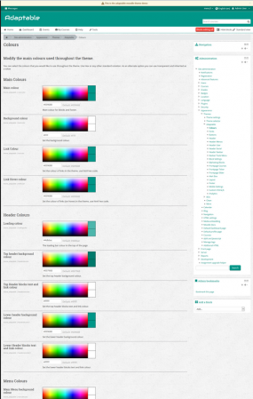
Colours
You can select the colours that you would like to use throughout the theme. Use Hexadecimal color notation or any other standard notation. As an alternate option you can use transparent and inherited as a value
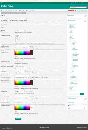
Fonts
You can select the Google Fonts that you would like to use throughout the theme. Select the subset needed (latin is always included) and enter the right font weight or the font will not displayed.
Buttons
Alter the appearance of buttons used in this theme. Configure as needed.
Header
- Customize the header of this theme.
- Upload your favicon, logo, set login form in header, adjust titles in header.
- You can set font size and styles for titles in the "fonts" settings page.
Header Menus
- Tools Menus (in navbar) and Top Menus (upper header) can be restricted based on custom profile fields (optional).
- To add a restriction enter the name of the profile field and expected value.
- Menu Structure follows the common Moodle format:
Moodle community|https://moodle.org
-Moodle free support|https://moodle.org/support
-Moodle development|https://moodle.org/development
--Moodle Docs|http://docs.moodle.org
--German Moodle Docs|http://docs.moodle.org/de
Moodle.com|http://moodle.com/
- General settings for Top Menu visibility
- These settings allow you to control where menus appear and optionally allow users to customise their settings
Header User
Allows you to control all of the elements that appear in the user navigation dropdown.
Header Social
- You can disable the sitewide search box and enable social icons / links in its place.
- To setup icons enter a de-limited list into the "Social Icon List" field below.
- This should be in the format:
url|title|icon
- For example:
http://localhost/moodle/course/search.php%7CSearch Moodle|fa-search
http://facebook.com/%7CFacebook%7Cfa-facebook-square
http://twitter.com/%7CTwitter%7Cfa-twitter-square
http://instagram.com%7CInstagram%7Cfa-instagram
- For reference you can find the full list of Font Awesome Icons Here
... customize as needed ...
Header Tools Menu
... customize as needed ...
Block Settings
... customize as needed ...
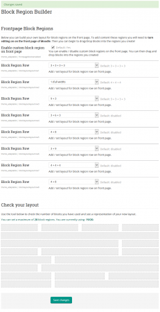
Block Region Builder
- You can build your own layout for block regions on the Front page.
- To add content these regions you will need to Turn editing on on the Front page of Moodle.
- Then you can begin to drag/drop blocks into the regions you create!
Course Sections
... customize as needed ...
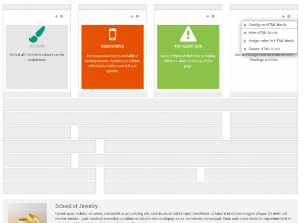
Marketing Blocks
- There are two full width info boxes witht differing styles you can use.
- In addition to this there is a layout builder, allowing you to decide how many blocks you need and define your own layout.
- Please see the README file that comes with this theme.
Front page Courses
Configure the way that the course boxes are rendered on the Front page.
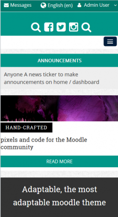
Frontpage Ticker
- Here you can set a news ticker to run across the Front page of your Moodle site.
- It is intended as a less intrusive alternative to the slider, taking up very little space.
- To setup your ticker, simply entere a bulleted list and include any hyperlinks you need to in that text.
- Note: you must not put ul tags around our list, only li. Moodles Text editor tends to add ul tags.
- If your ticker does not load properly, switch to HTML view and ensure you have only li tags:
News item one..... News item two.....
Frontpage Slider
- Upload the images, add the links and description for the carousel on the Front page.
- Sample HTML for Slider Captions:
Hand-crafted
pixels and code for the Moodle community
<a href="#" class="submit">Please favorite our theme!</a>
Alert Box
- Enter and customize a text to be displayed in the top of the site as an alert.
- It is possible to set more than one alert to target different user types.
- You also have the option of showing alerts sitewide or on homepages only.
Layout
Set the default layout that users see.
Set the content that should appear in the footer
Mobile Settings
Control how your site looks on mobile devices
Social Wall
Customise the appearance of the Social Wall Course Format (if in use on your site)
Custom CSS & JS
Here you can find various settings to add your own CSS and JavaScript code to the theme.
Analytics
You can setup multiple codes for Google Analytics and targed them to user profile fields.
Migration from BCU to Adaptable
Advice on migrating from BCU to Adaptable can be found here
HTML code for settings and block areas
Here you will find some code samples to help you to customize the Info Box and the Marketing Blocks
You can insert any HTML tag to customize the Front page blocks. Use a <div> as a main container and add the height to keep the same value in all the blocks.
The Font Awesome icons set is available in http://fortawesome.github.io/Font-Awesome/icons/. You can insert any of them and following the examples in http://fortawesome.github.io/Font-Awesome/examples/
Front Page Slider Styles
There are two possible slider styles each with different markup required:
Original BCU Slider Markup
Information
   Lorem ipsum dolor sit amet, consectetur adipisicing elit, sed do eiusmod tempor incididunt ut labore
   et dolore magna aliqua. Ut enim ad minim veniam, quis nostrud exercitation ullamco laboris nisi ut aliquip
   ex ea commodo consequat. Duis aute irure dolor in reprehenderit in voluptate velit esse cillum dolore eu fugiat nulla pariatur.


 <a href="#" class="submit">2013/14 Courses </a>
Coventry Style Slider Markup
Hand-crafted pixels and code for the Moodle community
<a href="#" class="submit">Check out our custom theme pricing!</a>
Frontpage Marketing Block HTML structure Coventry
<img src="http://somewebsite.com/2.jpg" class="marketimage">
<a href="#">International Courses</a>
Some text below the link....
Front page Info Block
There are two Info blocks in the frontpage located above and below the Marketing Blocks. See pix/layout.png
Simple box with solid background and using a default heading
Add your text here
Simple box with solid background colour, default heading h3 and white text colour
Add your text here
Front Page Secondary Info Block Example
You can apply additional styles to the secondary info block:
       <img src="/urltoanimage.jpg" alt="person">


School of Jewelry
   Lorem ipsum dolor sit amet, consectetur adipisicing elit, sed do eiusmod tempor incididunt ut labore et dolore magna aliqua.
   Ut enim ad minim veniam, quis nostrud exercitation ullamco laboris nisi ut aliquip ex ea commodo consequat.
   Duis aute irure dolor in reprehenderit in voluptate velit esse cillum dolore eu fugiat nulla pariatur.
   <a href="#" class="submit">Learn more... </a>
Frontpage Marketing Block HTML
You can add up to 12 Marketing Blocks in the Front page. The blocks are located automatically in rows, with a maximum of 4 blocks per row. The full width is divided equally between the blocks.
Simple Block with white background and Font Awesome icon. Using the default text colour and h3 heading
TITLE
Add your text here
Block with solid background colour, white text colour and Font Awesome icon
TITLE
Add your text here
Block with solid background, white text colour and text aligned vertically (useful for blocks 100% wide)
moodle 3.0 ready !!!
Contact information
 High St. 100

123456 City


 +12 (3)456 78 90

 info@mail.com

 www.example.com
List with Chevron
- <a href="http://moodle.org/">Accessibility</a>
- <a href="http://moodle.org/">Moodle Help</a>
- <a href="http://moodle.org/">Moodle Feedback</a>
- <a href="http://moodle.org/">IT Help</a>
- <a href="http://moodle.org/">IT Feedback</a>
</nowiki>
Credits
- Adaptable is a fork of BCU theme and owes its existence to all those credited on that theme
- Adaptable development was driven by 3Bits E-Learning Solutions and Coventry University
- Persistence of Bootstrap Alerts provided by Justin Hunt in between mowing lawns and brokering cease fires (see his Moodle Services page)
- Ideas on Social Wall support provided by Chris Kenniburg
- Help with renderers and other tricky stuff provided by Mary Evans and Gareth J BarnardH
- Additional support provided by New School Learning
Support
Please post your questions in the Themes Forum.
We do not provide direct support
See also
The authors documentation page at https://bitbucket.org/covuni/moodle-theme_adaptable