Development:Wizard
Moodle User Interface Guidelines > Wizard
Problem
- Users need to perform a complex task, which which they are not familiar or lack needed domain knowledge
- The task users need to perform naturally divides into subtasks, and the nature or number of subtasks depends on what is selected in some other (preceding) tasks
Context
You are designing an UI for users who are not experts at a given task that involves entering a lot of information or making intricate selections that depend on each other.
Forces: factors that affect selection
- Unexperienced users may get frustrated
- if too many choices, dependent on each other, are presented to them at once
- if they do not have all the background information related to a task
- Experienced users easily get frustrated
- if a task they know is split into too many phases
- if the order they enter data into the application is controlled
- Any user can be frustrated by lack of control in the process, i.e. not knowing the number of steps left or not being capable of controlling the process (returning back in the process to an earlier screen in case of a misunderstanding or mistake, for example)
Solution
A Wizard, sometimes called an Assistant, is an interface that guides users through a predefined sequence of steps.
Elements of a wizard
Status display
Displays the steps required to complete the wizard, and indicates the step the user is in currently, giving important feedback to the user resulting from their actions, making the application seem responsive.
- Previous: Whereever it is possible to allow the user to change the selections they have already made, a button labeled 'Previous' should be provided.
- Obviously, the first page of the wizard does not include a previous button, nor do pages which are a result of actions that can not be undone.
- Unlike one might assume, the Previous button acts as a submit button for the current page, just like the Next button. If the user has made changes on the current page when they decide to return to a previous step, those changes are saved.
- Provide a Previous button whenever possible to maximize user control.
- Next: Used for moving to the next step
- When the next step is to actually start an operation (usually the last step of the wizard), the button is in the same position, but the label is an action verb such as "Start Backup". This is to let users know that they are doing something that actually has consequences and not just continuing to enter data. If the operation that the user is about to start cannot be undone or is in some other way potentially dangerous, consider adding a javascript warning dialog confirming the user wants to continue.
- Cancel: If there is a specific page from which the user can be assumed to have arrived to the wizard from, clicking Cancel will return them to this page. If you can not be sure, determine a reasonable default.
- The Cancel button should in most cases (except in very simple Wizards) have a javascript confirmation dialog associated with it, noting them that all the information they have entered will be lost, and asking them if they really want to continue.
Notes
The user should be capable of using the browser's back button normally in a wizard.
- After pressing the Next button, the user should end up in the step that was before the page
- After pressing the Previous button, the user should end up in the step that is after the current step in the wizard's sequence
- If the user cannot return to the previous step anymore, the user should be returned to the earliest possible screen, or alternatively the wizard should be reinitialized and the user sent to the first page of the wizard
If there is a danger that experienced users want to use the functionality provided by the wizard and that they want more control than what the wizard provides, provide an alternate user interface to them.
Common mistakes
Moodle Wizards typically do not have all of the required buttons nor the status display.
Each screen is a form, so no links are used for moving between the screens but the next/previous should be used. The added click of selecting a form field and then pressing 'next' is secondary to the problem of potentially losing user data: even if the data is preserved (using javascript which cannot be relied upon anyway), navigation links do not afford this so the user is left anxious. Also usage of back/forward browser buttons is problematic if what user has selected is not saved in the session using a the next/prev buttons (which are technically form submit buttons).
Examples and implementation
Backup
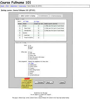
This mockup (MDL-20036) demonstrates the main features of a wizard.
- Status display and controls for controlling the wizard
- The visual hierarchy of the page expresses that the content in the box with the darker background is part of the wizard, and that this wizard is completes the process of backing up the Course Course Fullname 101.
Note that this wizard is in the sense not typical that it only contains one step where the user actually does anything actively (enters information). The fact that the single screen contains a lot of information may slow down novices, but since backup can be considered an advanced operation, slowing down more experienced users would be worse.
- Note: Moodle 2.0 contains a implementation of a wizard done according to MDL-20036 (see MDL-22142). View it at http://qa.moodle.net/backup/backup.php?id=1 (requires login). A screenshot should be added here as soon as Moodle 2.0 is released.
Further examples and code samples: Development:Wizard Examples and Code Samples
Related guidelines
Another way of only showing unexperienced users what they understand is using Progressive Disclosure
Related issues in the tracker
- TODO: all the issues with installation and backup
