Standard view of a blank course
Our examples will be for a course homepage that is the standard default for a new install on a site. There are many course options that determine a course's appearance and make it look very different from our examples. The example course has a header, a footer (both content largely determined by a theme) and 3 columns in the middle.
Here are basic elements of a course page and links to Moodle documentation.

Parts of a course homepage
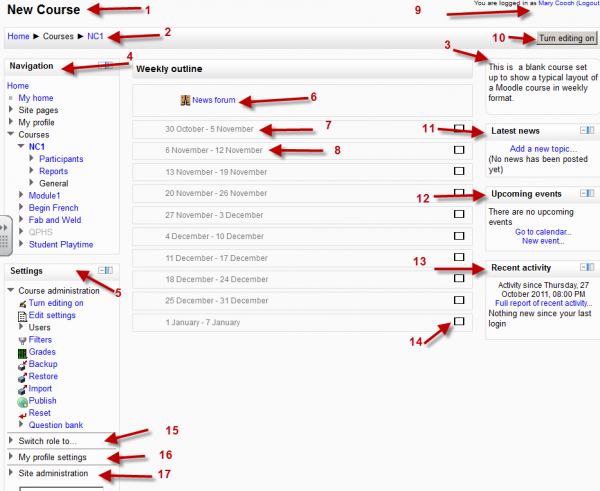
Using the above image, here are the parts of a typical course homepage. It is possible to move and hide parts of the page and different themes display blocks in different regions, so not all courses will look like this.
| Column left | Course sections - Center | Column right |
| *1 Course full name | *6 Section header & News topic | *9 Login information |
| *2 Navigation bar | *7 Current week - First section | *10 Turn editing on button |
| *4 Navigation block | *8 Future week - Second section | *11 Latest news |
| *5 Settings block | *14 "Show only this section" | *12 Upcoming events |
| *15 "Switch role to" | *13 Recent activity | |
| *16 User profile settings | ||
| *17 Site Administration |
Adding elements to your course home page
- Turn on the editing by clicking the button top right or the link in Settings>Course Administration.
- For resources and activities, dropdown menus will appear in each section. Click the appropriate dropdown menu to add your item.
- For blocks, click the "add block" dropdown which is usually situated bottom right of the screen.
Editing elements on your course homepage
With the editing turned on, each item on your course homepage and each section/block will have icons next to it which all perform different functions such as edit/move/copy/delete/hide. Note: your theme may have icons different from these below::
 - the move here icon appears when moving a course element. Click into the box to re-locate your item.
 - the "crosshairs" move icon allows you to move items or sections by dragging and dropping. It appears if your admin has enabled Ajax in Settings > Site Administration > Appearance > Ajax and Javascript
The following icons are visible when editing is both on and off
The following icon only applies to sections
Moving sections or blocks on your course's homepage
To move a Block
Blocks appear at the side(s) of your course area. To move one,
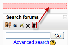
- Turn Editing On and *click and release* the Block's crosshair icon. Place holders - zones with a dashed border - appear on the screen indicating the possible areas where your Block can appear.
- Click the placeholder where you want the Block appear. On course area homepages, you can move Blocks from one side to the other, but not into the middle.
- The block should now appear in the location you chose.
To move a Section
To move a Topic or Week section:
- turn editing on
- click the up or down arrow or the crosshairs icon to move the section
Displaying activity descriptions on the course page
New feature
in Moodle 2.2!
Activity and resource descriptions can be displayed on the course page just below the link to the activity or resource by clicking the 'Display description on course page' checkbox in the activity or resource settings.
Tips and tricks
- Make your course home page look more like a webpage - see Course FAQ
Course homepage capabilities
See also
- Course settings for details of how to change the number of sections displayed on the course homepage

